I’m a designer. I don’t write shaders. Or at least, I didn’t.
But I kept seeing these dithered images everywhere—that crunchy, pixelated texture that feels both old and new. And I wanted to make my own. Not by running images through some filter, but in real-time, on 3D models, with controls I could tweak.
My first experiment was actually for Lummi, where I used v0 to prototype an effects tool. It was hacky and limited, but it worked well enough that I got hooked.
The Lummi effects tool I built with v0. Hacky, but it worked.
So I started building [Efecto](https://ef…
I’m a designer. I don’t write shaders. Or at least, I didn’t.
But I kept seeing these dithered images everywhere—that crunchy, pixelated texture that feels both old and new. And I wanted to make my own. Not by running images through some filter, but in real-time, on 3D models, with controls I could tweak.
My first experiment was actually for Lummi, where I used v0 to prototype an effects tool. It was hacky and limited, but it worked well enough that I got hooked.
The Lummi effects tool I built with v0. Hacky, but it worked.
So I started building Efecto. What started as a quick experiment kept expanding as I read about different algorithms and got curious about how they worked.
I couldn’t have done any of this without the work others have shared. Shadertoy was where I learned by reading other people’s code. The Book of Shaders by Patricio Gonzalez Vivo taught me the fundamentals. And libraries like postprocessing and React Three Fiber gave me something to build on.
This is what I figured out along the way.
 Same image, different algorithms: Floyd-Steinberg, Atkinson, Jarvis-Judice-Ninke, Stucki, Burkes, and Sierra.
Starting with dithering
Dithering is a technique that creates the illusion of more colors than you actually have. If you only have black and white pixels, you can’t show gray. But if you arrange black and white pixels in a pattern, your brain blends them together and perceives gray.
The technique comes from newspapers. Before digital anything, printers had to figure out how to reproduce photographs using only black ink on white paper. Their solution was halftones: tiny dots of varying sizes that trick your eye into seeing continuous shades.
 From 1869 newspaper halftones to MacPaint to modern algorithms.
The digital version of this started in 1976 with a paper by Robert Floyd and Louis Steinberg. Their insight: when you round a pixel to the nearest available color, you get an “error” (the difference between what you wanted and what you got). Instead of throwing that error away, you can spread it to neighboring pixels. This creates organic patterns instead of harsh bands.
Here’s the basic idea in code:
// For each pixel...
const [r, g, b] = getPixel(x, y)

// Find the nearest color in our palette
const [qR, qG, qB] = findNearestColor(r, g, b, palette)

// Calculate the error
const errR = r - qR
const errG = g - qG
const errB = b - qB

// Spread that error to neighbors (Floyd-Steinberg weights)
addError(x + 1, y,     errR * 7/16, errG * 7/16, errB * 7/16)
addError(x - 1, y + 1, errR * 3/16, errG * 3/16, errB * 3/16)
addError(x,     y + 1, errR * 5/16, errG * 5/16, errB * 5/16)
addError(x + 1, y + 1, errR * 1/16, errG * 1/16, errB * 1/16)
The weights (7/16, 3/16, 5/16, 1/16) add up to 1, so you’re redistributing 100% of the error. The asymmetric distribution prevents visible diagonal patterns.
Try dithering with the original Floyd-Steinberg error diffusion algorithm from 1976.
Other algorithms
Once I got Floyd-Steinberg working, I wanted to try others. Each algorithm distributes error differently, which creates different textures:
Atkinson (1984) was created by Bill Atkinson for the original Macintosh, which could only display black or white. His trick: only distribute 75% of the error. This creates higher contrast images with a slightly “crunchy” quality.
const atkinson = {
kernel: [
[1, 0, 1],   // right
[2, 0, 1],   // two right
[-1, 1, 1],  // bottom-left
[0, 1, 1],   // bottom
[1, 1, 1],   // bottom-right
[0, 2, 1],   // two below
],
divisor: 8,  // 6 neighbors × 1 = 6, but divisor is 8
}
Notice how only 6/8 of the error gets distributed. That “lost” 25% is what gives Atkinson its distinctive look.
Try dithering with the Bill Atkinson’s algorithm from the original Macintosh.
Jarvis-Judice-Ninke spreads error to 12 neighbors across 3 rows. It’s slower but produces smoother gradients:
Jarvis-Judice-Ninke in motion. Notice how smooth the gradients are.
Try the Jarvis-Judice-Ninke 12-neighbor algorithm for ultra-smooth gradients.
I ended up implementing 8 different algorithms. Each has its own character. Which one looks best depends on the image.
Adding color
Two-color dithering (black and white) is classic, but multi-color palettes open up more options. Efecto includes 31 preset palettes organized into categories: classic terminal colors, warm tones, cool tones, neon/synthwave, earth tones, and monochrome. You can also create custom palettes with 2-6 colors.
Switching between different color palettes in real-time.
The Game Boy had four shades of green. That’s it. But artists made memorable games within those constraints. The limited palette forced creativity.
Try the classic Game Boy 4-color palette from 1989.
The palette you choose completely changes the mood. Warm palettes feel nostalgic, neon feels cyberpunk, monochrome feels like old print.
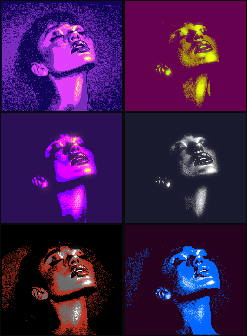 Same portrait, different palettes: synthwave, gold, cyberpunk, noir, campfire, and deep sea.
Efecto maps colors using luminance. First, calculate the brightness of each pixel:
const luminance = 0.299 * r + 0.587 * g + 0.114 * b
Then map that brightness to a palette index. Palettes are ordered from dark to light, so a dark pixel picks colors from the start of the palette, bright pixels from the end:
const index = Math.floor(luminance * palette.length)
const color = palette[Math.min(index, palette.length - 1)]
This means palette order matters. Flip the colors around and you get an inverted image.
There’s also a pixelation control (block size 1-10) that processes the image in chunks rather than individual pixels. Higher values give you that chunky, low-res look. The error diffusion still works, but it spreads between block centers instead of individual pixels.
Try the Synthwave palette with pink, purple, and cyan gradients.
The bloom trick
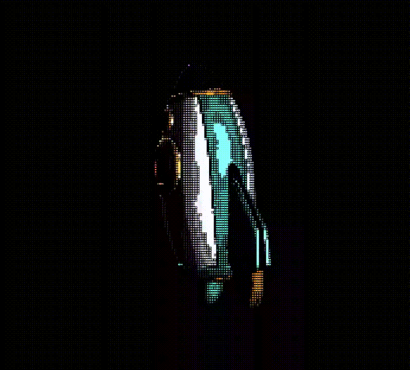
I wanted to simulate how CRT monitors looked, and bloom turned out to be the key. Dithering creates high-contrast pixel patterns. Bloom makes bright pixels glow into dark ones, softening the harsh edges while keeping the dithered texture.
Bloom softens harsh pixel edges. Similar to how old CRT monitors looked.
Apply a green monochrome look with a CRT-style glow and dithering with bloom.
Then I wanted ASCII
After getting dithering to work, I got curious about ASCII art. Same basic idea (represent brightness with patterns) but using text characters instead of pixel arrangements.
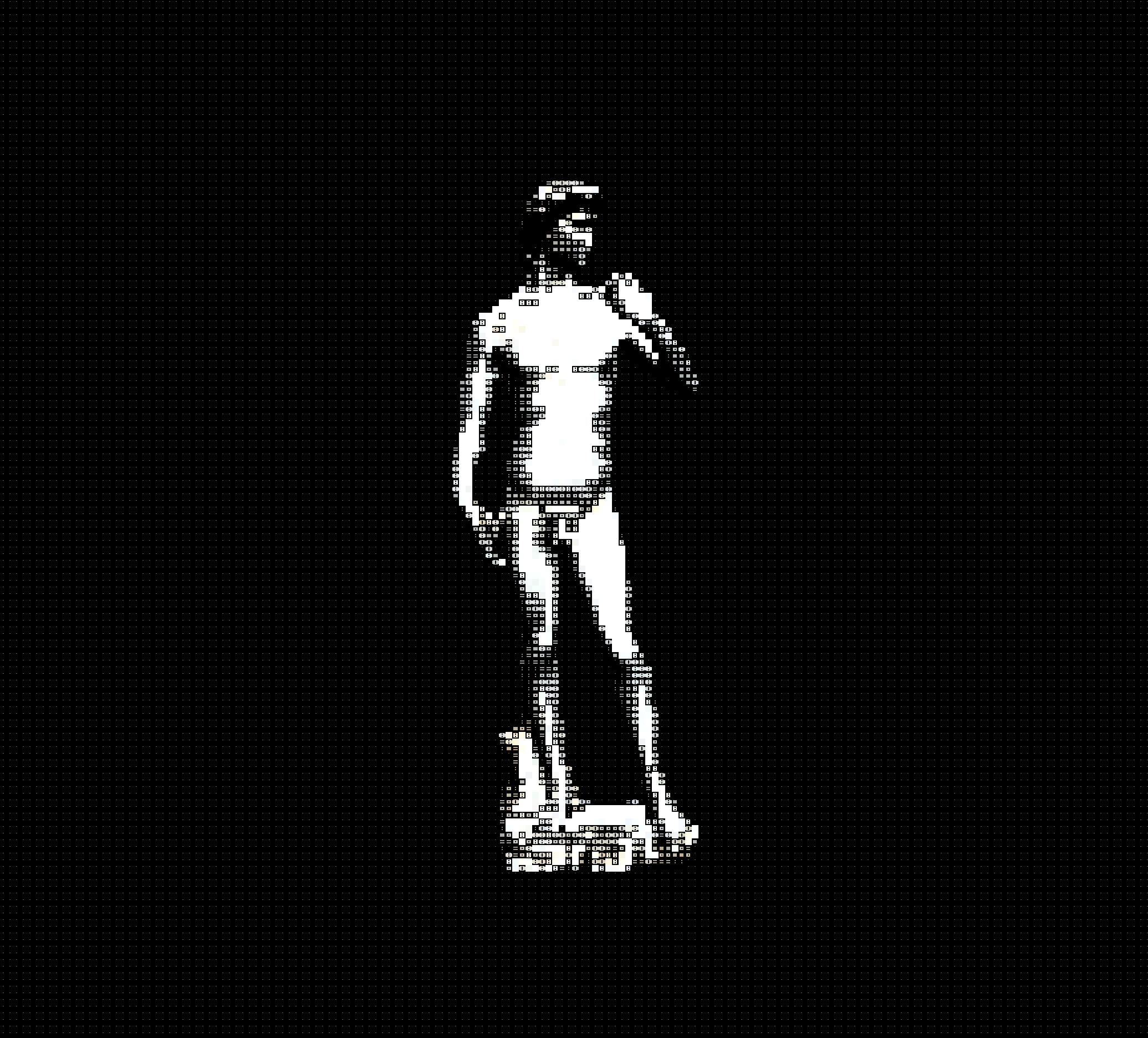 A 3D model rendered in real-time as ASCII characters.
The challenge: shaders don’t have fonts. You can’t just call drawText(). Everything has to be math.
The solution is to draw characters procedurally on a 5×7 pixel grid. Each character becomes a function that returns 1 (filled) or 0 (empty) for any position:
// A colon: two dots vertically centered
if (grid.x == 2.0 && (grid.y == 2.0 || grid.y == 4.0)) {
return 1.0;
}
return 0.0;
// An asterisk: center + arms + diagonals
bool center = (grid.x == 2.0 && grid.y == 3.0);
bool vert = (grid.x == 2.0 && (grid.y >= 2.0 && grid.y <= 4.0));
bool horiz = (grid.y == 3.0 && (grid.x >= 1.0 && grid.x <= 3.0));
bool diag1 = ((grid.x == 1.0 && grid.y == 2.0) || (grid.x == 3.0 && grid.y == 4.0));
bool diag2 = ((grid.x == 1.0 && grid.y == 4.0) || (grid.x == 3.0 && grid.y == 2.0));

return (center || vert || horiz || diag1 || diag2) ? 1.0 : 0.0;
The shader divides the screen into a grid of cells. For each cell, it:
- Samples the color at the cell center
- Calculates brightness
- Picks a character based on that brightness
Darker regions get denser characters (@, #, 8), lighter regions get sparser ones (., :, space).
float brightness = dot(cellColor.rgb, vec3(0.299, 0.587, 0.114));
Those numbers (0.299, 0.587, 0.114) come from how human eyes perceive color. We’re most sensitive to green, then red, then blue. This gives perceptually accurate grayscale.
 ASCII rendering on a rotating 3D object.
Efecto has 8 different ASCII styles. Each uses a different character set and arrangement:
 The same image rendered in 8 styles: standard, dense, minimal, blocks, braille, technical, matrix, and hatching.
CRT effects
Both dithering and ASCII evoke early computing, so I added some post effects to complete the look:
Scanlines are horizontal dark bands that simulate CRT phosphor rows.
Screen curvature mimics the curved glass of old monitors:
vec2 centered = uv * 2.0 - 1.0;
float dist = dot(centered, centered);
centered *= 1.0 + curvature * dist;
uv = centered * 0.5 + 0.5;
This pushes pixels outward from the center, more at the edges. Simple math, convincing effect.
Chromatic aberration slightly separates RGB channels, like cheap optics.
Vignette darkens the edges, drawing focus to the center.
Combined with a green phosphor or amber palette, the whole thing feels like an old terminal.
 Original, scanlines, curvature, chromatic aberration, vignette, and all combined.
How Efecto is built
Dithering runs on the CPU. Error diffusion is inherently sequential since each pixel depends on previously processed pixels. The actual dithering algorithm runs in JavaScript, processing pixel data in memory. WebGPU handles texture management and the bloom effect (which is GPU-accelerated). When WebGPU isn’t available (like in Firefox), there’s a Canvas 2D fallback.
ASCII runs as a WebGL shader. Unlike dithering, each cell is independent, so it can run entirely on the GPU. The shader is built with Three.js and the postprocessing library. Characters are generated procedurally in GLSL, not from bitmap fonts.
Some effects are heavy. Complex shaders with lots of post-processing can drop frame rates significantly, especially on older hardware. This is a tradeoff between visual complexity and performance.
Try it
Here are some starting points:
 Original
  Dithered Photo: Floyd-Steinberg with subtle bloom ↗
  Original
  Dithered Illustration: Atkinson with a custom ink pattern ↗
  Original
  Dithered Retro: Stucki with a Game Boy palette ↗
What I learned
Historical algorithms hold up. Floyd-Steinberg from 1976 is still one of the best. The original papers are worth reading.
Constraints force creativity. Working within technical limitations forces different solutions. Shaders can’t use fonts, so characters have to be drawn as math. Error diffusion can’t parallelize easily, so it runs on the CPU while bloom runs on the GPU.
The details matter. Those luminance weights (0.299, 0.587, 0.114) exist because someone studied how human vision works. The asymmetric error distribution in Floyd-Steinberg exists because someone noticed diagonal artifacts. These small decisions compound.
If you want to dig deeper:
Papers:
- Floyd & Steinberg (1976): “An adaptive algorithm for spatial grey scale”
- Jarvis, Judice & Ninke (1976): “A survey of techniques for the display of continuous tone pictures on bilevel displays”
- Donald Knuth (1987): “Digital Halftones by Dot Diffusion” – a different approach worth exploring
Learning resources:
- The Book of Shaders by Patricio Gonzalez Vivo
- Shadertoy for inspiration and learning from others
- Inigo Quilez’s articles on shader techniques
Libraries I built on:
- postprocessing for Three.js post-processing effects
- React Three Fiber for React + Three.js integration
And if you build something with these techniques, I’d love to see it.