What typefaces are more readable and accessible than others? And what characteristics make them so? As a UX and accessibility expert, Gareth Ford Williams found himself drawn to these questions. As a believer in data, he found some of the claims being made around those questions lacking.
Take Comic Sans, for instance. The much-derided, comic book-inspired typeface existed mostly as a punchline before enjoying a new reputation for dyslexia-friendliness. But that reputation is based mostly on anecdotal testimony, rather than research. Similarly…
What typefaces are more readable and accessible than others? And what characteristics make them so? As a UX and accessibility expert, Gareth Ford Williams found himself drawn to these questions. As a believer in data, he found some of the claims being made around those questions lacking.
Take Comic Sans, for instance. The much-derided, comic book-inspired typeface existed mostly as a punchline before enjoying a new reputation for dyslexia-friendliness. But that reputation is based mostly on anecdotal testimony, rather than research. Similarly, typefaces like Dyslexie and OpenDyslexic were introduced as dyslexia-friendly alternatives, but also lacked evidence to support the claim.
“There are a lot of anecdotes, but data is not the plural of anecdote,” said Williams, who now directs the accessibility consultancy Ab11y.com, after previously heading accessibility at the BBC, and who has dyslexia himself.
Williams, along with typographer David Bailey and type designer Bruno Maag, founded the Readability Group last year to chart a more data-driven approach — not simply for the question of dyslexia-friendly typefaces, but to better understand typeface readability and legibility more broadly.
What Makes a Typeface Readable and Accessible?
Ample letter spacing, open letters and humanist features (like width variation) are important characteristics to consider when choosing a typeface that is readable and accessible for user interface design, according to a survey by the Readability Group. Letter mirroring is also worth considering, but may be less important compared to the other factors.
In February, the Readability Group launched a large-scale survey, about two years in development, in which some 2,500 participants were shown a word in 20 different typefaces, then asked to take “no more than a couple of seconds” to choose which was easiest to read. The group included people with varying levels of vision impairment, people with characteristics of dyslexia (ranging from mild to severe), and those with none. It also spanned a diversity of user attributes, like font size preference, reading confidence, and preference for color or black-and-white text.
The results aren’t intended to be the final word, but they elicit some interesting takeaways, especially when examined through the lens of existing recommendations. Williams created a guide last year around what features to think about when considering typeface accessibility. It was informed by the research he helped spearhead while working with Maag and others to develop a new typeface for the BBC, called BBC Reith, which was introduced in 2017.
Here’s what the Readability Group study showed.
Find out who’s hiring.
See all Design + UX jobs at top tech companies & startups
View Jobs
5 Things to Consider for Typeface Readability
Based on the survey results, we asked Maag and Williams to rank what they consider most important when choosing a typeface. From most important to least, the hierarchy they recommend goes: context, letter spacing, open letters, humanist versus grotesque, and mirroring.
Consideration #1: Context
The very first thing one should consider when thinking about typeface selection is context. Obvious, perhaps, but worth making explicit.
“No one in their right mind would want to read a book in San Francisco Pro,” said Maag, referencing the utilitarian, sans-serif option, known for its close resemblance to Helvetica. (The San Francisco Chronicle recently called San Francisco Pro “Helvetica on a low-carb diet.”) On the other hand, you wouldn’t want to use something like a Garamond typeface, which is serifed and popular in book publishing and long-form writing, for user interface design, Maag added.
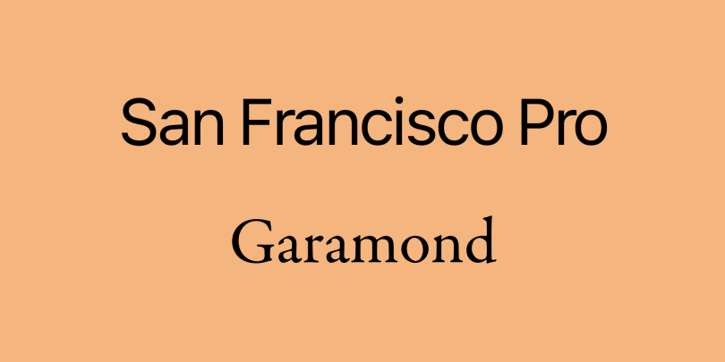 Top: San Francisco Pro. Bottom: Garamond.
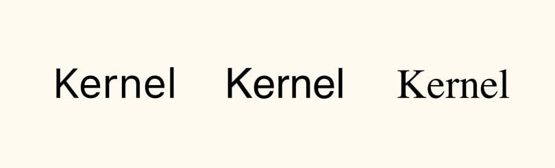
Consideration #2: Letter Spacing
With that said, the next (less obvious) consideration should be letter spacing. Think of “rn” words, like “kernel” or “furnished.” Williams pointed out, when discussing the survey results at the digital accessibility conference axe-con earlier this year, that when letter spacing is tight, “kernel” might read as “kemel,” and “furnished” as “fumished.” The effect is compounded in people with visual and cognitive impairments, Williams noted. Other guidelines have also stressed letter spacing in terms of typeface accessibility.
 Left: San Francisco text. Center: Helvetica. Right: Mshtakan. Ordered from most to least letter spacing.
But what did the survey show? The typeface chosen by the most participants as easiest to read was the aforementioned San Francisco Pro. What does that have to do with letter spacing? A lot, it seems, when you consider that Helvetica fell in the middle of the pack. While Helvetica and San Francisco Pro indeed look strikingly alike, a crucial difference is letter spacing. San Francisco Pro has ample. Helvetica? Much less so.
“Cearly, letter spacing is a major contributing factor to good readability,” said Maag.
More on accessibility5 Tips for Making a Website Accessible
Consideration #3: Open Letters
Another noteworthy finding? Three of the four typefaces that performed best among all participants (Segoe UI, BBC Reith Sans and Verdana) share at least one notable trait: their terminals don’t curve back into the character.
What exactly does that mean, and why is it noteworthy? To explain, let’s look at San Francisco Pro, a typeface where the terminals do curve back. Notice below how the “c” and the “e” curl in on themselves, so to speak. That makes them look more similar to each other, and to “o,” than they do in some other typefaces.
 San Francisco Pro, an example of a typeface with more closed-letter shapes.
Compare that below to “c” and “e” in Segoe UI. The terminal doesn’t curve in so much, so the letter is more open, making it more legible.
 Segoe UI, an example of a typeface with more open-letter shapes.
“Open-letter shapes have less ambiguity amongst one another, and ambiguity is the enemy of decision-making,” Maag said. “The less ambiguous the shapes, the easier [you] can quickly and accurately identify and decode the shape.”
But here’s a curveball: Even though three of the four best-performing typefaces had open letters, the top overall performer (San Francisco Pro) is a closed-letter typeface. How to explain that? Remember the importance of letter spacing. Closed letters become less of an issue in typefaces that have ample letter spacing and therefore less crowding, Maag said. That may help explain why a closed-letter typeface nonetheless fared best.
Consideration #4: Humanist vs. Grotesque
Humanist typefaces are “generally more legible at smaller sizes” than grotesque ones, according to Williams’ guide. A quick primer for the uninitiated: grotesque (plus its similar descendent, neo-grotesque) and humanist are all sans-serif typefaces, but humanist ones are more varied in character widths.
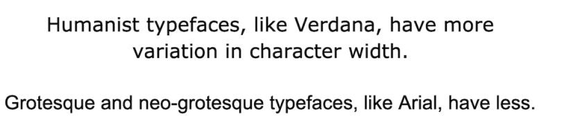 Humanist vs. Grotesque typefaces.
“Varied character widths aid character recognition for people with all types of eye condition or learning disabilities,” Williams wrote.
Sure enough, humanist typefaces also performed well in the survey. The three open-letter typefaces that ranked among the top four — Segoe UI, Verdana and BBC Reith Sans — were also humanist. It might not carry as much weight as context, letter spacing and open letters, but the humanist versus grotesque question is also worth looking at when considering typefaces, Williams said.
More on UI AccessabilityAccessible UI Basics for Users With Visual Impairments
Consideration #5: Mirroring
Conventional wisdom says that avoiding mirroring can improve typeface readability. Take a look below to get a sense of the mirroring effect. In the first typeface, notice how “d” and “b,” and “q” and “p,” are essentially mirror inverses of each other.
 Veranda; an example of a mirroring typeface.
Now compare that to a typeface with plenty of differentiating characteristics in similar areas, like so:
 Georgia; an example of a non-mirroring typeface.
In the Readability Group survey, however, many of the typefaces that garnered strong responses from participants overall did in fact exhibit this kind of mirroring. That was also the case if you narrow in specifically on participants with severe characteristics of dyslexia. Those participants chose San Francisco Pro and Verdana as most readable, both of which have some mirrored letters. Meanwhile, Comic Sans, which does not mirror, performed poorly with participants with strong characteristics of dyslexia.
Those findings would seem to further undercut the popular misconception that all dyslexic people mirror, or flip, their letters, Williams said. More broadly, they suggest that mirroring may be a more minor concern within the hierarchy of considerations, Maag said.
That doesn’t mean it’s no concern at all. Maag did note that young readers flip letters during early childhood development. That condition takes longer to resolve in some children, and it can even last throughout life for some. For reasons like those, don’t ignore mirroring as a potential issue altogether.
Test Away
These are all good starting points, but the best way to test them with consumers of your product is by doing just that — testing. “We can start pulling together rules to get you into a good place, but nothing actually replaces that,” stressed Williams. Once you’ve narrowed candidates down to a few, put them through your own careful process.
“A/B is always really useful, but you need to do stuff that’s statistically significant, you need to do it at scale, and you need to think about the diversity of the UX obstacles and preferences of your user groups,” Williams said.
Indeed, a few of the findings in their survey ran counter to some of the stronger general takeaways. OpenDyslexic, Dyslexie and Comic Sans — despite their reputation for dyslexia-friendliness — were the lowest-ranked options among dyslexic participants. In fact, they were lowest overall, even though they actually make the grade on some key characteristics, like good letter spacing.
It’s not totally clear why those typefaces fared so poorly. During the axe-con presentation, Maag wondered if the exaggerated shapes and heavy weights didn’t put readers off on a more emotional gut level. Indeed, the Readability Group stresses that emotion plays a part in responses to text, too, not simply functional and technical details — a fact that calls for further investigation. Somewhat relatedly, Williams noted the possibility that cognitive biases could be a factor to some degree. Some of the well-performing typefaces are also some of the most ubiquitous, while Comic Sans (reappraisals aside) remains fraught with baggage.
Needless to say, choosing an optimal typeface is a bit more complex than it may appear at first blush. But the tips above can provide a helpful baseline. From there, listen to your audience’s feedback.
“The truth will win out with really good data,” Williams said.