Published on December 14, 2025 6:47 PM GMT
I hate the polling question “What percentage of the US budget goes to foreign aid?” Or, more precisely, I hate the way the results are interpreted.
The way these polls are reported is essentially guaranteed to produce a wild overestimate, which inevitably leads experts to write “how wrong Americans are” pieces, like this Brookings article claiming that “Americans believe foreign aid is in the range of 25 percent of the federal budget,” or KFF<span class=“footnote-reference” data-footnote-re…
Published on December 14, 2025 6:47 PM GMT
I hate the polling question “What percentage of the US budget goes to foreign aid?” Or, more precisely, I hate the way the results are interpreted.
The way these polls are reported is essentially guaranteed to produce a wild overestimate, which inevitably leads experts to write “how wrong Americans are” pieces, like this Brookings article claiming that “Americans believe foreign aid is in the range of 25 percent of the federal budget,” or KFF[1]reporting that the “average perceived amount spent on foreign aid was 26%.”
But this isn’t just ignorance. The real problem is a failure of measurement and the statistics used to summarize it. The story isn’t “Americans are clueless” (though that may also be true), it’s “pollsters are using the wrong math.”
The Real Problem: Arithmetic Mean + Small Numbers
The problem is that pollsters ask for a percentage, then take the arithmetic mean to represent the data. For small true values, this approach is structurally doomed, and it has nothing to do with foreign aid specifically. It has to do with how we summarize guesses about small numbers.
When the true value is small, guesses are bounded at zero but unbounded above. That is, nobody can guess negative percentages, but anyone can guess 50% or 80%. On top of that, people tend to respond with round numbers like 5% or 20%, not decimals like 0.05% or 0.15%. This means that, even if there are many guesses around the true value of ~1%, there can only be outliers in the positive direction, so it results in a right-skewed distribution. If we choose the arithmetic mean as the average, it will be dragged upward by the right tail. A handful of overestimates skew the whole average.
This isn’t a sampling problem, and it won’t go away with more data. With more data, the arithmetic mean converges to the population arithmetic mean, but in a right-skewed distribution, that number is systematically higher than the median or geometric mean. A larger sample just gives you a more precise estimate of a misleading number. The “wisdom of the crowd” effect also will not fix this. That only works when the errors are independent and centered around the truth. If everyone is biased in the same direction, it won’t cancel out.
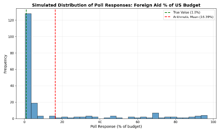
To see this in action, look at the histogram below. I simulated[2]200 responses where most people guess close to the true value of 1%, but some outliers guess much higher (there’s a floor at zero, so they can’t guess much lower). The arithmetic mean comes out to 16.39%. But when you see the raw data, you can tell that this isn’t a good representation of the responses.
Now, I want to be clear about what I’m not arguing. I’m not claiming people actually know how much we spend on foreign aid. We systematically overestimate small, salient things, especially whatever’s been in the news lately. This is the availability bias, and it’s definitely a factor.
But there’s an additional problem here. People overestimate foreign aid, and these polling methods exaggerate how much they overestimate. In the KFF data, the majority of respondents said it was below 20%, and the largest decile by far was 0-10%. KFF said that average was 26%, but their own data show that this isn’t what most people actually believe; it’s an artifact of using the wrong statistic.
This isn’t unique to foreign aid. You can produce the same distortion with any small number. If you’re itching to write a “here’s how dumb Americans are” piece, simply ask people to estimate something small, then take the arithmetic mean. What percentage of the federal budget goes to the National Endowment for the Arts? What percentage of high school students are pregnant? What share of deaths are from terrorism? In each case, the true number is small, guesses are bounded at zero but unbounded above, and a few outliers will drag the arithmetic mean into misleading territory.
Here’s a simple example. Say you want to write about how Americans overestimate the Scots-Irish population. Wikipedia says the percentage of Scots-Irish is 0.11%. You poll 50 people and 49 of them just happen to be incredibly accurate and guess 0.1%, but then one person comes along and guesses 5%. The arithmetic mean would be 0.198%. Nearly double the true value.
You’ve got your headline: “Americans massively overestimate Scots-Irish population!” But is that really what your data showed? 49 out of 50 people were almost exactly right with a slight underestimation. One outlier dragged the arithmetic mean up, and if we’ve chosen the arithmetic mean to represent the average, now you’ve got a story about American overestimation.
There’s a psychological basis for this problem. Empirically, when you ask people to estimate quantities, like how many jelly beans are in a jar, the distribution of guesses tends to be lognormal. That means if you take the logarithm of everyone’s guesses, those values are roughly normally distributed.
This is because humans perceive the world proportionally, not linearly. The difference between 1% and 2% feels significant; the difference between 51% and 52% feels trivial, even though both are one percentage point. This is known as the Weber-Fechner law.
This matters for polling because it means errors are proportional rather than additive. Someone who overestimates by a factor of 5 (guessing 5% instead of 1%) is making the same kind of error as someone who guesses 50% instead of 10%. But when you take the arithmetic mean, that 5% guess gets treated as a modest overshoot while the 50% guess massively distorts the average. The use of the arithmetic mean doesn’t match the way people think.
The Fix: The Geometric Mean
If the underlying distribution is lognormal, one solution would be to have people estimate on a log scale, then transform back. But this is obviously impractical. No sane pollster is going to ask, “What is your estimate of the natural log of the percent spent on foreign aid?”
Fortunately, there’s a mathematically equivalent approach that doesn’t require confusing anyone with logarithms: the geometric mean.
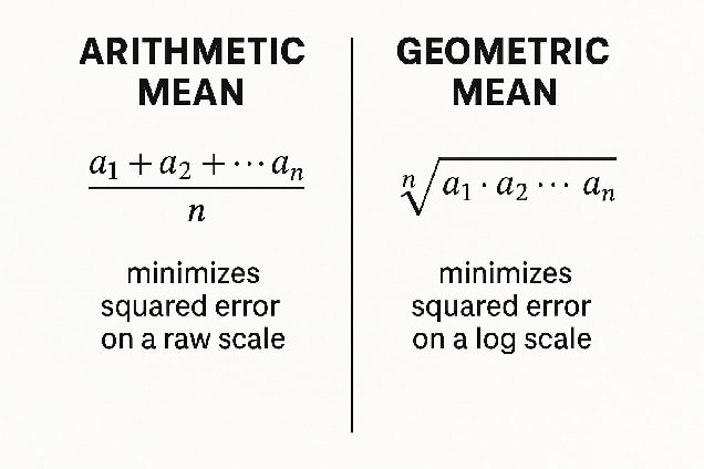
The most common meaning of “average” is the arithmetic mean, where we add up all the values and divide by how many there are. But this isn’t the only way of averaging. Another is the geometric mean, where we multiply all the values together and take the nth root (where n is the number of values). Just like the arithmetic mean minimizes the squared error on a raw scale, the geometric mean minimizes squared error on a log scale. If you think people’s errors are multiplicative, the natural average is the geometric mean.[3]
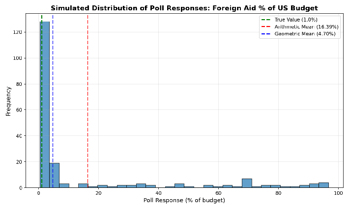
The graph below shows the simulated foreign aid data again, this time with the geometric mean. Instead of 16.39%, we get 4.7%, which, based on visual inspection, seems to be a much better representation of the responses.
Let’s go back to that Scots-Irish example. 49 people guessed 0.1%, one person guessed 5%, and the arithmetic mean came out to 0.198%, nearly double what everyone except for one person said. The geometric mean is 0.1080%. If you’re going to try to represent the results with a single number, this is a much better representation of what people believed.
Same data, better summary statistic, and a sensible result.
Other Possible Solutions
The geometric mean is my preferred method in the case of polling for small numbers, but it’s not the only option. Here are some others that one might consider:
- Take the median. Report the middle value instead of the arithmetic mean. It’s far more robust to outliers.
- Remove the outliers. Drop the top and bottom X% of responses before averaging. This removes the most extreme outliers, though it requires choosing a cutoff, which introduces another degree of freedom, so you must be careful.
- Bin the responses. Instead of asking for a precise number, give people ranges: 0–1%, 1–5%, 5–10%, and so on. Then report something like “a plurality of respondents placed foreign aid in the 1–5% range.” This sacrifices precision but avoids the outlier problem entirely. It also introduces a degree of freedom in which bins to select.
- Force respondents to make trade-offs. For budget questions specifically, ask people to allocate 100% across all major categories—essentially, “draw us a pie chart.” This forces internal consistency. If you ask about each category separately, people’s estimates could add up to way more than 100%. If you make them allocate from a fixed budget, you’ll get more realistic answers. (Of course, this adds complexity, which always increases the chance you get bogus answers from people who just don’t want to be polled at the moment.)
Conclusion
I don’t think (most) pollsters are being malicious. The arithmetic mean is the default for a reason: it’s simple, it’s familiar, and in most contexts it works fine. The problem is that “most contexts” doesn’t include “estimating small percentages,” and nobody stopped to notice.
There are assumptions baked into everything we do with data. Taking the arithmetic mean of a bunch of numbers and calling it “the average” is a choice, one so automatic we often forget it’s a choice at all. Sometimes it’s the right choice. Sometimes it isn’t. Knowing the difference matters.[4][5]
When pollsters report that “the average perceived amount spent on foreign aid was 26%,” they’re not providing the most accurate representation of the responses. Even an incredibly well-informed population would produce an inflated arithmetic mean, simply because a few high guesses drag the number up.
That’s how these things usually go. A reasonable choice in one context becomes an unexamined habit. The habit produces nonsense. The nonsense becomes a talking point: “Americans think 26% of the budget goes to foreign aid!” No, they don’t. Some people guessed high, and the poor statistical choices of the pollster did the rest.
Formerly known as the Kaiser Family Foundation ↩︎
I used simulated data because the polls referenced above didn’t provide their raw data. ↩︎
Note that the use of geometric mean requires non-zero values, so if anyone responded with 0%, this would have to be replaced with a small, non-zero value. ↩︎
Another, which I’ve talked about before, is, of course, that any result with a p-value of less than 0.05 can be declared “significant”, no matter how insignificant the effect size. ↩︎
In addition, even trying to represent the responses in a single number is a choice. Sometimes, a single number can capture the essence of the data. Other times, you might use a box plot, which shows five summary statistics: the minimum, first quartile, median, third quartile, and maximum. Other times, you’re best off showing all the data in a beeswarm plot. ↩︎
Discuss