Summary: Create better AI-prototyping designs by using precise visual keywords, references, analysis, as well as mock data and code snippets.
The rise of GenAI tools has introduced a new paradigm for design work — rather than crafting interfaces by directly manipulating elements in design tools, designers can prompt AI-prototyping tools to generate designs.
When you’re working with AI, the output quality will be largely dependent on the specificity of the prompt. This article discusses common issues with vague text prompts and offers recommendations on how to achieve better results from AI-prototyping tools without undertaking the bulk of the design work yourself.
- Research Recap
- [Problems with Gene…
Summary: Create better AI-prototyping designs by using precise visual keywords, references, analysis, as well as mock data and code snippets.
The rise of GenAI tools has introduced a new paradigm for design work — rather than crafting interfaces by directly manipulating elements in design tools, designers can prompt AI-prototyping tools to generate designs.
When you’re working with AI, the output quality will be largely dependent on the specificity of the prompt. This article discusses common issues with vague text prompts and offers recommendations on how to achieve better results from AI-prototyping tools without undertaking the bulk of the design work yourself.
- Research Recap
- Problems with Generic Prompts in Design Work
- 5 Prompting Strategies for AI Prototyping
- Iterate and Critique Your Prompt with AI
- Good Design Decisions Can’t be Automated
Research Recap
When we asked AI-prototyping tools to generate a live-training profile page for NN/G course attendees, a detailed prompt yielded quality results resembling what a human designer created, whereas a vague prompt generated inconsistent and unpredictable outcomes across the board. (For more information about the prompts and tools we used, see our description of the study methodology.)
A skilled human designer can take a broad design statement (such as “design a profile page that allows course attendees to do XYZ”), identify and prioritize the information users need to see on the page, choose the design patterns that support users in accomplishing their goals, and arrange elements in a logical layout that is easy to navigate. In contrast, AI struggles with ambiguity and is unable to deliver thoughtful results within a broad context.
While open-ended prompts may be fine for exploring diverse ideas in the early design phase, they fail to produce the precise outputs needed for all other design work.
However, writing long, detailed text prompts is rarely the default strategy in practice because providing comprehensive detail takes time and many turn to AI precisely to reduce work. To get the most value from AI prototyping tools, designers need to understand how prompt specificity affects the AI’s output and tailor their prompting strategy to fit the task.
Problems with Generic Prompts in Design Work
One of the most prominent patterns we saw across prototypes generated with broad prompts is the Frankenstein layout — designs that feel randomly pieced together instead of thoughtfully structured.
AI-prototyping tools demonstrate a surface-level understanding of individual UI components (e.g., progress bars, list views). But when these elements are combined to create a page, the layouts often lack hierarchy, displaying a few common characteristics:
- Unnecessary visual clutter
- Repeated design elements
- Counterintuitive content flow
- Visually prominent containers with low information density
Unnecessary Visual Clutter
AI prototyping tools often generate more elements than necessary in response to broadly scoped prompts. It’s like an inefficient navigation system that can get you to the destination but always takes a convoluted route.
Cluttered designs hurt everyone: users’ cognitive load and interaction cost increase, important content risks being buried, and the system becomes more cumbersome, resulting in slower load times and more complex code for developers to manage.
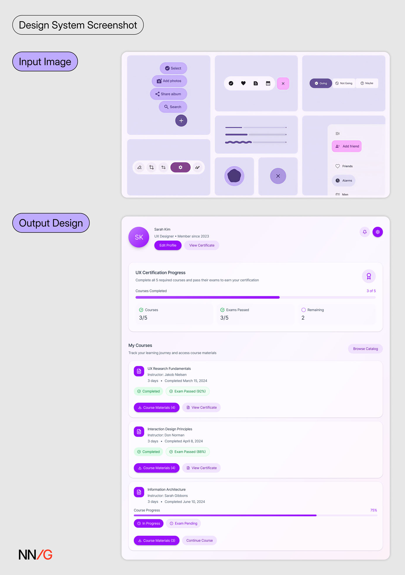
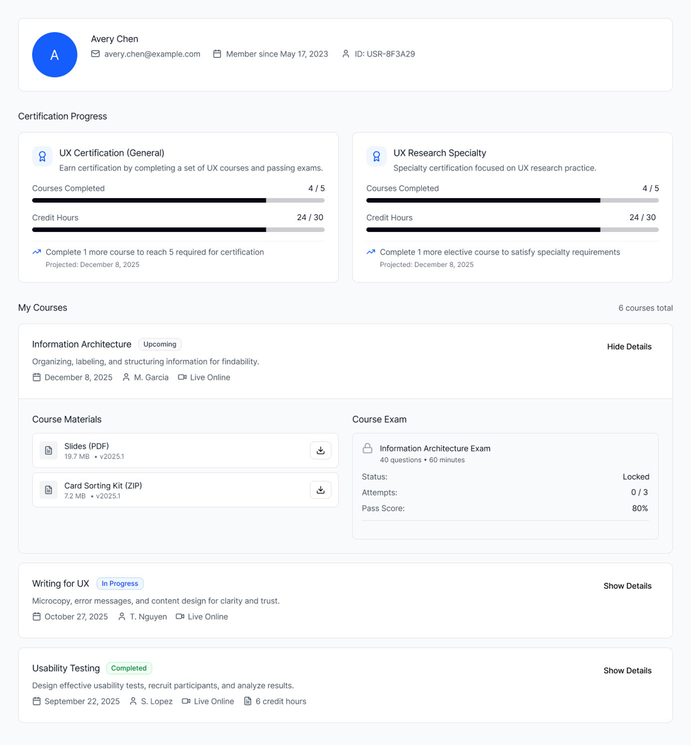
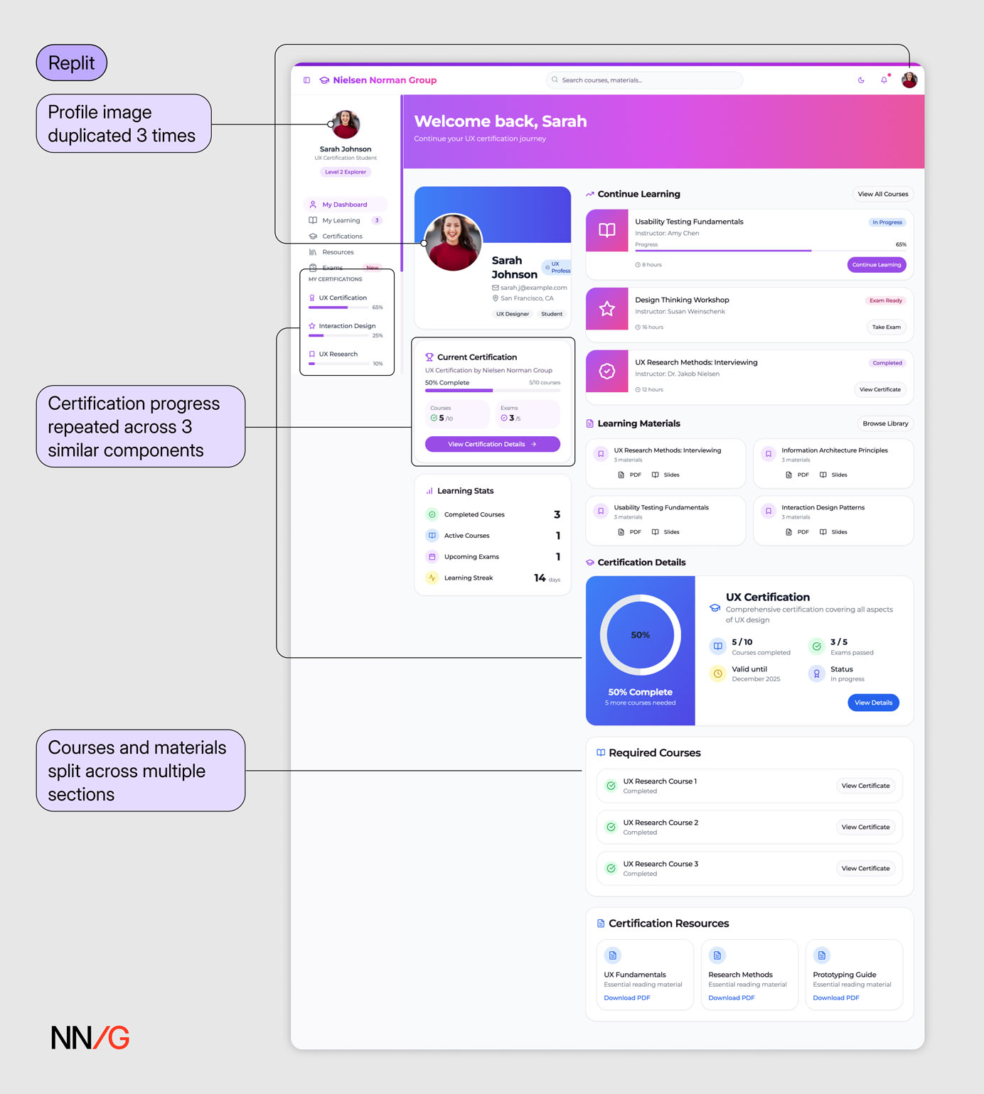 In response to a broad text prompt (Prompt 1), the AI produced an interface saturated with content and visuals, which suffered from poor organization and visual hierarchy. There’s no clear path through the page — it’s hard to tell where to look or what to do next. Multiple content blocks appear repeated and could have been combined or reduced.
Repeated Design Elements
In our testing, there were several instances where the same element or information was displayed multiple times. In contrast, in a real design, screen real estate is precious and user attention is scarce, so design teams rarely tolerate this redundancy. Repetition without purpose only adds noise to the interface and distracts users from the key content.
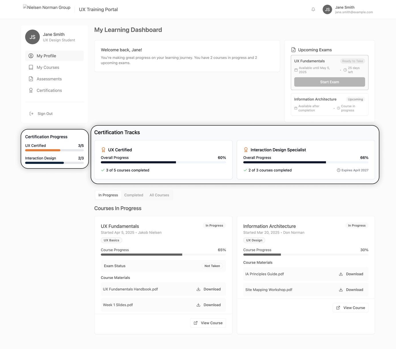
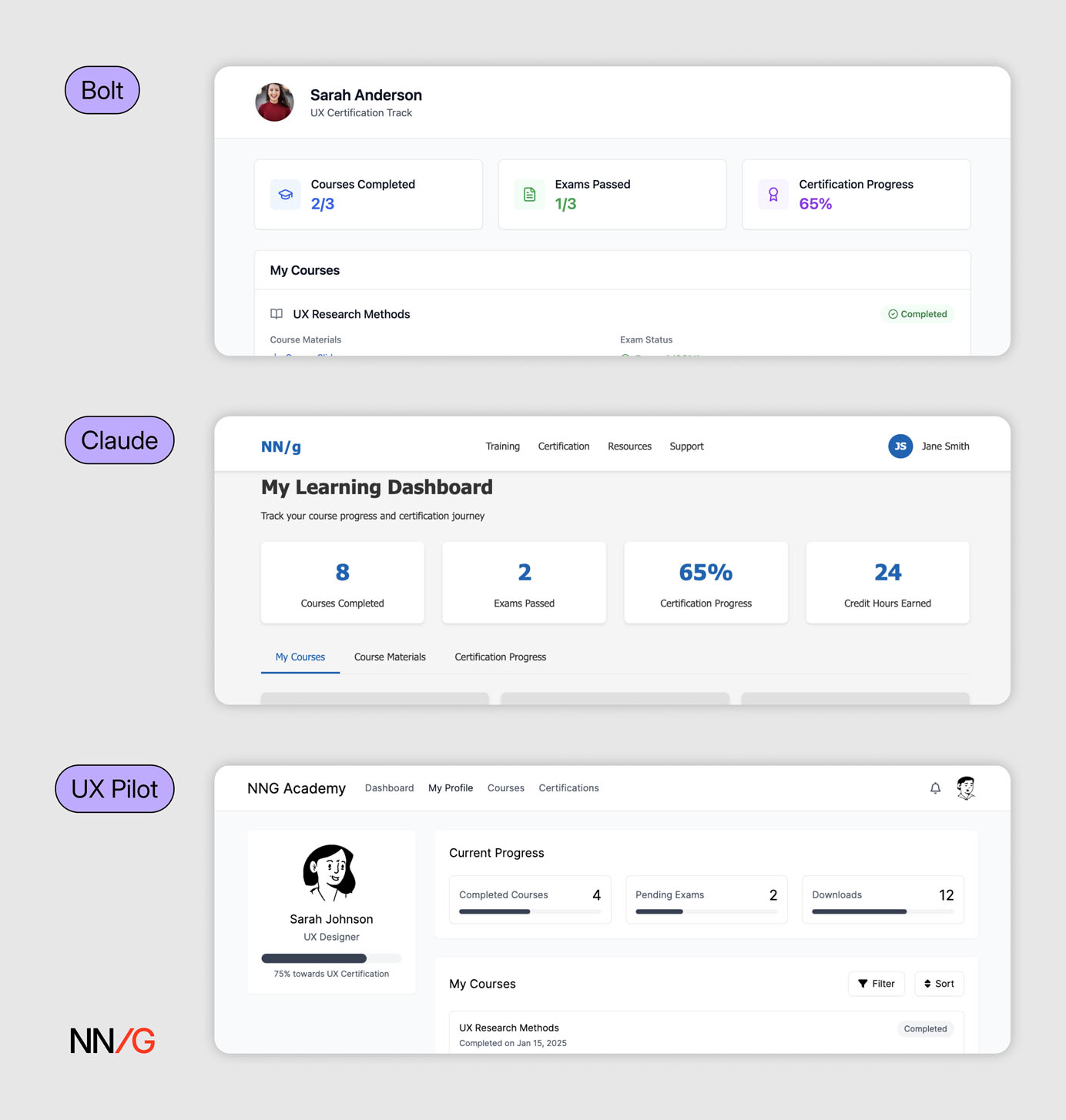
 In both interfaces generated by AI (Lovable & Bolt), the certification progress bars are duplicated within the same interface. While the certification process is presented in a slightly different way, the information is redundant.
Counterintuitive Content Flow
Users expect information to follow a logical, intuitive sequence — typically moving from general to specific, with related items grouped together. This structure helps users build mental models and reduces the effort needed to parse through and understand content, and reduces the effort needed to parse through and understand content.
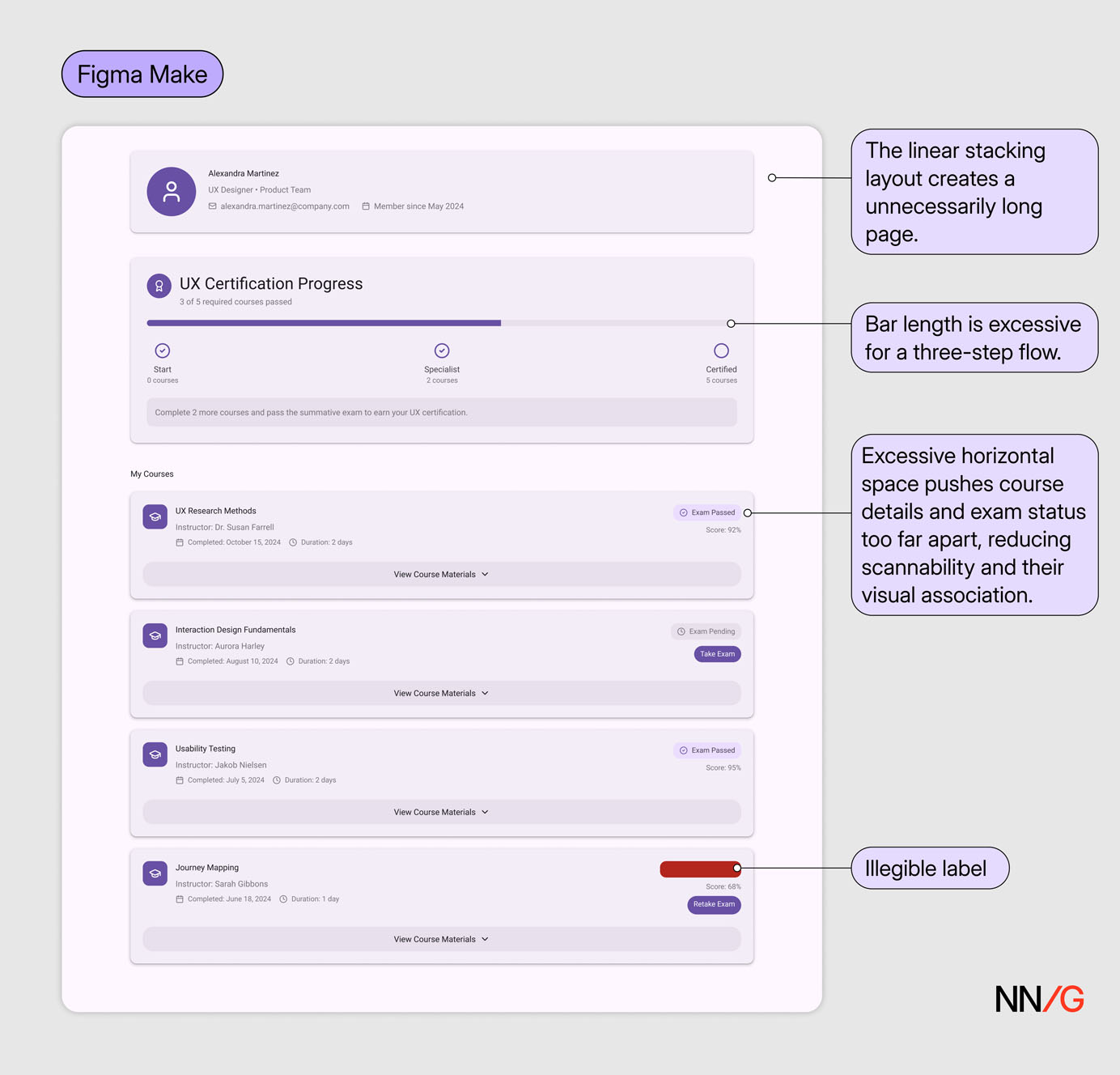
Multiple **AI-generated designs presented content in an illogical sequence. **These disruptions, compounded by poor visual hierarchy, created disjointed layouts with no clear focus or sense of progression.
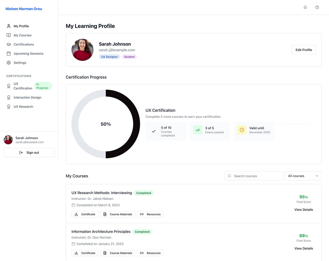
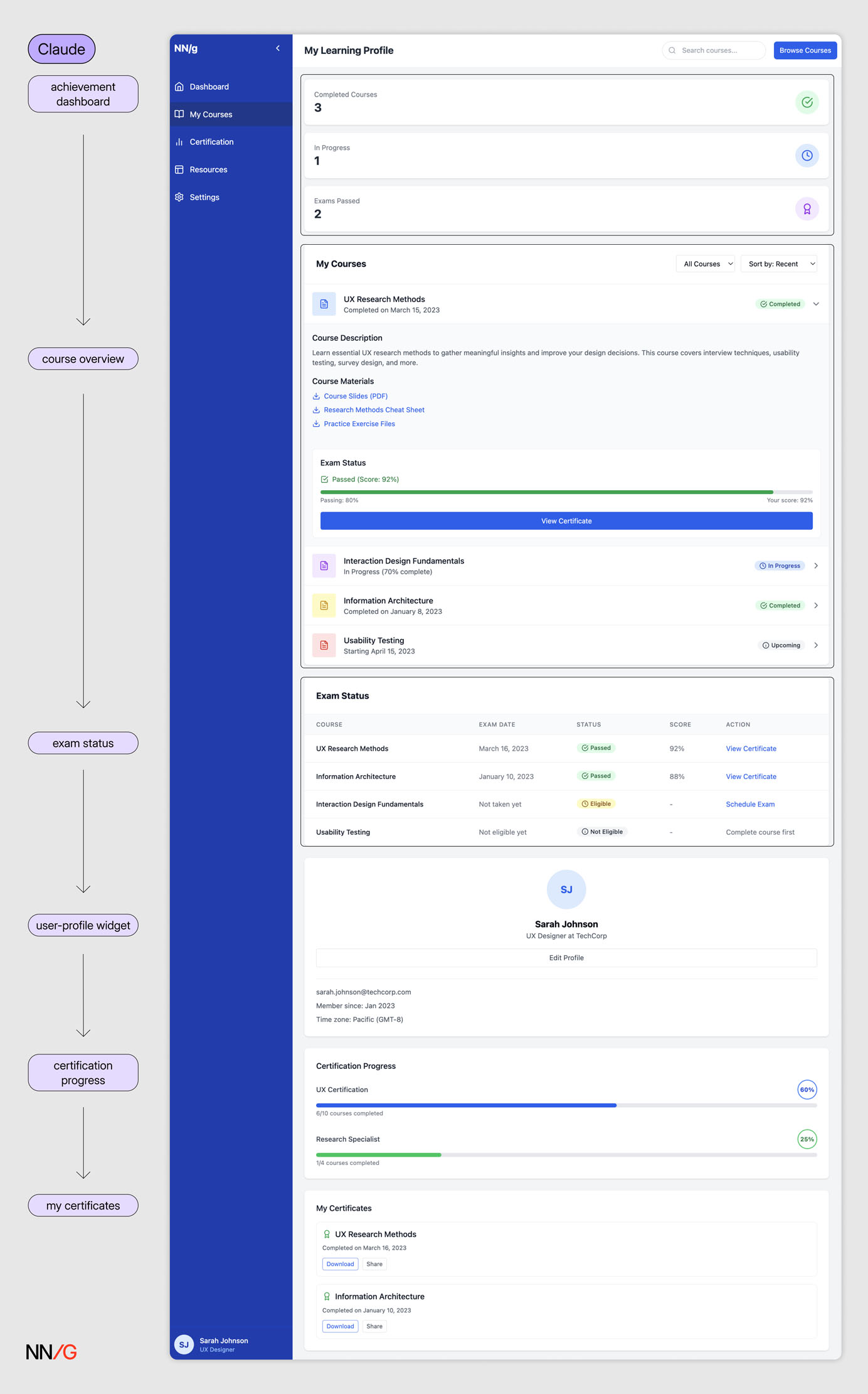 The page follows a linear sequence: achievement dashboard → course overview → exam status → user-profile widget → certification progress → my certificates. However, the user-profile widget in the middle disrupts this progression. With no clear hierarchy beyond placement, the layout lacks a coherent flow.
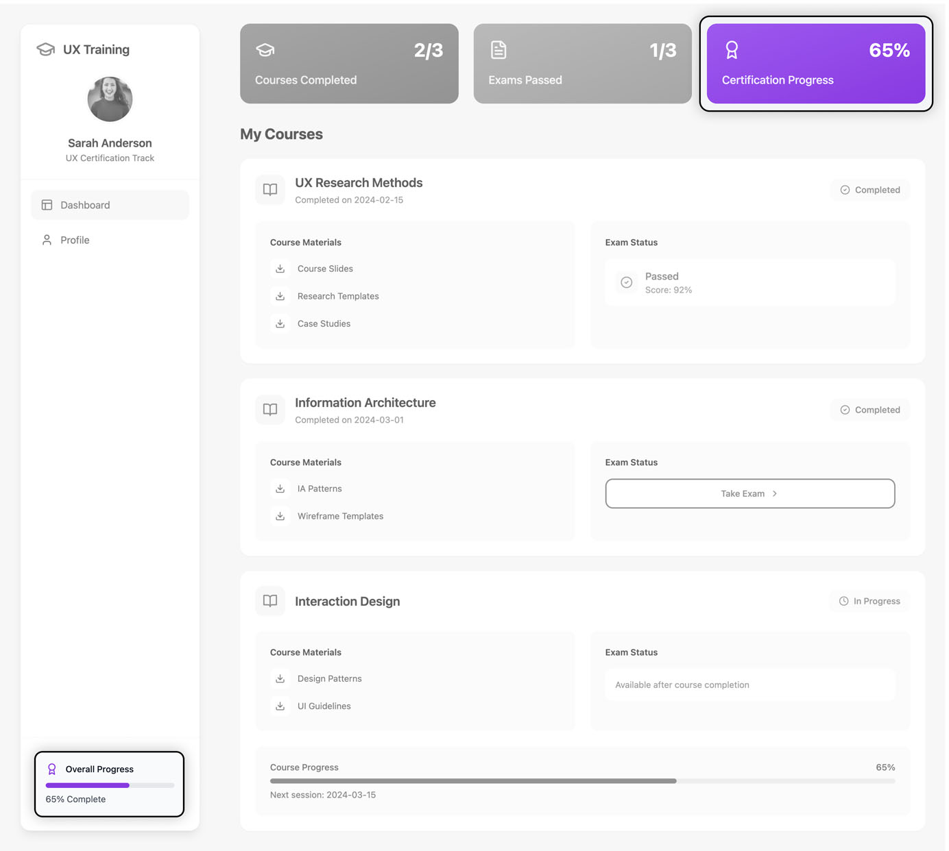
Visually Prominent Containers with Low Information Density
Visual hierarchy guides users to the most important elements on the page. The larger, more colorful, or more prominent an element, the greater its perceived importance relative to other items.
When hierarchy contradicts content priority, users may feel confused or distracted from completing the main tasks. This is a common flaw of AI-generated interfaces, which often place visual emphasis on the wrong element, as the model doesn’t have a contextual understanding of what is essential for the goal.
 Compared to viewing course-related information, tracking certification progress is considered a secondary goal on this page. However, the certification-progress ring is the most prominent element, due to its scale and the whitespace around it. The mismatch between visual hierarchy and content dilutes the focus of the page.
Another pattern that we noticed in the AI-generated designs was **the unnecessary use of prominent containers displaying a single piece of numerical information. **These containers tended to occupy a large amount of space but communicated little information; moreover, this information was secondary to the main user task.
 Multiple AI outputs featured containers with a single piece of numerical information that took up significant space at the top of the page. The number of courses or exams taken by a user offers limited informational value. Users gain little insight into their progress or into what steps to take next.
5 Prompting Strategies for AI Prototyping
In this section, we discuss 5 ways of improving the output of a vague text prompt without needing to design in Figma first or write extensive prompts. These strategies can be combined or used separately to increase your input specificity.
Use Precise Visual Keywords
When crafting prompts**, clarity and specificity** matter more than sheer length. Many frontier AI models like ChatGPT5 are designed to follow instructions with laser focus. Verbosity without precision*** hurts clarity** — *a concise, well-chosen keyword can often produce better results than a long but vague description.
When using AI-assisted design or coding tools, describe your intent by pointing to established design styles or frameworks instead of using generic visual descriptions like simple, clean, and modern. Referencing a recognizable visual design style — like skeuomorphism, flat design, glassmorphism, or retro / Y2K — helps the model interpret your visual intent. This is where a good understanding of design vocabulary and of visual-design fundamentals becomes essential.
For example (assuming neobrutalism is the target visual style):
- **❌ **Poor: “Design a trendy conference landing page.”
- **✅ **Acceptable: “Design a conference landing page with high contrast, blocky layouts, and bold colors.”
- 👏** Better:** “Design a conference landing page in a neobrutalist style.”
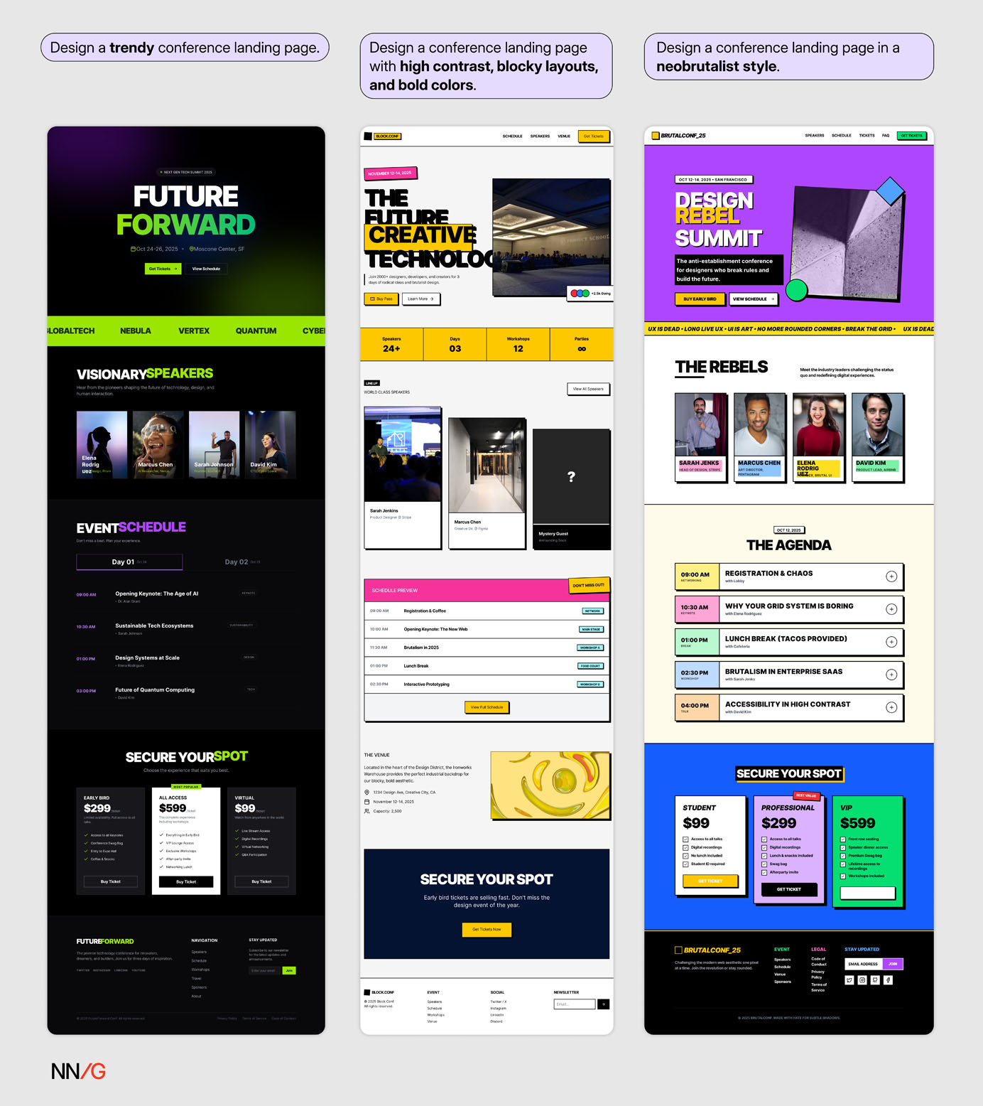 Explicitly naming the neobrutalist style in the prompt produced the best result.
The same principle applies when prompting AI for code generation. Developers often include specific frameworks and component libraries (e.g., React, Next.js, or Tailwind CSS) early in their prompts to shape the structure and logic of the generated code.
Designers can also reference a famous design system or brand style by its name. That said, avoid asking AI to imitate a specific brand. While it’s tempting to request “design like Apple” or “in Airbnb’s style,” copying an existing brand’s visual identity is not a sustainable strategy. Famous brands don’t guarantee good design. A design that works for a billion-dollar company might fail in your context due to different goals, audiences, or constraints.
Attach Lightweight Visual References
High-fidelity mockups are effective for communicating your design vision to AI-prototyping tools, but they take time to create — often more than writing a detailed prompt. When you’re still early in the design process or lack the resources to produce polished assets, use lightweight visual references instead, such moodboards, inspiration images, or screenshots of your design system.
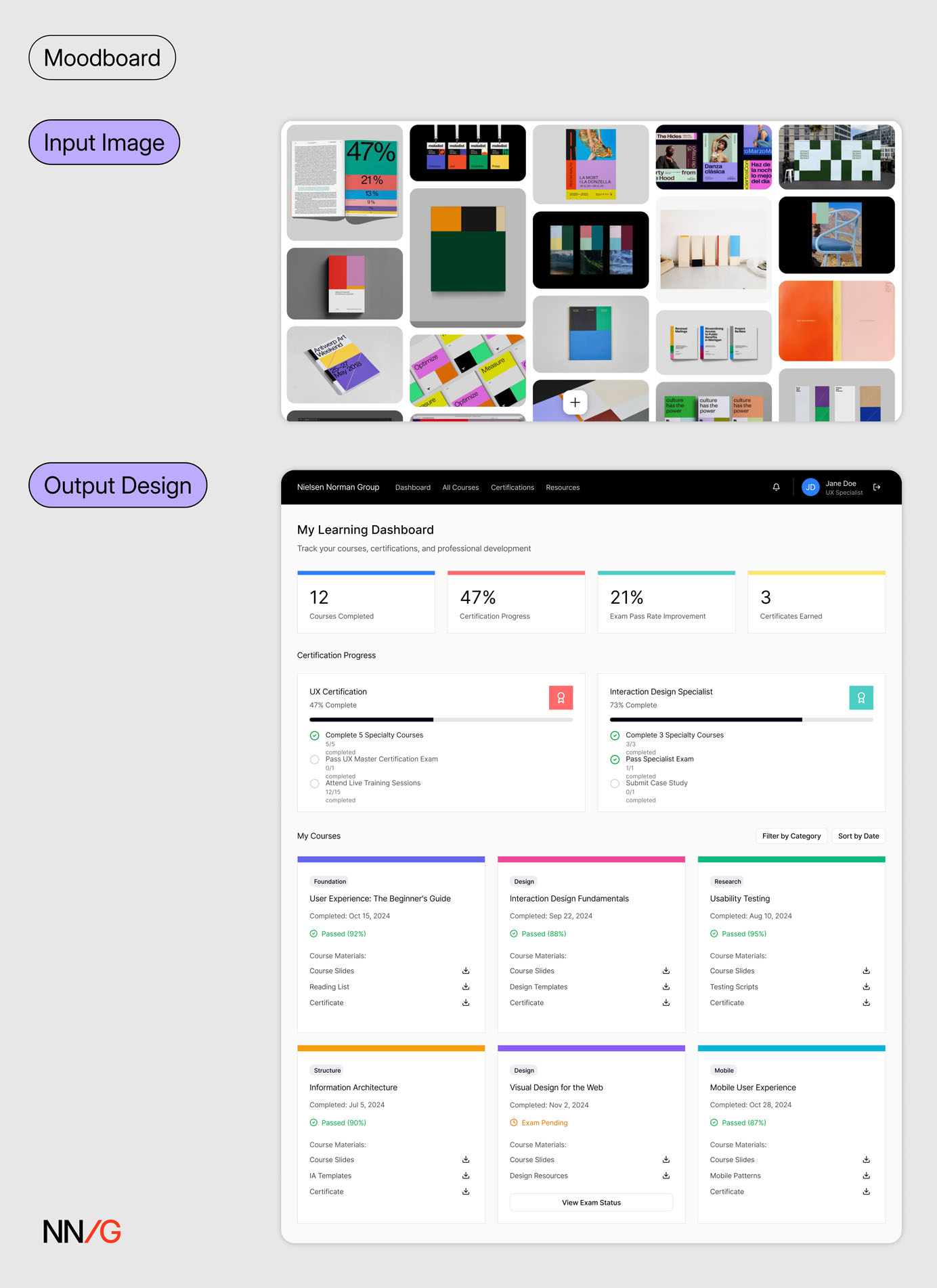 When a screenshot of a Pinterest board was provided alongside a broad text prompt (Prompt 1), Figma Make generated a design that visually resembled the board’s design style.
Do manage your expectations with this approach. Even though image references are a big step up from text-based descriptions, it’s unlikely for AI to achieve pixel-perfect precision.
 When given a screenshot of the Material Design 3 system, Figma Make produced a design with a similar tone, but with more saturated colors than the reference.
When visual precision is essential, connect AI tools directly to your design source. Some tools have built-in features that can retrieve the visual spec and design tokens directly from a Figma frame. Developers can also leverage Figma MCP to pull in design details like design frames, variables, components, and layout data directly into their IDEs. These methods will achieve higher precision than image uploads.
Finally, don’t confuse visual fidelity with design quality. A visually polished AI-generated mockup that aligns with your design system can still be a poor design if the accompanying prompt is vague or underspecified. Evaluate the outcome for usability and clarity — not just for visual polish.
 The design generated with the Material 3 Design Kit from a broad prompt (Prompt 1) in Figma Make resembles Material Design 3 visually but lacks spatial coherence and nuance in hierarchy, spacing, and legibility.
Conduct a Visual Analysis with AI to Formulate the Prompt
While most AI-prototyping tools support image uploads in addition to text prompting, not all do — and some limit image uploads to paid plans. An alternative is to use a general-purpose chatbot to analyze the visual style or layout of a page in natural language, then convert that description into a design prompt. This text-based approach can also be combined with an image attachment to further reinforce the intended visual direction.
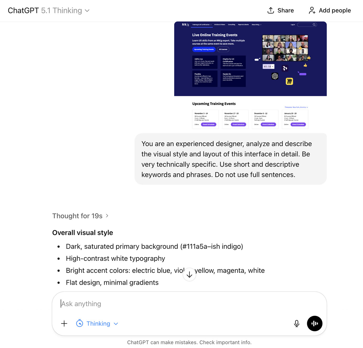 *In this example, *NNG’s Live Training overview page served as the visual reference for generating the Course Profile page. When prompted to conduct a visual analysis, ChatGPT produced a detailed list of design characteristics and stylistic elements. These AI-generated descriptions can then be refined into prompts or used to extract relevant keywords and phrases for new ones.
 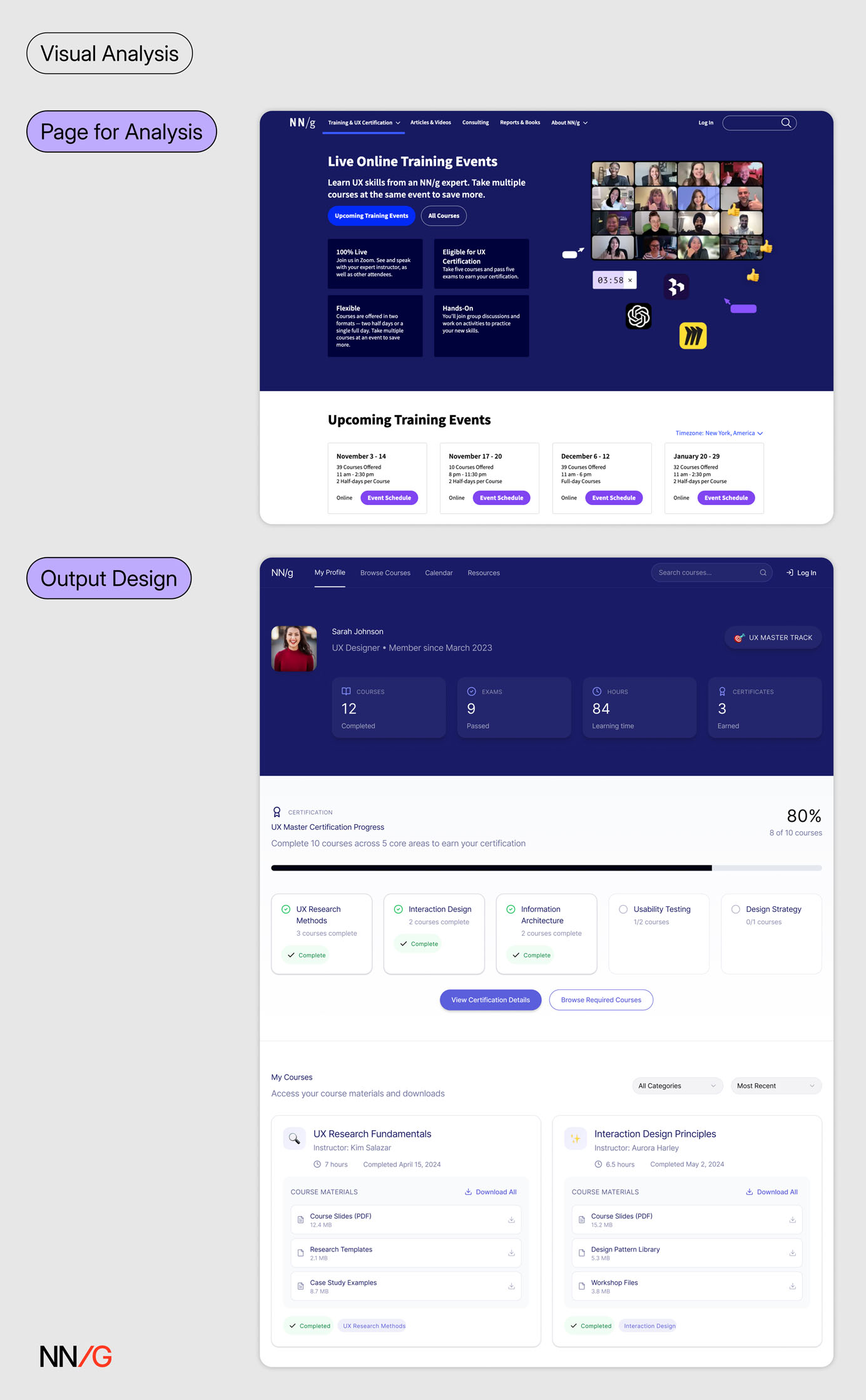 The visual description serves as supplemental design context alongside the generic text prompt (Prompt 1). Using this approach, the generated design reproduces the visual style of the Live Training page even without attaching it as an image reference.
Generate Mock Data
Crafting prompts for AI-prototyping tools is a lot like creating design specs for handoffs. In both cases, designers need to define not only visual and layout details but also interaction flows, content, and accessibility.
We often recommend a content-focused design approach — that is, working with realistic data so that visual design supports the key content rather than the other way around. The same principle applies when using AI-prototyping tools: providing sample content or data guides the AI to generate better designs.
Designers should collaborate with developers and content teams to obtain the data displayed in the interface. When real data isn’t available early in the process, designers can use AI to generate mock data first, then refine the content and iterate on the design based on that data.
 ChatGPT generated the mock data in JSON format, which was then used as content in Figma Make to create the profile page. Information is better grouped and displayed with this approach.
Attach Code Snippets
When AI interprets images or documents instead of receiving direct input, some contextual details can get lost in translation. Therefore, the more direct the context you provide, the less interpretation the system needs to make — and the higher the accuracy of the output. One of the most direct forms of context you can provide to an AI-prototyping tool is code snippets.
Designers can source code snippets in several ways:
- From your codebase: Collaborate with developers to access relevant components or layout structures.
- From open-source design systems or code repositories: Many public design systems (e.g., Material Design, Carbon) and platforms like 21st.dev or GitHub offer reusable component code that can be incorporated directly into prompts.
- From live websites: Use browser-inspection tools or plugins to extract the underlying code of a page or component.
When using external sources, keep in mind that visible code isn’t always free to reuse — always check the licensing or permissions. Stick to code from your own product, shared design-system libraries, or open-source components.
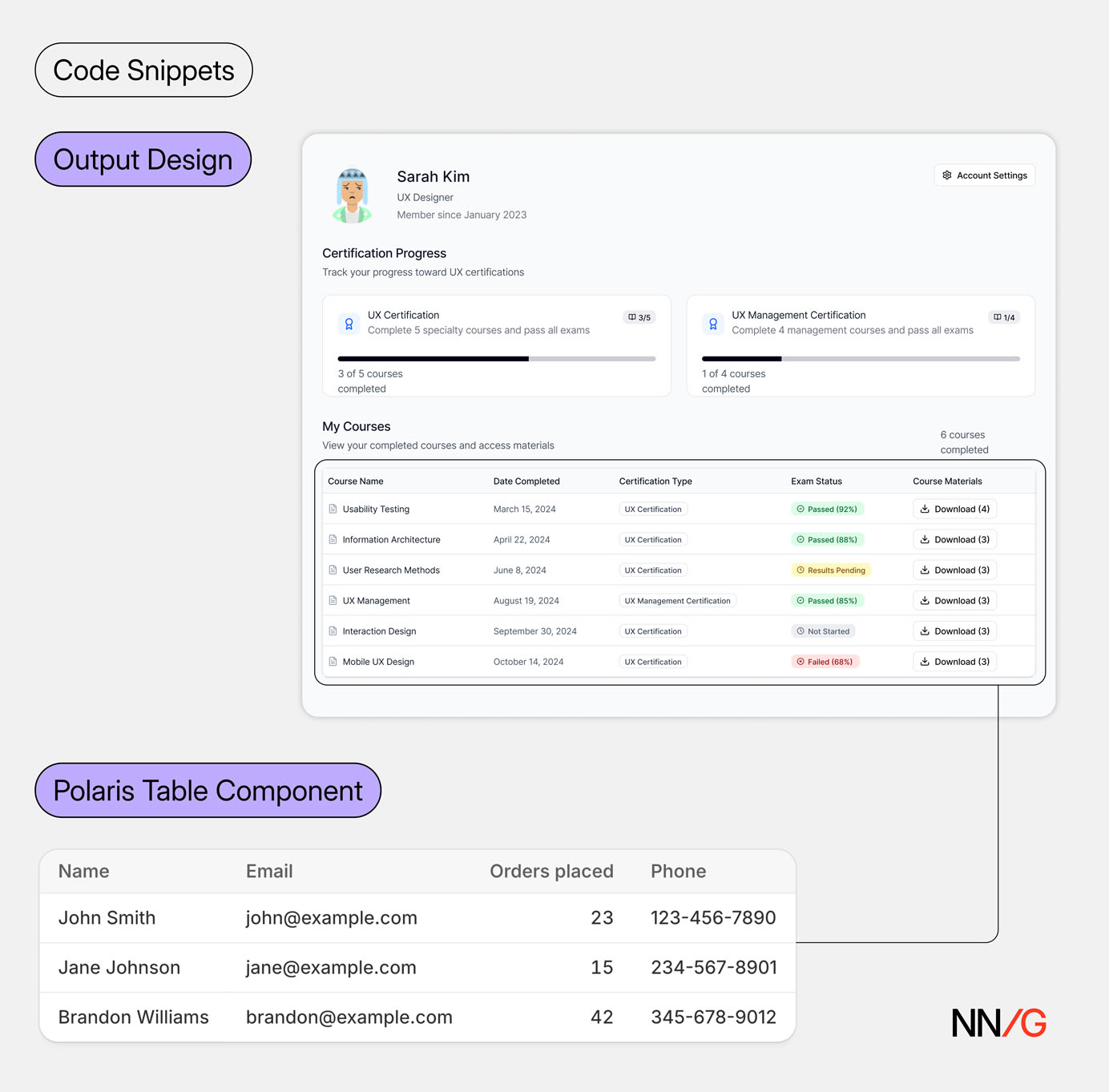 *The course-listing table is generated by referencing the *Table *component from the *Shopify Polaris design system and attaching the corresponding code snippets.
While this method yields the most precise results in AI-prototyping tools, it comes with tradeoffs. Long code snippets can overload the model’s context window, leading to performance issues. Moreover, this approach requires designers to understand basic code structure and assess the quality of the snippet before using it.
Iterate and Critique Your Prompt with AI
Besides prompting AI to generate designs, you can also use it as a creative partner to enhance your prompts. You can use a general-purpose chatbot to:
- Create a text prompt from scratch, based on provided context
- **Organize design requirements **into a clear, structured prompt
- Ask guiding questions that help you think through requirements and refine ideas
- Critique existing prompts, identify missing context, and suggest improvements
- Brainstorm and ideate design variations in text form
- Generate code snippets for design components
Good Design Decisions Can’t be Automated
At the end of the day, there is no shortcut to** **solving complex design problems. While strategies discussed in this article can help you improve your prompt specificity and get higher-quality output, they can’t replace the hard work that goes into thinking through design requirements, weighing tradeoffs, and making informed design decisions.