Table of Contents
I know what you’re thinking: "ANOTHER blog post about redesigning the website?"
Yes. Another blog post about redesigning the website. I enjoy it, what can I say?
I wrote my latest post about redesigning from a monospace-driven, terminal-styled theme to a more natural paper-inspired theme. However, it left a nagging feeling that something was missing. What if I took it further? Was there really any reason that I had any of that CSS at all?
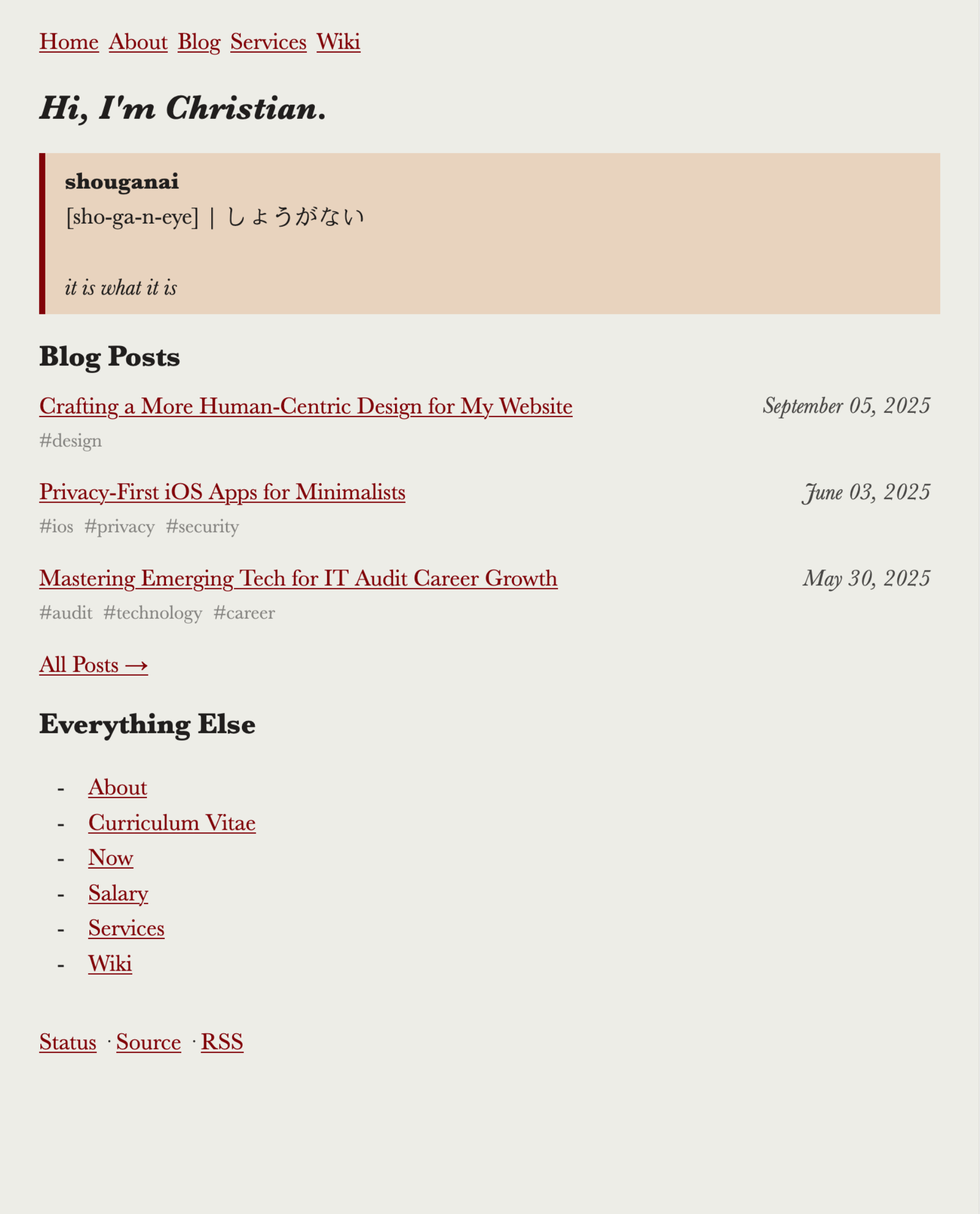
Figure 1: Old Theme
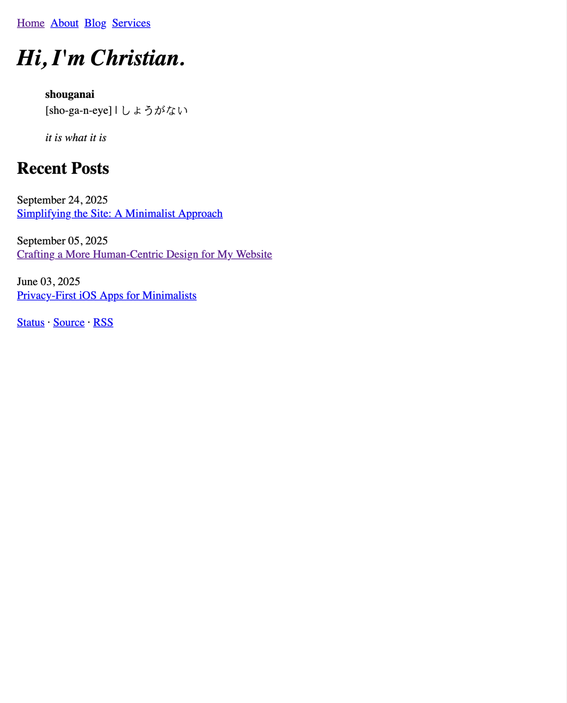
Figure 2: New Theme
1. Inspiration
I briefly touched on my inspiration in the last post (hint: wabi-sabi, sho ga nai, brutalism, minimalism), but I didn’t expand on the why for these concepts.
So, why? The minimalismtic approach to web design has resonated with me for a long time. But why minimalism?
Officially, "the concept of minimalist architecture is to strip everything down to its essential quality and achieve simplicity."
This is a blog. It also has pages dedicated to describing who I am and what I offer. Therefore, the essential quality is the information delivered by the words and the design on your screen. To effectively communicate this information, I tried to understand how online information is best read.
With all of that out of the way, let’s get on with it.
2. Core Changes
Below is a quick audit of the original style sheet and markup, and the elements I’ve removed or added. For more in-depth information, refer to the git diff.
HTML
- HTML is now minified
- File tags
- Links to site pages are moved from the
indexto theaboutpage - Wiki was removed entirely
- Added a few
<br>elements to compensate for some of the CSS removals
CSS
For the CSS, I removed everything, except the following rules.
body {
max-width: 50em;
margin: 1.5rem;
}

nav ul {
list-style-type: none;
display: flex;
padding: 0;
}

nav ul li {
margin-right: 0.5rem;
}

img {
border-style: none;
width: 100%;
}

table {
border: 1px solid #111;
border-collapse: collapse;
width: 100%;
}

pre,
pre>code,
code {
font-size: 0.9rem;
}

pre {
border: 1px solid #111;
margin: 0.5rem 0;
padding: 0.5rem;
overflow-x: auto;
}

time {
display: block;
}

:not(pre)>code {
color: #f00;
}

@media (prefers-color-scheme: dark) {
body {
background-color: #222;
color: #eee;
}

a {
color: #add8e6;
}

pre {
border-color: #eee;
}
}
That’s it. No framework, no vendor prefixes, no unnecessary selectors.
This gave me an almost-pure HTML site. It’s freeing. It’s liberating. It’s comfortable.
3. Reading Experience Benefits
Recent research shows that line length between 45–75 characters maximizes reading speed and comprehension. By constraining the container width to ~50 rem (≈ 100 characters), we stay close to that range while still staying wide enough for my personal preferences. Additionally, a lean stylesheet eliminates FOUC (flash‑of‑unstyled‑content) on slower networks, delivering a smoother first‑paint experience.
4. Final Thoughts
I am very pleased with the new theme and will see how it holds up to time. Based on enabling short-term server logs to debug issues (before promptly wiping it to the ether), I notice that most visitors to my site are via RSS anyway. Either way, I hope you reach out if you have an opinion; I always enjoy hearing from you.