One of the most interesting parts of changing your penname (Maggie Mahoney >> Maggie French) is that you need to update a lot of old game files, and it can be a great opportunity to reimagine the game formats themselves. In this case, while updating my name and links on the game, I decided I wanted to take the layout for Revisions out of Canva and do it in Affinity 2, the software I now use to do my layout work.
This meant asking myself a few questions.
1) What’s working about the game?
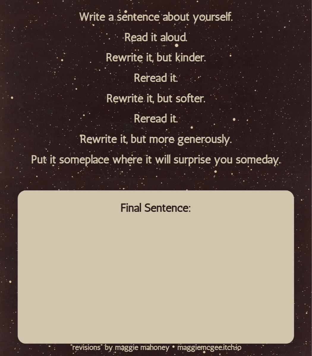
- For me, one thing that’s working extremely well is** the text of the game itself**. Revisions was created for the 36-Word Game Jam, and as such, I thought very carefully about the text of the game while I was creating it. I can sincerely say I wouldn’t change a single word - not to …
One of the most interesting parts of changing your penname (Maggie Mahoney >> Maggie French) is that you need to update a lot of old game files, and it can be a great opportunity to reimagine the game formats themselves. In this case, while updating my name and links on the game, I decided I wanted to take the layout for Revisions out of Canva and do it in Affinity 2, the software I now use to do my layout work.
This meant asking myself a few questions.
1) What’s working about the game?
-
For me, one thing that’s working extremely well is** the text of the game itself**. Revisions was created for the 36-Word Game Jam, and as such, I thought very carefully about the text of the game while I was creating it. I can sincerely say I wouldn’t change a single word - not to say that short-form games can’t be revised, but I am really happy with how this one stands, and the very kind and generous feedback from many people has assured me that lots of other people feel the same.
-
Another thing that works for me is** the size/format**. I like this game as a business card game, it feels easy to tuck into a wallet or bag - both easy to obtain/print and play, but also easy to actually put in a place where it will surprise you someday, the final condition of the game. I also liked leaving a space for the final sentence to be written directly onto the card, making the only true material requirement here a pencil and an eraser.
-
I also really enjoy** the general aesthetic **of the game. I love the public domain image of stars I found last time, and would like to keep using it. Even though I made this game on Canva which has some stock assets that are at risk of being AI generated, I didn’t use any Canva stock assets for this game, so I don’t need to change anything there.
2) What’s not working about the game, and how can I fix that?
-
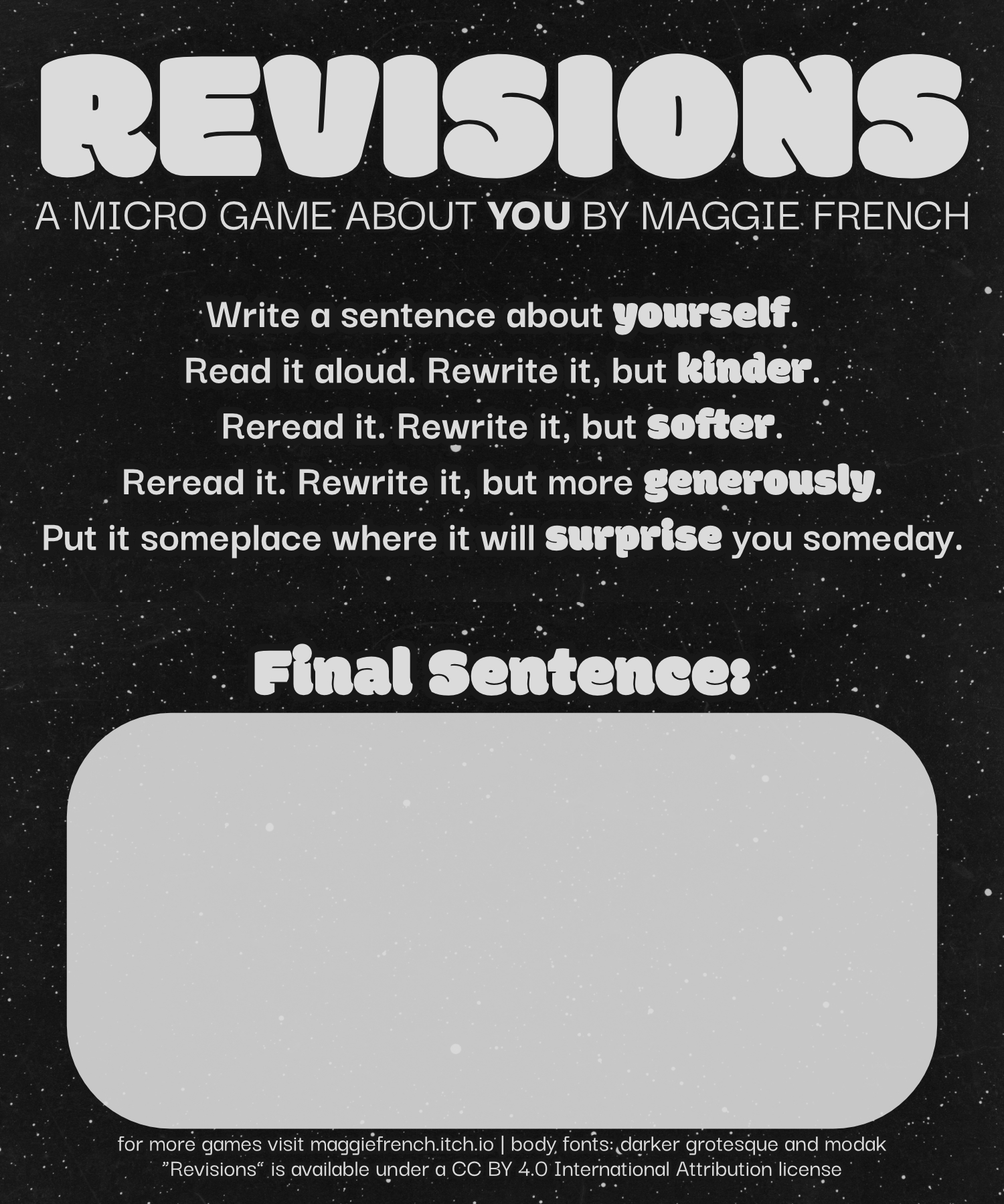
I was so focused on getting the actual game content in that I didn’t worry about the title of the game - which is only really small at the bottom! I found myself wishing it was larger **and more prominently placed **- so that it truly felt like the title of the game. (And while we were at it, I also felt like the font of the title wasn’t working for me.)
-
The** color palette didn’t feel as crisp to me as it did when I first made it**. There was something about the sepia toned brown, or maybe it lacked crispness because of the way Canva downloads images, and honestly either way, I just felt like it put me off the color. I originally went with this color because it was from the original image. But actually, it’d be pretty easy to turn black and white.
3) What do I want to change, based on the answers to 1 & 2?
-
**The Header/Title font: **I looked for a font that felt softer and friendlier, something that felt very inviting. I’m no font expert, but I like Modak, the font I found (thanks, FontSquirrel!) because it felt like a very comfortable font to me, something about its curviness and bold lettering. Once I had that font and I knew I liked it, I looked for other ways I could use it, like key words in the game text itself.
-
**The Title Placement: **I decided to re-arrange everything so that there was more space for the title. This meant a few things:
-
Deciding where to put the title, which felt pretty intuitive to me, but I did fiddle around with the sizing a lot.
-
Re-formatting the line breaks of the game text itself. In the original, every "reread it" had its own line. When trying to use limited space to fit a larger title, that didn’t work well anymore. I liked ending lines with the instructions for how to rewrite, so that gave me a new set of (fewer) line breaks to work with.
-
Changing the size of the Final Sentence textbox. It’s a little smaller now, but I think folks can still use it.
-
**Color Adjustment: **I converted the public domain image I was working with to black and white, but then I also used the color picker to make sure the font matched the almost-white of the stars (ever so slightly gray!) instead of a starker true white. I also added a border around all the letters that matched the background color, purely to keep stars from bumping into the letters. Could I have used other editing tools to simply remove the stars? Yes. But I liked doing it this way.
-
**Updated the Itch Page: **I used the same hex codes from the game to change the color palette of the itch page, and made new graphics to match the new color palette and fonts. I had to update all the different formats with the new images, so that meant making a couple different file versions to upload. And of course, since the whole reason for these changes was to update my name and itch link, I even had to change the text only version of the game, even though I didn’t actually change any of the game text.
Anyway, this is a little peek into my thought process - thank goodness I didn’t limit my devlog to 36 words... Thanks for reading!
THE NEW VERSION:
THE OLD VERSION: