I’ve never liked the philosophy of “put an icon in every menu item by default”.
[…]
This posture lends itself to a practice where designers have an attitude of “I need an icon to fill up this space” instead of an attitude of “Does the addition of a icon here, and the cognitive load of parsing and understanding it, help or hurt how someone would use this menu system?”
Apple currently says:
Don’t display an icon if you can’t find one that clearly represents the menu item. Not all menu items need an icon. Be careful when adding icons for custom menu items to avoid confusion …
I’ve never liked the philosophy of “put an icon in every menu item by default”.
[…]
This posture lends itself to a practice where designers have an attitude of “I need an icon to fill up this space” instead of an attitude of “Does the addition of a icon here, and the cognitive load of parsing and understanding it, help or hurt how someone would use this menu system?”
Apple currently says:
Don’t display an icon if you can’t find one that clearly represents the menu item. Not all menu items need an icon. Be careful when adding icons for custom menu items to avoid confusion with other existing actions, and don’t add icons just for the sake of ornamentation.
and in fact omits many icons in their apps. But I agree with Nielsen that there doesn’t seem to be a clear rationale for when they do this. It’s inconsistent and feels like they just didn’t finish the job or didn’t have suitable stock icons rather than that they actually considered and decided that certain commands shouldn’t have icons. It’s a mess.
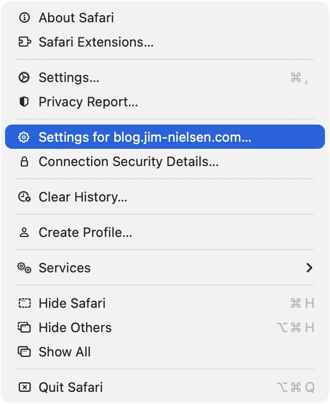
Let’s look at the “File” menu in Safari[…] Some groupings have icons and get inset, while other groupings don’t have icons and don’t get inset.
[…]
Some of these menu items have the notion of a toggle (indicated by the checkmark) so now you’ve got all kinds of alignment things to deal with. The visual symbols are doubling-up when there’s a toggle and an icon.
[…]
You know what would be a fun game? Get a bunch of people in a room, show them menus where the textual labels are gone, and see who can get the most right.
Apple’s previous human interface guidelines specifically said not to use “arbitrary symbols in menus, because they add visual clutter and may confuse people.”
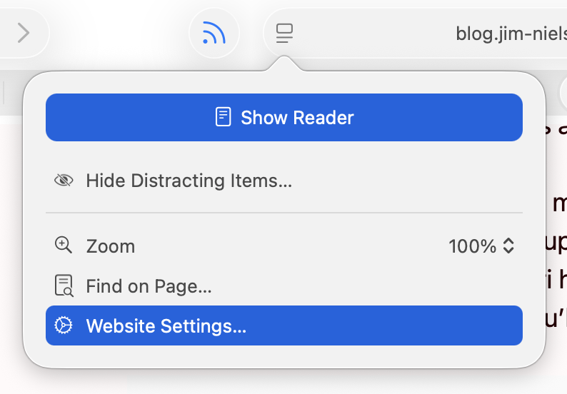
I am running 26.2, with a more complete set of icons in each menu, though not to the user’s benefit. For example, in Neilsen’s screenshot, the Safari menu has a gear icon beside the “Settings…” menu item, but not beside the “Settings for pxlnv.com…”, or whatever the current domain is. In 26.2, the latter has gained an icon — another gear. But it is a gear that is different from the “Settings…” menu item just above it, which makes sense, and also from the icon beside the “Website Settings…” menu item accessible from the menu in the address bar, which does not make sense because it does exactly the same thing.
On Tahoe, why is the image next to the save command in the File menu “square.and.arrow.down”, but the export and share commands are “square.and.arrow.up” and import has the arrow pointing down?
The arrow icons feel very iOS. I think the basic idea is that down means into the app and up means out of the app, but it doesn’t quite work for me because saving on the Mac can create a file anywhere. If there’s a command to save, that means it’s not going into the app’s own managed storage, like with saving a photo on iOS. And the difference with save vs. export is really the file format, not the location, so it doesn’t really make sense that the arrows would go in opposite directions.
Previously:
Design Finder Google Sheets Icons Liquid Glass Mac macOS Tahoe 26 Safari