Icons in Menus *⇥ blog.jim-nielsen.com *
Apple, in the 2020 edition of its Human Interface Guidelines:
Sometimes, icons can be used to help people recognize menu items—not menus—and associate them with content. For example, Safari uses the icons displayed by some webpages (known as favicons) to produce a visual connection between the webpage and the menu item for that webpage.
Minimize the use of icons. Use icons in menus only when they add significant value. A menu that includes too many icons may appear cluttered and be difficult to read.
[App…
Icons in Menus *⇥ blog.jim-nielsen.com *
Apple, in the 2020 edition of its Human Interface Guidelines:
Sometimes, icons can be used to help people recognize menu items—not menus—and associate them with content. For example, Safari uses the icons displayed by some webpages (known as favicons) to produce a visual connection between the webpage and the menu item for that webpage.
Minimize the use of icons. Use icons in menus only when they add significant value. A menu that includes too many icons may appear cluttered and be difficult to read.
Apple, in the latest version of its Human Interface Guidelines:
Represent menu item actions with familiar icons. Icons help people recognize common actions throughout your app. Use the same icons as the system to represent actions such as Copy, Share, and Delete, wherever they appear. […]
It’s extra noise to me. It’s not that I think menu items should never have icons. I think they can be incredibly useful (more on that below). It’s more that I don’t like the idea of “give each menu item an icon” being the default approach.
This posture lends itself to a practice where designers have an attitude of “I need an icon to fill up this space” instead of an attitude of “Does the addition of a icon here, and the cognitive load of parsing and understanding it, help or hurt how someone would use this menu system?”
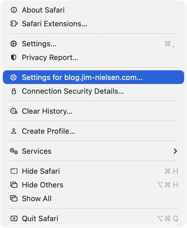
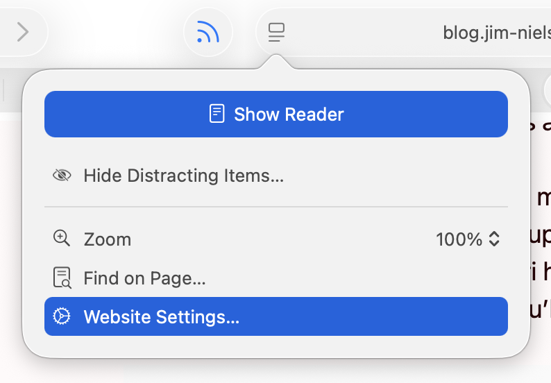
Nielsen explores the different menus in Safari on MacOS Tahoe — I assume version 26.0 or 26.1. I am running 26.2, with a more complete set of icons in each menu, though not to the user’s benefit. For example, in Neilsen’s screenshot, the Safari menu has a gear icon beside the “Settings…” menu item, but not beside the “Settings for pxlnv.com…”, or whatever the current domain is. In 26.2, the latter has gained an icon — another gear. But it is a gear that is different from the “Settings…” menu item just above it, which makes sense, and also from the icon beside the “Website Settings…” menu item accessible from the menu in the address bar, which does not make sense because it does exactly the same thing.
Also, the context menu for a tab has three “×” icons, one after another, for each of the “Close Tab” menu items. This is not clarifying and is something the HIG says is not permitted.