A little backstory...
Reading code is a lot different than reading books.
Input addressing the basic needs of programmers with easily-distinguishable characters, large punctuation, and generous letterspacing — all crucial elements for parsing dense onscreen code at small sizes. While code is traditionally set in monospaced fonts, Input offers b…
A little backstory...
Reading code is a lot different than reading books.
Input addressing the basic needs of programmers with easily-distinguishable characters, large punctuation, and generous letterspacing — all crucial elements for parsing dense onscreen code at small sizes. While code is traditionally set in monospaced fonts, Input offers both monospaced and proportional variants, as well as sans-serif and serif styles, and a large range of widths, weights, and alternate characters.
While Input’s modular design recalls the pixel-based fonts of early computer consoles, the typeface looks to a future where designers have full control over their typographic environments. This expansive array of options encourages developers to create typographically rich stylesheets for themselves, where they can choose the best width and weight for their screen and tailor the typography to their preferences.
I realize that using proportional fonts in code is a tad experimental, and many will stick to Input’s 56 monospaced variants. Input’s proportional fonts, Sans and Serif, try to take what is best about the monospaced genre and fuse it with a font that has the luxury to let each letter take up the space it needs. I use and combine Input Sans, Serif, and Mono on my computer for everything from code to correspondence to my OS system font. While most user interface fonts are generic, Input has a distinct voice.
For me, one of the most interesting parts of this typeface’s development was the Cyrillic. I gave it a shot, but knowing I was no expert, decided to consult with Russian typeface designer Maria Doreuli. She sent me several rounds of comments, teaching me about the hierarchy of shapes in the Cyrillic alphabet, and suggesting alternative approaches to the forms I had drawn. It was tricky, and it was exciting to work with Maria to balance Input’s funky, modular design on one hand, and the specific needs of the Cyrillic alphabet on the other.
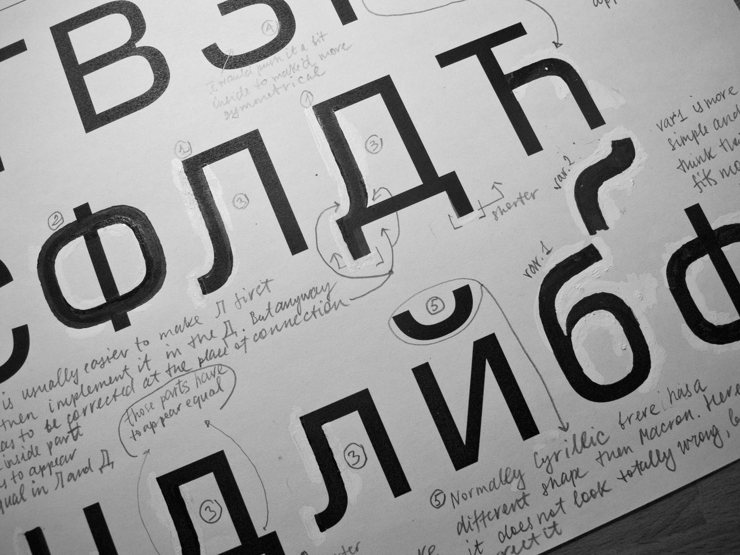 An Input proof, with corrections and comments by Maria Doreuli. Photo courtesy of Maria.
All typefaces I work on are collaborations, but this typeface especially benefitted from the feedback and advice of a large number of people. I’d like to thank all of Input’s beta testers who tried it on for size; Maria Doreuli, who consulted with me on the Cyrillic; Matthew Butterick, who gave helpful advice as a coder and as typeface designer; the folks at Paratype, who made the hinting of this massive family possible; Frank Grießhammer, who wrote the excellent box drawing character generator and suggested the Thin weights; and finally my coworkers who played a role in making this typeface happen: David Berlow, Sam Berlow, Petr van Blokland, Paley Dreier, CJ Dunn, Cyrus Highsmith, Indra Kupferschmid, Chris Lewis, André Mora, Jill Pichotta, and Nick Sherman.