***Editor’s note: *This blog was updated by Clara Ekekenta in December 2025 to reflect the latest React Native UI library landscape, including performance and bundle-size considerations, accessibility best practices, and Expo SDK 54 compatibility.

When building a React Native app, choosing the right UI components can dramatically speed up development and ensure a polished, platform‐consistent design. This is where React Native UI libraries come in — they provide pre-built, ready-to-use UI elements like buttons, input fields, and modals, helping developers create beautiful an…
***Editor’s note: *This blog was updated by Clara Ekekenta in December 2025 to reflect the latest React Native UI library landscape, including performance and bundle-size considerations, accessibility best practices, and Expo SDK 54 compatibility.
When building a React Native app, choosing the right UI components can dramatically speed up development and ensure a polished, platform‐consistent design. This is where React Native UI libraries come in — they provide pre-built, ready-to-use UI elements like buttons, input fields, and modals, helping developers create beautiful and functional interfaces without starting from scratch.
Unlike general component libraries, which may include utilities for animations, forms, or other functionalities, UI libraries focus specifically on visual components that align with platform design guidelines. Popular options like gluestack (formerly NativeBase) and React Native UI Kitten offer customizable, production-ready UI kits that streamline the development process.
In this article, we’ll explore the 10 best React Native UI libraries — comparing features, theming support, and use cases — to help you choose the right tools for your next project.
🚀 Sign up for The Replay newsletter
The Replay is a weekly newsletter for dev and engineering leaders.
Delivered once a week, it’s your curated guide to the most important conversations around frontend dev, emerging AI tools, and the state of modern software.
Why use a UI library in React Native?
React Native UI libraries offer predeveloped components that help accelerate project delivery. For example, developers can create icon buttons with react-native-vector-icons. Using a UI library with a complete UI kit eliminates the need to write custom styles for built-in UI elements or install multiple third-party components. UI libraries typically provide a collection of customizable UI elements for building modern apps.
With so many great options available, choosing the right React Native UI library can be challenging. However, understanding each library’s components, features, limitations, and developer support makes it easier to select one based on your design goals.
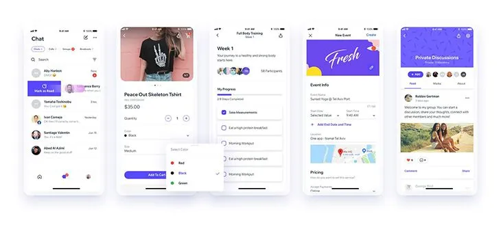
The best React Native UI libraries
The following open source React Native UI libraries can enhance your development process by improving efficiency and ensuring a consistent user experience across platforms like iOS and Android.
Below is a quick comparison table of the libraries covered in this article:
| Library | Best for | Theming support | Web support | Live example | Unique features |
|---|---|---|---|---|---|
| gluestack UI | Headless accessible components | NativeWind v2 / Tailwind | Yes | Yes | High (compiler-optimized) |
| Tamagui | High-performance universal apps | Custom tokens & headless themes | Yes | Yes | Optimizing compiler that flattens view trees |
| React Native Paper | Material Design-based UI components | Material theming | Yes (React Native Web) | Yes | Strict adherence to Material Design 3 guidelines |
| React Native Elements | Quick MVP / general use | ThemeProvider | Yes (React Native Web) | Yes | Massive component set reducing boilerplate |
| React Native UI Kitten | Legacy projects / Eva Design | Eva Design System | Yes (React Native Web) | Yes | Runtime theming (switch themes instantly) |
| RNUIlib | Modern, animated UI components | Supports theming | Yes | Yes | Animated components, modern UI elements |
| Shoutem UI | Composable UI with predefined styles | Shoutem themes | Yes | Yes | CSS-like styling and animation components |
| Lottie for React Native | Smooth animations | N/A | N/A | Yes | JSON-based animations using Airbnb’s Lottie |
| React Native Maps | Customizable maps | N/A | N/A | Yes | MapView, polygons, polylines, animated maps |
| React Native Gifted Chat | Pre-built chat UI | Customizable UI | N/A | Yes | Chat UI with quick replies and extensibility |
| NativeWind | Tailwind users, fast iteration | Tailwind CSS classes | Yes | Yes | Compile-time styling with zero runtime cost |
| Dripsy | Responsive, universal apps | sx prop / Theme UI | Yes | Yes | Mobile-first responsive styling |
| Shopify Restyle | Enterprise design systems | TypeScript-enforced theming | N/A | Yes | Strict type-safety for design tokens |
gluestack UI
gluestack UI, which evolved from NativeBase, is a library focused on improving performance and efficiency in web and mobile apps:
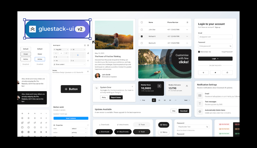
It offers a collection of 30+ pre-built, customizable components along with styling utilities that accelerate development while ensuring design consistency.
The launch of gluestack UI v3 in 2025 established its modular, unbundled component structure. This change offers unstyled, accessible elements that you can style using Tailwind CSS utility classes along with NativeWind’s styling engine. This method provides great flexibility, high performance, and strong accessibility. It is fully optimized for the new Expo SDK 54 and the latest React Native architecture.
gluestack UI is easy to use – simply copy and paste components or use the CLI tool into your app – yet still allows full control to tailor each UI element to your specifications using Tailwind CSS classes.
Version 3 of gluestack UI uses Tailwind CSS utility classes in conjunction with NativeWind’s styling engine for unparalleled flexibility across web and mobile platforms.
TL;DR: gluestack UI
NativeWind
NativeWind has quickly become the main styling choice for many developers in 2025. It essentially brings Tailwind CSS to React Native, but with a twist. It compiles your Tailwind classes into native stylesheets during the build process.
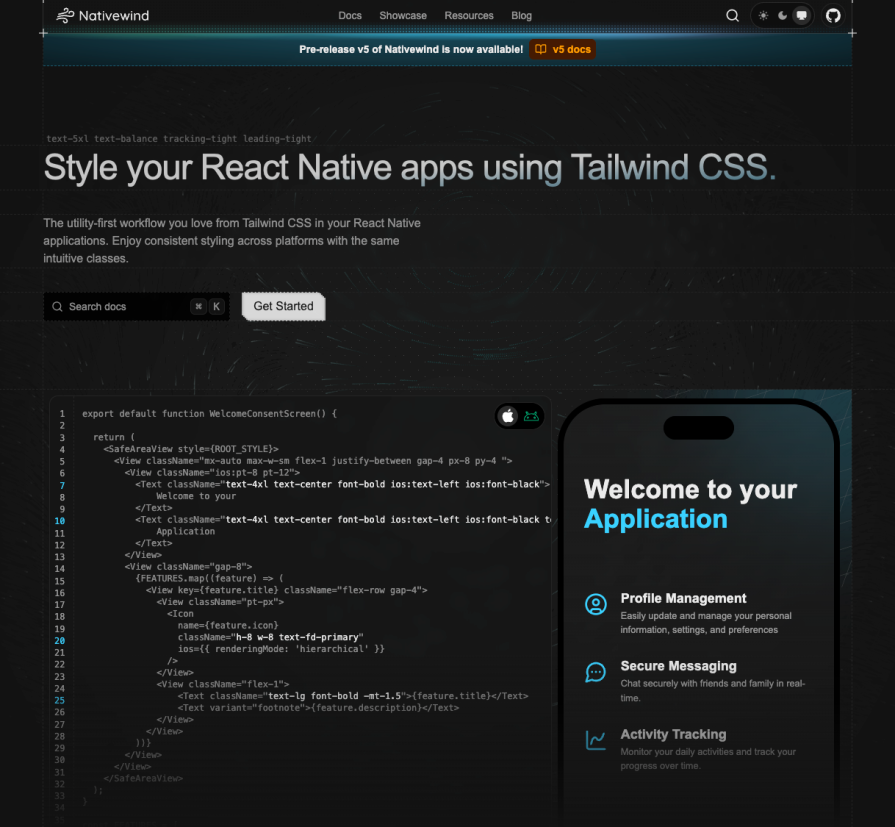
It lets you share styles directly between your React web app and your React Native mobile app. If you come from a web background, you can use the same utility classes you’re already familiar with, such as flex-1, bg-white, and px-4. Because it processes styles during the build step, or compile-time, there is almost no runtime overhead compared to older CSS-in-JS libraries. NativeWind creates native style objects. This means your app runs as fast as if you wrote the stylesheets manually.
TL;DR: NativeWind
- Documentation
- Includes support for Expo
- GitHub repository
- Live example
Shopify Restyle
Shopify Restyle is more than just a UI kit; it functions as a “Design System Engine.” It is built entirely with TypeScript to maintain consistency, making it the best choice for large enterprise teams that need to follow strict design guidelines.
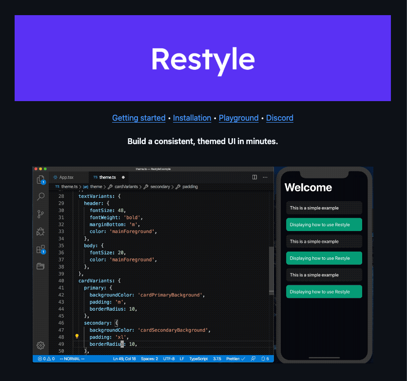
Restyle prevents “magic numbers.” If you define a spacing token like s as 8px in your theme, Restyle will surface a TypeScript error whenever you try to use an invalid value, such as 10px or m="medium".
Don’t use this if you want ready-made buttons right away. Use this if you want to create your own internal component library, like “MyCompanyButton,” that is impossible to misuse.
TL;DR: Shopify Restyle
- Documentation
- Includes support for Expo
- GitHub repository
- Live example
Dripsy
Dripsy is widely loved for its responsive-first approach. Built on Moti, it uses a sx prop like Theme UI. This makes it easy to create layouts that adjust smoothly from mobile screens to desktop web browsers.
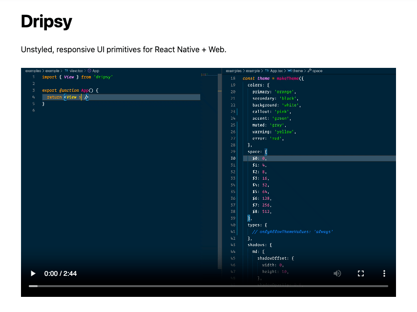
Dripsy takes away the hassle of media queries in React Native. You can define responsive styles using simple arrays, such as sx={{ width: ['100%', '50%'] }}. This automatically applies a width of 100% on mobile and 50% on tablets or the web. The approach is well-suited for universal apps and works efficiently across platforms, including Next.js and Expo.
TL;DR: Dripsy
- Documentation
- Includes support for Expo
- GitHub repository
- Live example
Tamagui
Tamagui is a performance-focused, customizable React Native component library and styling solution that offers a unique approach to building performant and scalable React Native applications.
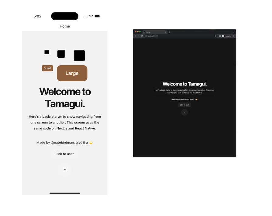
Its main benefit is its optimizing compiler. This tool flattens component trees and extracts static styles at build time. As a result, it creates almost no runtime overhead and offers very fast compilation speed. This setup lets developers write code once and deploy it easily on both web and mobile platforms while achieving top performance. The Tamagui system offers a base for custom components, enabling developers to build high-performing, tailored design systems.
TL;DR: Tamagui
React Native paper
React Native Paper is a cross-platform React Native UI library that remains the most reliable implementation of Google’s Material Design (M3). Developed by the official React Native development partner Callstack, React Native Paper offers customizable and production-ready components with native support for Light & Dark themes.
When using this React Native UI library, you can reduce its bundle size by using a Babel plugin that allows you to optionally require modules. This will exclude all the modules that your app doesn’t use and rewrite the import statements to include only those that are imported in the app’s component files. React Native Paper also supports web using React Native Web.
How do you use React Native Paper themes? Applying themes to a particular component is easy; React Native Paper comes with two default themes, namely light and dark, which you can extend. It uses the react-native-vector-icons library to support and use icons correctly in buttons, floating action buttons, lists, and more.
How do you use React Native paper themes?
Applying themes to a particular component is easy; React Native Paper comes with two default themes, namely light and dark, which you can extend. It uses the react-native-vector-icons library to support and use icons correctly in buttons, floating action buttons, lists, and more.
TL;DR: React Native paper
- Documentation
- Includes support for Expo
- GitHub repository
- Live example
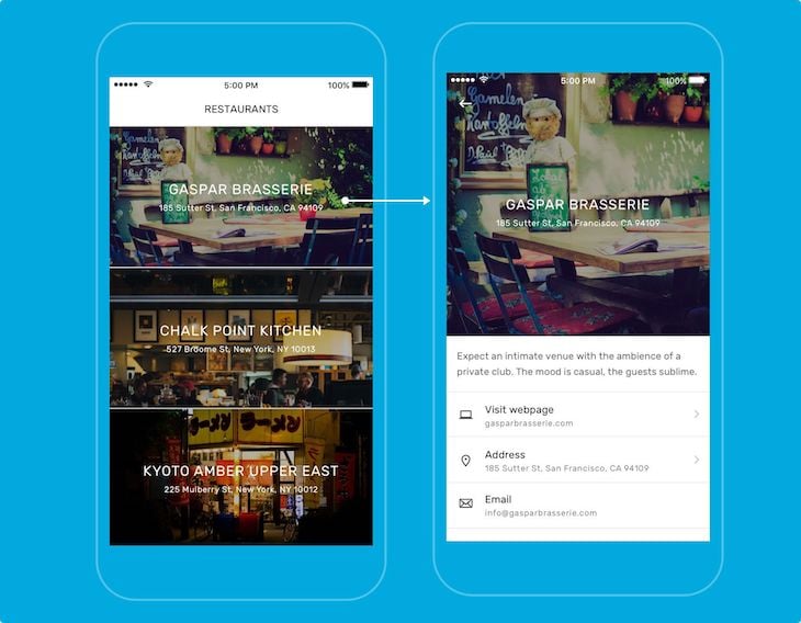
React Native elements
One of the oldest and easiest libraries to start with, React Native Elements is a cross-platform UI library that implements Material Design. Instead of following an opinionated design system, this toolkit offers a more basic structure through its generalized inbuilt components, meaning you’ll have more control over how you want to customize components. Customization of any component in this library will include a mixture of some custom props, as well as props from the React Native core API.
That being said, when using this React Native UI library, I’ve found that I can write much less boilerplate code than I do when using some of the other libraries covered in this post. The applications built using this UI toolkit also look and feel universal across both iOS and Android platforms.
ThemeProvider offers support for theming. Unlike some of the other libraries, which give you both light and dark themes, you’ll have to define your themes to make them work with React Native Elements. You can also use React Native Elements in web projects by using React Native Web.
TL;DR: React Native elements
- Documentation
- Includes support for Expo
- GitHub repository
- Live example
React Native UI Kitten
There are more than 20 essential UI components that you can use with React Native UI Kitten. It is based on the Eva Design System and is one of the few UI libraries that offer strong support for the right-to-left (RTL) writing system across all its components, making it a solid choice for global apps. It also has support for the web.
If you set up the UI Kitten library for an existing project, you’ll have to go through some configuration steps. For new projects, you can easily use a pre-developed app template. While this is a complete solution, developers creating new apps in 2025 should compare its runtime-based theming with newer, compiler-optimized libraries to manage bundle size.
TL;DR: React Native UI Kitten
- Documentation
- Includes support for Expo
- GitHub repository
RNUIlib: React Native UI Library
Well-maintained and used by Wix, RNUIlib is a library for building amazing React Native apps. It supports both older and the latest React Native versions. It offers more than 20 customized components. Some of these, such as the Drawer and Animated Scanner, are easy to integrate for creating modern UI designs, like the inbox in the Gmail app.
It supports both older and the latest React Native versions, and it provides more than 20 customized components, some of which, like Drawer, can be easily integrated for building modern swipeable lists, like the Gmail app’s inbox. It also has custom animated components, like an animated scanner, which is useful for indicating progress for a card, such as an uploading status, as well as an animated image.
RNUIlib is another UI library that supports the right-to-left writing system, and it includes full accessibility support, making it a reliable and function-packed option for production applications.
TL;DR: RNUIlib
- Documentation
- Includes support for Expo
- GitHub repository
- Live example
Shoutem UI
If you’re in the market for a professional-looking React Native UI library for your iOS or Android apps, then the Shoutem UI kit is a great choice. It is an open-source library with over 25 composable and customizable UI components. These components come with predefined styles that support other components.
Shoutem UI is an open source library that is a part of the Shoutem UI toolkit.
Shoutem UI consists of more than 25 composable and customizable UI components that come with pre-defined styles that support other components. You can build complex UIs by combining them, and apply custom CSS-like styling using the Shoutem themes library. It also includes dedicated animation components like ZoomIn and FadeIn, for creating more advanced UI effects.
TL;DR: Shoutem UI
- Documentation
- Includes support for Expo
- GitHub repository
Lottie for React Native
Lottie React Native is an excellent open-source animated graphic library developed by Airbnb for creating beautiful animations:

The Lottie community provides featured animations that you can use freely for React Native iOS or Android applications. You can also create custom animations using Adobe After Effects. Lottie then uses the Bodymovin extension to export the custom animations to JSON format and render them in the native mobile app. Because of the JSON export format, your app will have great performance.
The lottie-react-native package includes the Lottie component, which lets you add high-quality animations to React Native apps. Under the hood, it uses lottie-android on Android and lottie-ios on iOS, rendering Lottie files natively on each platform for smooth, performant animations.
TL;DR: Lottie for React Native
- Documentation
- Includes support for Expo
- GitHub repository
React Native Maps
React Native Maps is another useful library that provides customizable map components for your iOS and Android apps:
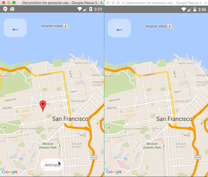 Its components include:
MapViewMarkerPolygonPolylineCalloutCircleHeatMapGeojsonOverlay
With these components, you can offer your users many different experiences on the map. Additionally, you can combine the components with the Animated API to give an animated effect to the components. For example, you can animate the zoom, marker views, and marker coordinates, and also render polygons and polylines on the map.
Keep in mind that React Native Maps v1.14.0 and above require React Native ≥v0.74, while versions below 1.14.0 are compatible only with React Native ≥v0.64.3. Be sure to update your React Native version if you plan to use React Native Maps with an older project.
TL;DR: React Native Maps
- Documentation
- Includes support for Expo
- GitHub repository
- LogRocket’s Introduction to React Native Maps
React Native Gifted Chat
In some development scenarios, React Native developers add chat screens to their mobile apps. For example, integrating a chatbot or implementing an inter-user chat system requires a chat component that includes incoming and outgoing messages with avatars, a text input for typing, and a send button.
The React Native Gifted Chat library offers a pre-developed, customizable chat component that you can use without having to build one from scratch:
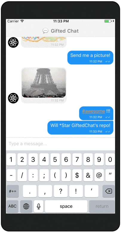
This chat component library comes with features like a highly customizable UI, useful event handlers such as onPressAvatar and onInputTextChanged, a typing indicator, quick reply options, and composer actions for attaching photos.
TL;DR: React Native Gifted Chat
- Includes support for Expo
- GitHub repository
- Live example
UI library vs. component library: What’s the difference?
When discussing UI development in React Native, it’s important to differentiate between a UI library and a component library, as these terms are often used interchangeably.
A UI library in React Native provides a set of prebuilt, ready-to-use components that help developers build apps faster. Instead of creating UI elements like buttons, input fields, or modals from scratch, developers get fully designed and functional components that follow platform-specific styles. This saves time and ensures a consistent app design.
A component library, on the other hand, is a broader category. It includes UI libraries but also encompasses UI kits, form builders, and specialized tools for handling animations, charts, or drag-and-drop interfaces. Examples include libraries for animations, charts, or drag-and-drop interfaces.
Some great examples of React Native UI libraries are NativeBase and UI Kitten, while libraries like Lottie and Tamagui better fit the component library description.
What is the best React Native component library?
The best React Native component library depends on your specific project needs. When multiple component libraries meet your design or development requirements, selecting one with strong developer support, an active development timeline, and comprehensive documentation is key.
All the component libraries in this list are actively maintained and are designed to speed up development by providing efficient, ready-to-use components. As long as you have a clear vision for your UI design, any of these libraries should work well.
Performance & bundle size
Today, performance is the main differentiator between React Native UI libraries. We evaluated each library based on startup time (TTR, Time to Render) and how much work they push onto the main thread.
Top tier (compiler-optimized):
Tamagui extracts styles to CSS on the web and optimizes native views on mobile, often performing on par with vanilla React Native. NativeWind compiles Tailwind-style utilities ahead of time, avoiding the runtime cost of passing large style objects across the bridge.
Mid-tier (runtime-styled):
Shopify Restyle remains efficient but relies on lightweight runtime calculations for theming and layout. React Native Paper performs reliably, but its full Material Design bundle can inflate app size unless you enable the Babel plugin for effective tree-shaking.
Low tier (legacy):
NativeBase and UI Kitten compute styles during every render cycle, which can introduce jank and dropped frames in animation-heavy screens.
Note: Tree-shaking is now standard in libraries like Tamagui and Gluestack UI. Older kits, such as React Native Elements, often ship unused components by default, increasing bundle size and startup cost.
Design system readiness matrix
How well does each library support a strict design system, including Figma tokens and theming?
| Feature | Shopify Restyle | Tamagui | React Native Paper |
|---|---|---|---|
| Type-safe tokens | Best (strict TypeScript enforcement) | High (typed configuration) | Moderate |
| Figma handoff | Manual | Plugin available (Tamagui Takeout) | N/A |
| Dark mode | Native support | Native support | Native support |
| Scaling | Enterprise-ready | Scalable | Rigid (Material-only) |
Accessibility (a11y) audit
A polished UI that isn’t accessible is still broken.
React Native Paper continues to set the bar for accessibility. It closely follows Google’s Material Design guidelines, handling essentials like 48×48dp touch targets and screen reader labels out of the box.
Gluestack UI builds on @react-native-aria, allowing complex components such as accordions and modals to correctly implement focus trapping. This keeps keyboard and screen reader focus contained within modals for VoiceOver and TalkBack users.
Dripsy and React Native Elements focus primarily on visual styling. While usable, they often require developers to manually add accessibilityRole and accessibilityLabel props to achieve full accessibility compliance.
Web & expo compatibility
With the release of Expo SDK 54, the gap between web and native continues to narrow, but not every UI library has kept pace.
Gluestack UI and Tamagui are built with universal development in mind. On the web, they render semantic <div> elements for better SEO and accessibility, while using View on mobile. Both are fully compatible with Expo’s new architecture, including Fabric and TurboModules.
React Native Elements and UI Kitten can run on the web, but their output often relies on Canvas-based or poorly optimized views. This results in a less native-feeling experience on desktop browsers compared to newer, web-first libraries.
LogRocket: Instantly identify and recreate issues in your React Native apps
LogRocket’s Galileo AI watches sessions for you and and surfaces the technical and usability issues holding back your React Native apps.
LogRocket also helps you increase conversion rates and product usage by showing you exactly how users are interacting with your app. LogRocket’s product analytics features surface the reasons why users don’t complete a particular flow or don’t adopt a new feature.
Start proactively monitoring your React Native apps — try LogRocket for free.
Community health stats (2025)
Before committing to a library, check if it’s active.
NativeWind has seen explosive growth, with around 403k weekly downloads. It has become the top choice for developers moving from React Web and Tailwind to Native.
React Native Paper is very stable with consistent use, boasting about 337k weekly downloads. Maintained by Callstack, it is the safest choice for Material Design apps.
Tamagui shows high innovation but has niche adoption. It has a lot of development activity, with frequent commits and releases, but its adoption is smaller than that of major players, at about 75k weekly downloads. It’s best for power users who need advanced compiler features.
React Native Elements is fragmented and declining. It struggles with visibility after renaming to @rneui/themed. With low adoption at around 46k weekly downloads, it seems to be fading and is best for maintaining legacy applications only.
Decision framework
Can’t decide? Use this simple rule of thumb.
- Do you need top-tier performance? Choose Tamagui or NativeWind.
- Are you building an enterprise design system? Choose Shopify Restyle.
- Do you need to stick to Material Design? Choose React Native Paper.
- Do you want full accessibility without extra work? Choose gluestack UI.
Do you have a favorite React Native component library? Let us know in the comments!