What other Garamond revivals are out there?


Cormorant, designed by Christian Thalmann and released in 2011 as an open-source project, offers a unique take on the Garamond legacy. Unlike other revivals that base their forms on historical prints, Cormorant draws inspiration from the theoretical elegance of Claude Garamond’s original punches, aiming for a more idealized interpretation. **You can download the font for free [here](https://atypeofamigo.com/fonts/eb-garam…
What other Garamond revivals are out there?
Cormorant, designed by Christian Thalmann and released in 2011 as an open-source project, offers a unique take on the Garamond legacy. Unlike other revivals that base their forms on historical prints, Cormorant draws inspiration from the theoretical elegance of Claude Garamond’s original punches, aiming for a more idealized interpretation. You can download the font for free here.

Monotype’s Garamond design might be one of the first versions you’ll encounter in your day-to-day use, since it comes with Microsoft Office. It was originally created in 1922 by Frederic Goudy, being a replica of Jean Jannon’s typographic work. Jannon’s work is often confused with Garamond’s original typefaces, but the former’s work can be identified for its calligraphic nature. You can purchase MT Garamong here.
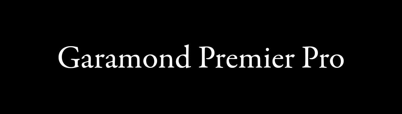
Garamond Premier Pro, designed by Robert Slimbach and released by Adobe in 2005, represents a sophisticated and comprehensive interpretation of Claude Garamond’s work. Unlike many revivals that focus on a single historical source, Slimbach’s design draws inspiration from a wide range of Renaissance printing, aiming to capture the spirit of Garamond’s era rather than a strict replication. This font is included in the Adobe Fonts subscription, you can find it here.


ITC Garamond was designed by Tony Stan and Alexander Tarbeev in 1975. Unlike revivals focused on historical accuracy, this version released by the International Typeface Corporation (ITC)is a contemporary adaptation. It emphasizes larger x-heights and shorter ascenders and descenders, giving the font a condensed look. This design choice makes it particularly well-suited for display purposes and headlines. You can buy this font here.
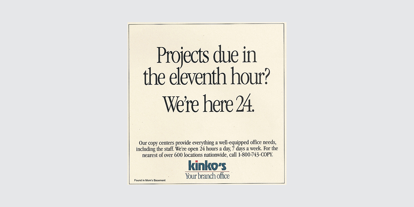
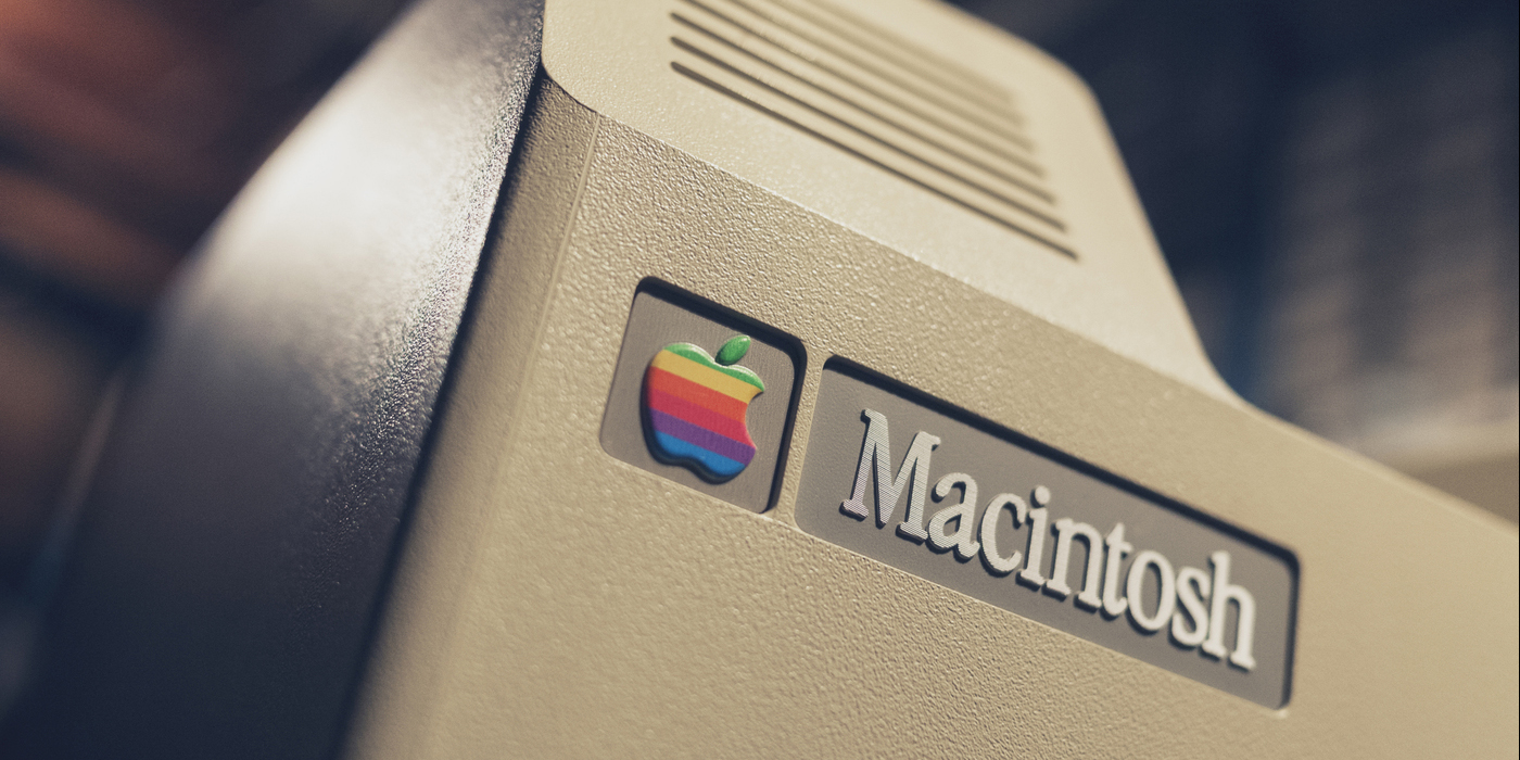
5. Apple Garamond
Unfortunately, this font is not available under any licensing, but since it was culturally relevant we’re including it anyways. Apple Garamond was a condensed variation of the ITC Garamond font. It was developed by the Bitstream typefoundry, condensing the original font to an 80%. It was set as the corporate font for apple from 1984, famously appearing in the logo of the first Macintosh, as well as in many Apple advertisements from the 80’s, being paired with Goudy Heavy, Goudy Oldstyle and Belwe.

Sabon was designed by Jan Tschichold in the late 60’s, a joint release by three type foundries: Linotype, Monotype and Stempel. It was created with practicality in mind, since it needed to fit the different equipments of all three typefoundries. That’s why the italic and bold styles take the same space as the roman style. You can purchase Sabon here.
![]()
Stanford University logo from 2005 to 2012.
Adobe Garamond, designed by Robert Slimbach, stands out as a careful digital interpretation of Claude Garamond’s roman and Robert Granjon’s italic types. Differing from other revivals that rely on later interpretations, Adobe Garamond is fixed on original sources from the 16th century, aiming for a more historically accurate representation. It’s distributed by Adobe Fonts, you can find it here.