I’ve previously tweaked Solarized to my tastes. I feel that was a pretty clearcut improvement. This attempt is a lot braver:
- Light and dark versions that both work.
- Slightly higher contrast, both between the colours and with the background.
- Warmer shades of gray, yay!
- More custom colours (hijacks the colour cube 😱).
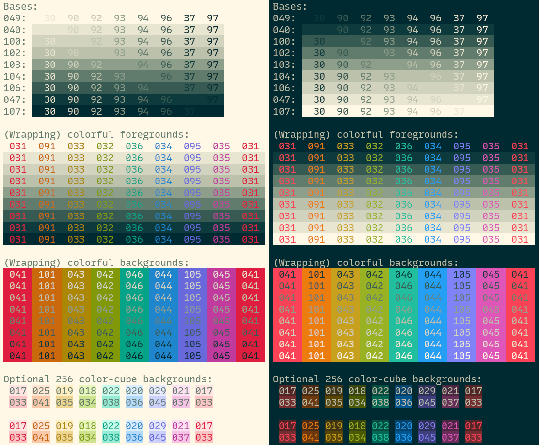
Light
Shades of gray, colours, optional backgrounds, and even more optional hi-vis backgrounds:
xoxoxo xoxoxo xoxoxo xoxoxo xoxoxo xoxoxo xoxoxo xoxoxo xoxoxo
xoxoxo
xoxoxo
xoxoxo
xoxoxo
xoxoxo
xoxoxo
xoxoxo
xoxoxo
xoxoxo
xoxoxo
xoxoxo
xoxoxo
xoxoxo
xoxoxo
xoxoxo
xoxoxo
xoxoxo
xoxoxo
xoxoxo
xoxoxo
xoxoxo
xoxoxo
xoxoxo
xoxoxo
xoxoxo
xoxoxo
xoxoxo
xoxoxo
xoxoxo
xoxoxo
Dark
xoxoxo xoxoxo …
I’ve previously tweaked Solarized to my tastes. I feel that was a pretty clearcut improvement. This attempt is a lot braver:
- Light and dark versions that both work.
- Slightly higher contrast, both between the colours and with the background.
- Warmer shades of gray, yay!
- More custom colours (hijacks the colour cube 😱).
Light
Shades of gray, colours, optional backgrounds, and even more optional hi-vis backgrounds:
xoxoxo xoxoxo xoxoxo xoxoxo xoxoxo xoxoxo xoxoxo xoxoxo xoxoxo
xoxoxo
xoxoxo
xoxoxo
xoxoxo
xoxoxo
xoxoxo
xoxoxo
xoxoxo
xoxoxo
xoxoxo
xoxoxo
xoxoxo
xoxoxo
xoxoxo
xoxoxo
xoxoxo
xoxoxo
xoxoxo
xoxoxo
xoxoxo
xoxoxo
xoxoxo
xoxoxo
xoxoxo
xoxoxo
xoxoxo
xoxoxo
xoxoxo
xoxoxo
xoxoxo
Dark
xoxoxo xoxoxo xoxoxo xoxoxo xoxoxo xoxoxo xoxoxo xoxoxo xoxoxo
xoxoxo
xoxoxo
xoxoxo
xoxoxo
xoxoxo
xoxoxo
xoxoxo
xoxoxo
xoxoxo
xoxoxo
xoxoxo
xoxoxo
xoxoxo
xoxoxo
xoxoxo
xoxoxo
xoxoxo
xoxoxo
xoxoxo
xoxoxo
xoxoxo
xoxoxo
xoxoxo
xoxoxo
xoxoxo
xoxoxo
xoxoxo
xoxoxo
xoxoxo
xoxoxo
Interested in exploring the colours in OKLCH?
The following are snippets you can paste to Huetone. Dark-to-light and light-to-dark backgrounds:
Enable JavaScript to see this.
The various colours:
Enable JavaScript to see this.
Why?
I like the feel of the original Solarized colour theme. I just wanted more and better:
- Slightly better separation of colours. The original had red and orange right next to each other.
- Slightly higher contrast. It’s impossible to have good contrast when the colours are the same on both the dark and light backgrounds.
- Coloured backgrounds. For like git history & stuff?
Why not selenized?
Selenized has had a lot of work put into it. However: I don’t like the green (too cold), and I did miss the orange and the purple. Yes it’s good to preserve the semantics of terminal colours. Had I not already worked around Solarized hijacking the “bright” colours, I would’ve preferred this.
What?
- The “authoritative” colours are in the OKLCH colourspace, view source here or see GitHub. The hex colours are displayed for your convenience.
- Kitty themes: light and dark. They hijack parts of the colour cube (colours 16-231) to provide coloured backgrounds.
- A relatively short Vim/Neovim theme supporting Tree-sitter, Vimwiki, and some other stuff I use. Requires a true color terminal with
set termguicolors.
The original Solarized (left) and my previous improvements (right):
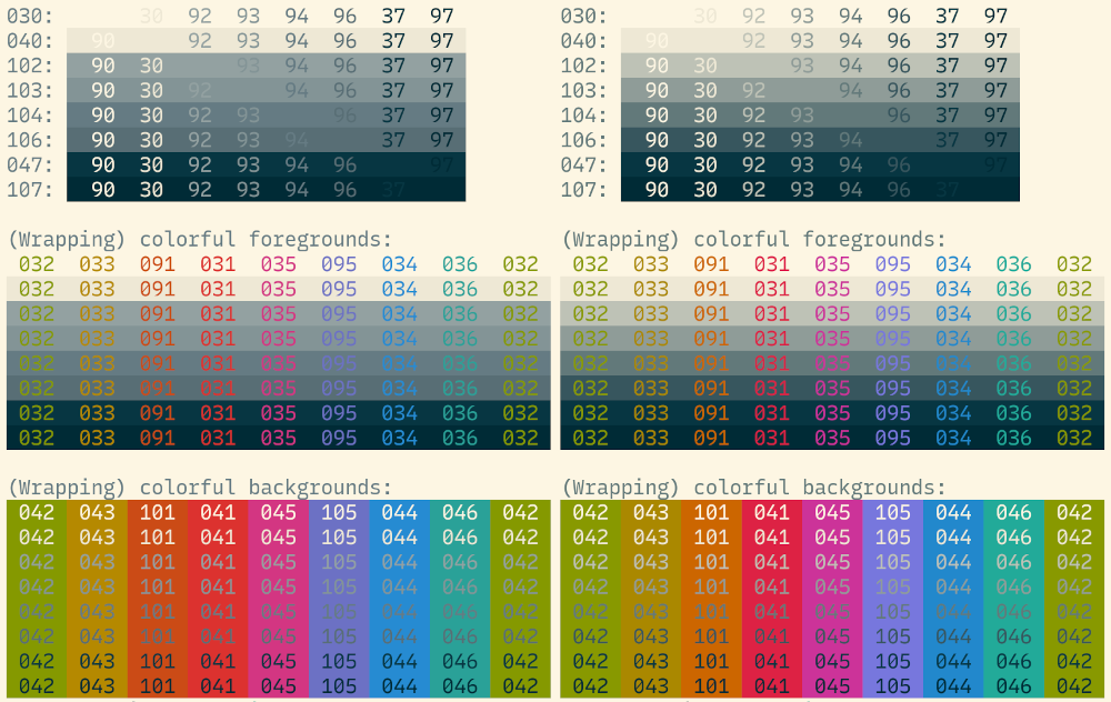
And these new ones, light (left) and dark (right):