Contributed by Florian Hardwig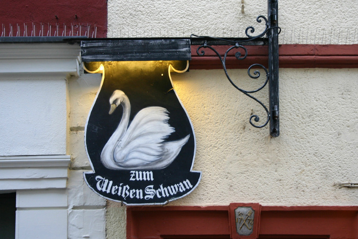
Source: www.flickr.com Photo: Florian Hardwig. License: CC BY-SA</sp…
Contributed by Florian Hardwig
Source: www.flickr.com Photo: Florian Hardwig. License: CC BY-SA.
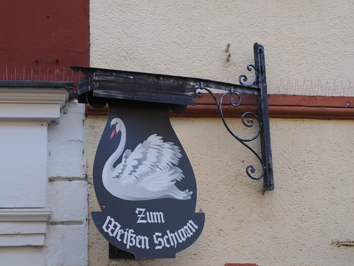
The sign featuring Agincourt, spotted in 2012
Der Weiße Schwan (“The White Swan”) is a pub and also a beer museum located in the old city of Heidelberg, Germany.
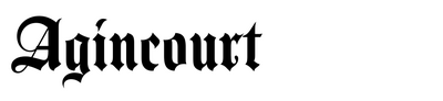
In 2012, their hanging sign with a painting of the eponymous water bird featured the name in Agincourt. The display blackletter was designed by David Quay and named after the England’s victorious battle in the Hundred Years’ War. Letraset released it in 1983. The sign thus can’t be any older than that (but probably was made later).
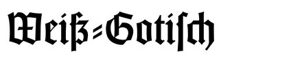
Sometime between 2018 and 2020, the sign was renovated, with a new swan and also a new typeface. Or rather, an old one: Weiß-Gotisch was first cast by Bauer in 1936 and is named after its designer, Emil Rudolf Weiß.
Source: www.flickr.com Luc Hermans . License: All Rights Reserved.
The new sign as documented in 2025, with Weiß-Gotisch. The article “zum” is now capitalized.
Source: www.flickr.com Photo: Florian Hardwig. License: CC BY-NC-SA.
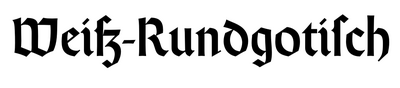
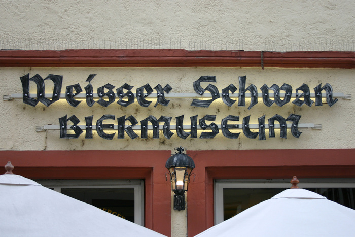
The sign on the façade uses custom-made letterforms. They are still based on a typeface, though, albeit loosely: it’s a bolder rendition of another design by Emil Rudolf Weiß, namely Weiß-Rundgotisch. See its glyph set for comparison.
“Weisser” is here spelled with a double s instead of an eszett (ß). This isn’t quite according to the rules, but perfectly readable. Blackletter aficionados will notice another, more serious error. Can you spot it? (And no, I’m not talking about the use of all caps for “BIERMUSEUM”).
This post was originally published at Fonts In Use