Maarten van Kampen has another disappointment for you: another celebrated technological breakthrough is most likely fake.
This time it is not about superconductors, but about electrochemistry, on nanoscale! Chinese superstar **Xuefeng Guo **successfully claimed for years to be the only one able to measure electrical current on one single organic molecule, and thus precisely measure structures and enzymatic reactions. Now Maarten will show you how exactly this nanotechnology “works” and why many other labs are too stupid to figure it out. Well, just like with superconductors, some did figure it out, and they didn’t stay silent, and it is their investigation whcih Maarten built on.
[Superconductive Fraud: The Sequel](…
Maarten van Kampen has another disappointment for you: another celebrated technological breakthrough is most likely fake.
This time it is not about superconductors, but about electrochemistry, on nanoscale! Chinese superstar **Xuefeng Guo **successfully claimed for years to be the only one able to measure electrical current on one single organic molecule, and thus precisely measure structures and enzymatic reactions. Now Maarten will show you how exactly this nanotechnology “works” and why many other labs are too stupid to figure it out. Well, just like with superconductors, some did figure it out, and they didn’t stay silent, and it is their investigation whcih Maarten built on.
Superconductive Fraud: The Sequel
“After the huge box-office success of “Nature 2020: Room-temperature superconductivity in CSH” this March our Nature studios released a sequel with the same star-studded cast: “Nature 2023: Near-ambient superconductivity in N-doped LuHx”. – Maarten van Kampen
Guo is since 2008 professor at the College of Chemistry and Molecular Engineering of Peking University in Beijing, in 2020 he gained an additional affiliation with the School of Electronic Information and Optical Engineering of the Nankai University. Prior to that, he trained as postdoc at Columbia University in New York, USA. Guo received many national and international awards, including “Ten-Thousand Talents Program” recognition and IUPAC Distinguished Award.
Many professorial science cheaters are actually dumb as bricks, which is evidenced by the pathetic quality of their image forgeries. But not Guo, he is very clever. Even where he slips, and gets caught on blatant spectra forgeries, Guo is ready to refute all evidence with raw data, repeat measurements, and even animations. Very convincingly even.
It takes some real experts with some real dedication to expose the fabrications.
Not a single molecule
by Maarten van Kampen
This post is about something that could have been very cool nanoscience: measuring the electrical properties of a single molecule. Except that you are reading For Better Science, and hence fraud and fabrication must be involved. The story is pretty technical, but for the bio-people reading this: it also has RNA and polynucleotide phosphorylases in it!
Image sources: Nankai University , Peking University
Introduction
To measure the resistance of a molecule one must connect leads to it. This is a big challenge, as molecules are obviously very small. Traditional methods include break junctions, where a thin metal wire on a surface is gradually pulled until it breaks. After breaking one is left with a very narrow gap that can be bridged by a single molecule. In another method a sharp-tipped needle is brought in close proximity of a conducting surface. In this case a single molecule can bridge the gap between the surface and the needle. The bridging molecules are typically deposited from a solution and get stuck by chance in the gap.
Our story is about professor Xuefeng Guo and his group at Peking university. In 2012, Guo developed a novel method for contacting single molecules, which was published in the highly prestigious journal Angewandte Chemie. The method uses graphene sheets, rather than metal wires, to contact the molecule. Guo’s method consists of lithographically cutting a graphene sheet in two halves, creating point contacts separated by narrow nanogaps:
Yang Cao, Shaohua Dong, Song Liu, Li He, Lin Gan, Xiaoming Yu, Michael L. Steigerwald, Xiaosong Wu, Zhongfan Liu, Xuefeng Guo Building High-Throughput Molecular Junctions Using Indented Graphene Point Contacts Angewandte Chemie (2012) doi: 10.1002/anie.201205607
Left: schematic of the cut graphene sheet forming point contacts. Middle: SEM image of the cut. Right: AFM image of the cut. From [Cao et al 2012].
The gaps in these point contacts need to be of the order of 1 nm to be bridged by a single molecule. Microfabrication does not have the accuracy to reliably produce these gaps. Guo solved this by a final step of electroburning, sending a high current through shorted contacts to evaporate material and widen the gap.
After fabrication, a reservoir is placed on top of the device and the molecules of interest are added to a solvent. Guo claims that a specific edge chemistry is employed to couple the molecules to the edge of the graphene sheets, causing single molecules to bridge the gaps. Once bonded, a seemingly endless number of experiments can be run on a single molecule. These include real-time observation of photo-switching, resolving individual reaction steps, and determining reaction rates.
Guo has by now build a large publication list in high-profile journals, including a Jia et al 2016 paper in Science that employs this technique. However, no other group has managed to adopt the method in the 13 years since its conception. Below I will show that a number of Guo’s papers contain fabricated data. And that when challenged, Guo not only denies this, but even submits more fabricated data.
Scientific concerns
The observations reported in Xuo’s nanocontact papers gradually became more and more spectacular, but did not raise much discussion. This changed when single-molecule researchers Latha Venkataraman and Jan van Ruitenbeek published a Matters Arising on a particularly spectacular paper:
Chen Yang, Yanwei Li, Shuyao Zhou, Yilin Guo, Chuancheng Jia, Zhirong Liu, Kendall N. Houk, Yonatan Dubi & Xuefeng Guo Real-time monitoring of reaction stereochemistry through single-molecule observations of chirality-induced spin selectivity) Nature Chemistry (2023) doi: 10.1038/s41557-023-01212-2
In the Yang et al Nat Chem 2023 paper, the authors use their graphene junction to study a single molecule reaction in real-time. And not only that: using cutting-edge techniques they could even electrically determine the chirality (left- or right-handedness) of the formed reaction product:
A side chain of the bridging molecule reacts with molecules in the solution, forming a reaction product that comes in two stereoisomers. The magnetic electrode on the left injects spin-polarized electrons that are sensitive to the chirality of the formed reaction product. Reproduced from Yang et al Nat Chem 2023, Fig. 1(b).
The sample preparation and experiment are complicated and technically very, very challenging. But the result of this and other Guo experiments is invariably simple and easy to interpret: a current versus time plot showing jumps between two or more levels. In this case the authors find that the current switches between two states that are deemed to correspond to the left- and right-handedness of the reaction product:
Fig. 4(c) from [Real-time monitoring of…] shows the measured current versus time at 60 K, so 100 oC below the freezing point of alcohol. The switching between two states is presumed to represent flipping of the chirality of a sidegroup.
“This is the first time that such a complex reaction was monitored in situ, in real time and at the single-molecule level”
Xuefeng Guo, in Chemistry World (2023)
The Matters Arising paper by Venkataraman and Ruitenbeek makes a number of excellent, but highly technical points. To me, the most intuitive one is made in the section “Chemical reactions in a frozen solvent?“. Here the critics point out that the authors perform their experiments in a solid material: the purported reactions run at temperatures that are up to 100 oC below the freezing point of their solvent, alcohol. And that is just very, very problematic. There are also hints of fabrication, with the section “IETS spectroscopy—inconsistent with experimental resolution” pointing out that the two main peaks in a so-called IETS spectrum are far narrower than the resolution of the used technique. It is hard to convey how badly wrong Fig. S8 is, here an attempt:
Annotated Fig. S8. The electrical measurement in the top panel perfectly matches with the optical measurements in the bottom panel. The two highest and most important peaks are about 5 mV wide, see the red arrows. This is more than 7x lower than the resolution of the used method, green arrows.
In the caption, an AC modulation of 21.2 mV is given, whilst the figure shows two peaks that are just 5 mV wide. This is akin to writing that one parked a 2.5 m wide truck in a 40 cm wide bicycle rack, without scratches. The correspondence with the optical techniques in the bottom panel is, however, excellent.
Addressing questionable science through a Matters Arising is more often than not a disappointing route, see e.g. here the attempt to show data fabrication in the superconductor research by the late Mikhail Eremets (also read below).
Superconductive Witch Hunt
“J. Hirsch. […] engaged in unscrupulous practices, including falsifying analyses and selectively presenting data to support unfounded claims. […] Hirsch’s tactics include manipulation of public opinion, personal attacks on our team members, and threats and complaints to our management and funding agencies.” – Mikhail Eremets, the single most highly regarded high pressure experimentalist today.
It took a year before the comment by Venkataraman and Ruitenbeek got published, alongside a reply from the authors. And that reply simply sidestepped the critical issues. For example, the frozen solvent is not mentioned at all. And whilst the reply does contain a section “High-resolution inelastic electron tunnelling spectroscopy“, it does not address the resolution issue raised by Venkataraman et al. The authors simply dwell on such much more minor criticism, and then ignore the large inconsistency in their data. Apparently neither editors nor reviewers noticed or bothered with this.
Super-spotter spots trouble
The dynamics changed when Ruitenbeek was brought in contact with super-spotter Elisabeth Bik. She went through part of Guo’s oeuvre and noticed issues in three papers. And these issues must be all too familiar to readers of this blog:
Wei Wei , Zhangjing Chen , Yan Zhang , Jian Chen , Liu Wan , Cheng Du , Mingjiang Xie, Xuefeng Guo Full-faradaic-active nitrogen species doping enables high-energy-density carbon-based supercapacitor Journal of Energy Chemistry (2020) doi: 10.1016/j.jechem.2020.02.011
 Jan Van Ruitenbeek: “with the help of the talents of Dr. Elisabeth Bik, we […] copy Fig. 8 here, where we have added colored boxes to indicate repeats in the noise pattern.”
The Wei et al 2020 study purports to have developed an electrode material that can withstand many charge-discharge cycles. And the stability is indeed excellent: a 1000-cycle long pattern can be found repeated seven times, filling the final 2/3 of the figure with highly stable repeats!
The second paper, in Angewandte Chemie, features a US collaborator, **Michael Steigerwald **of Columbia University:
Song Liu , Xinyue Zhang , Wangxi Luo , Zhenxing Wang , Xuefeng Guo, Michael L. Steigerwald , Xiaohong Fang Single‐Molecule Detection of Proteins Using Aptamer‐Functionalized Molecular Electronic Devices Angewandte Chemie (2011) doi:10.1002/anie.201006469

Jan Van Ruitenbeek: “with the help of the talents of Dr. Elisabeth Bik, we […] copy Fig. 3b here, where we have added colored boxes to indicate repeats in the noise pattern.”
Liu et al 2011 purports to study a single molecule contacted by carbon nanotubes. The current versus time plot above shows that the single molecule can sense guanidine. And that it apparently also can memorize minute-long stretches of noise and replay those up to three times!
Bik’s third find is the most interesting one as it pertains to… the Yang et al Nat Chem 2023 paper we already discussed! That paper comes with a 53-page, 49-figure supplement. Near the very end, in Fig. S47, Bik found something very troubling:
Chen Yang, Yanwei Li, Shuyao Zhou, Yilin Guo, Chuancheng Jia, Zhirong Liu, Kendall N. Houk, Yonatan Dubi & Xuefeng Guo Real-time monitoring of reaction stereochemistry through single-molecule observations of chirality-induced spin selectivity) Nature Chemistry (2023) doi: 10.1038/s41557-023-01212-2
Jan Van Ruitenbeek: “with the help of the talents of Dr. Elisabeth Bik, we found […] evidence of data falsification, which is most evident in the Supplementary Figure 47.”
Animated comparison
The plots purport to show the current through a single molecule whilst it switches between two reaction states. Except that the noise in the upper 278 K plot is exactly identical to that of the lower 288 K plot. And that cannot be: the curves have clearly been fabricated from a single noisy curve by vertically shifting blocks of data. To make matters worse, this happens for two pairs of panels in Fig. S47:
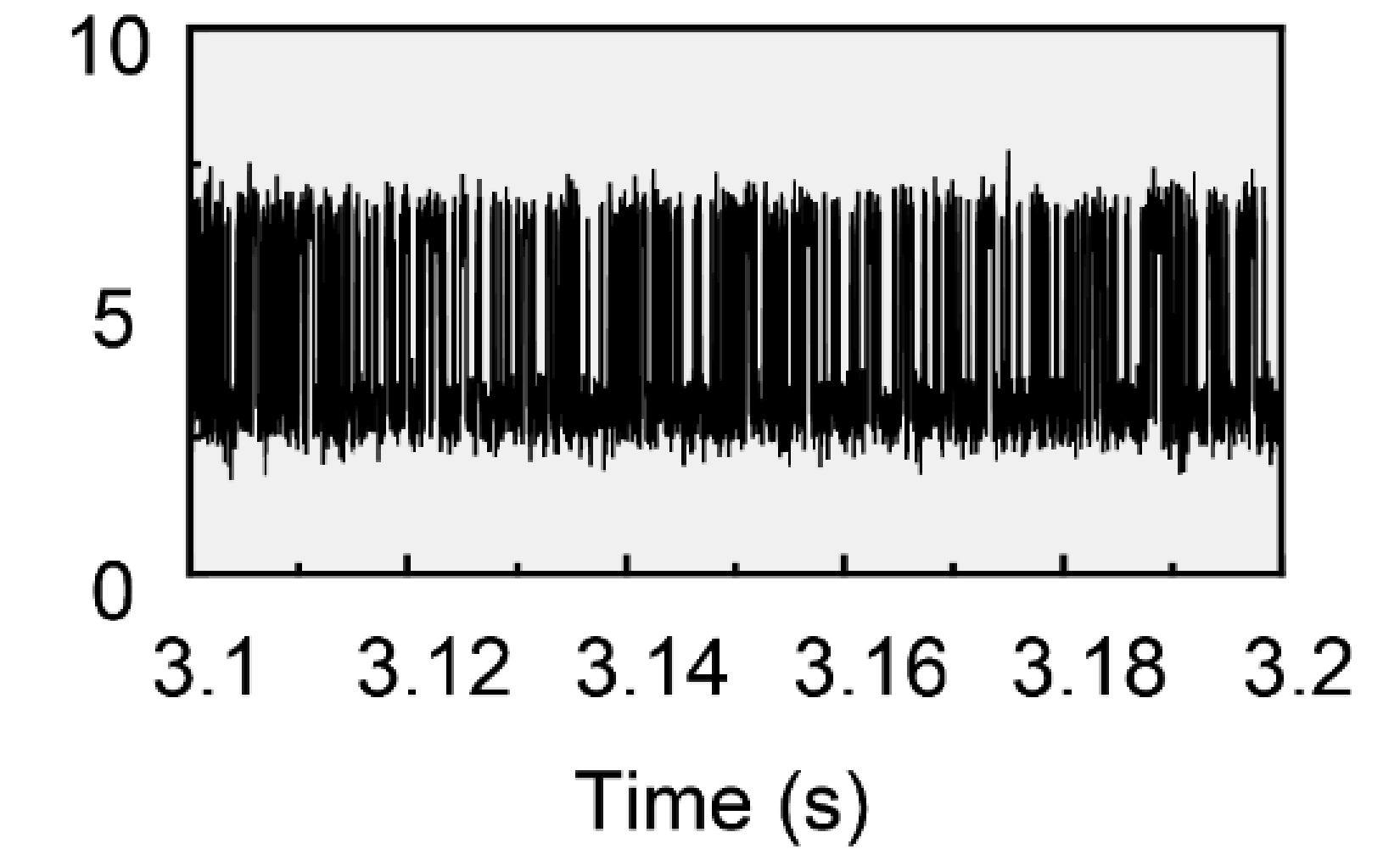
In cases like this I read a lot in the reaction of the authors. With issues as clear as those above I would at the very least expect the authors to recognize the concerns. The more calculating ones might even sacrifice a student or two to deflect the blame. There is also a much less favorable path: outright denial. And that is the route Guo has taken for his 2011 and 2023 papers. In April 2025, he wrote on PubPeer:
“Our datum volume is large (more than 50,000 datum points per second). During plotting massive datasets (e.g., 3.1−3.2 s) into a bitmap image, geometric distortion phenomena in data representation are observed. In detail, such a large amount of data is displayed in a limited number of pixels and spikes are integrated into a simple line, leading to the loss of details.“
Denial and more fabrication
The denial of the issues with the Yang et al Nat Chem 2023 paper comes with an extensive analysis that purports to show that the accusations are unfounded. In his analysis, Prof. Guo zooms in on many of the overlaps flagged by Bik, pointing out that the actual source data shows the regions to be **“completely different” **when looking in sufficient detail:
Figure taken from Guo’s reply on PubPeer.
And that is surprising and worrying. For one, in the as-published Fig. S47 the duplication was pixel-perfect. Secondly, a detailed look at the figure provided by Prof. Guo gives the eerie feeling that his curves are far more similar than one would expect. In the zoom-ins below one can see that the data is different in its finest details, but that at the same time the peaks and valleys are strongly correlated:
Zoom-in on the yellow, blue, and gray rectangles. The curves are indeed not exactly identical. However, many features are shared.
At the end of April 2025, something surprising happened: Prof. Guo provided a large data archive (available here) that not only contained the raw data behind Fig. S47, but even a complete replication of the experiment behind the figure.
We can describe the ‘raw data’ provided for Fig. S47 very briefly as: it is simply falsified.
A direct comparison of the as-published Fig. S47 and the raw data shows that they are different, even when plotted at a comparable resolution:
Direct comparison of the 278 and 288 K curves from the paper (left) and from the provided source data (right) as posted by Ruitenbeek on PubPeer.
The authors anticipated this, and their archive contains a folder titled “Videos about processing data using Origin software“. It has cute videos that blame plotting artefacts for the (lack of) overlap:
The data fabrication is, however, evident in the posted data. This can be shown in a very technical way, as I did on PubPeer. But the approach of Allochrusa versicolor is much more intuitive:
Left: the 278K and 308K datasets are uncorrelated. When plotting one as a function of the other one is left with shapeless blobs. Right: the 278K and 288K sets are strongly correlated, as evident by the ‘stripes’ with slope 1.
This commenter simply plotted the current values of one dataset versus that of another. When there is no relation, one will find four shapeless blobs that correspond to the different combinations of high- and low-current states between the two sets. This is for example the case for the pair shown above-left. For the 278-288 K case pointed out by Bik a very different picture emerges, top-right. One still finds blobs, but now with clear diagonal “stripes”. These stripes show that the two “independent” measurements are strongly correlated. And that is impossible: the authors just added some extra noise to the curves published in Fig. S47 to hide the all-too-obvious fabrication.
Journals are surprisingly often tolerant when authors vehemently deny fabrications, branding the issue a mere scientific controversy. Nothing helps more to happily resolve such “scientific controversies” than replacement data, and this is exactly what Prof. Guo and his group provided in their response. And it took these hardworking scientists merely three weeks to fully reproduce their cutting-edge results!
The data archive not only comes with a full replacement for Fig. S47, but also with screen recordings showing how each of the replacement traces is acquired in real time:
And would it surprise you that the replacement data is **also **a fabrication, just of higher quality?
The curves published in Fig. S47 were fabricated by vertically shifting blocks of data. This results in a clear fingerprint: the vertical transitions are instantaneous and do not show any intermediate current values. In an actual measurement, some of the transitions will show intermediate points. For one, the amplifier will have a limited rise time, resulting in intermediate readings. Secondly, any somewhat skilled experimentalist will apply a low-pass filter to remove high frequency signals that add noise but no usable information. This filtering will slow the response, resulting in more intermediate values.
A quick look shows that the original data in Guo’s reply indeed lacks intermediate points, see the panel below, on the left. In contrast, the the newly measured replacement data does show datapoints (round markers) on the switching flanks, below, on the right:
Left: “original” data lacking intermediate points on the transitions. Right: replacement data showing intermediate values. Red lines are idealized switching curves.
The difference can be made more explicit by looking at the current histograms in the figure below. The original data at the left just shows two peaks at the low- and a high current level, separated by a nice gap. In contrast, the replacement data at the right shows an excess of points in between its two current levels. And these points are there due to the finite switching time:
Left: histogram of the original data. The histogram just shows two Gaussian (noise) bands around the lower~3 and upper ~7 nA level. Right: same, but for the replacement data. The intermediate ‘switching’ points show as an excess of counts in between the two levels,
Together with the screen recordings this shows that the replacement data has been measured. This then leaves an important question: what was actually generating the switching signal? Also here the intermediate points help:
Left panel: 318 K current trace over a longer time interval. The yellow highlights indicate intermediate points falling in between the red horizontal lines. Right: Absolute difference between the measured data and an idealized curve. Peaks indicate intermediate points. Vertical gray bars are spaced at 28.5 ms.
The left panel shows a longer stretch of the replacement data, with the intermediate points highlighted in yellow. A strange pattern emerges: the intermediate points can only be found in narrow intervals that repeat every 28.5 ms. The same can also be seen in the right panel over a 1 s interval. The figure shows the difference between the data and an idealized, instant-switching curve. In this representation the intermediate points show up as peaks, and these peaks repeat like clockwork every 28.5 ms.
A single molecule is not a clock, it switches at random moments. Some of these switches will happen just after the digitizer took a sample and thus will show as an instantaneous transitions. Conversely, others happen at or just before sampling and hence will produce an intermediate value. The key word here is random: measurements on a switching molecule will not result in periodic intermediate values.
The observations of cyclic intermediate values are compatible with a very different scenario: the measured signal was generated by a digital function generator. A function generator will output its values on a fixed clock frequency. And when that clock frequency is close to, but different from, the sampling frequency of the digitizer, one will get beating effects. This is illustrated in the figure below:
Beating effect. The blue bars are slightly wider spaced than the red bars. Every 22 red and 21 blue bars the patterns perfectly align, as indicated by vertical lines.
The bars in the bottom row are slightly wider spaced (lower frequency) than those on the top row. This results in a beating effect that can be clearly seen in the middle: the bars start aligned, but gradually drift apart resulting in a darker appearance. After maximum misalignment the two again come closer until they are aligned again, and the process repeats.
The same happens when a function generator produces a signal at a slightly different frequency than the digitizer: the function generator initially changes its output shortly before the digitizer samples, resulting in a string of transitions with intermediate points. Due to the frequency mismatch this alignment will drift and the function generator will eventually change its output *after *sampling, making every transition seemingly instantaneous. The time difference will grow, ‘wrap around’, and eventually the generator will again switch shortly before sampling, creating a new string of transitions with intermediate points.
The deposited data shows that the digitizer was sampling at 56.7 kHz. The observed beating frequency of 1/28.5 ms = 31 Hz suggests that the function generator was generating its output values at a frequency that was 31 Hz higher or lower. Presumably the authors choose to run their function generator at the same frequency as their digitizer. However, a small frequency difference remained, possibly due to the way the clock frequency was derived. And this then leads to the tell-tale beating effects in the newly provided data.
Summarizing, Elisabeth Bik found duplicated noise in two pairs of current traces in the Yang et al Nat Chem 2023 paper. Senior author Xuo responded by denying the issue and providing raw data. The raw data turned out to be different from the published curves, but still solidly showed the fabrication identified by Bik. The authors also claimed to have repeated their experiments and provided a drop-in replacement for the fabricated figure. Close scrutiny of the new data showed that it has indeed been measured. However, the signal was not generated by a switching molecule, but fabricated using a function generator.
Single-exonuclease nanocircuits
With fabrications found in three papers one can expect that more studies are affected. Since Elisabeth Bik hasn’t found more issues, one can be pretty sure that these problems will not be visible as duplications in figures. This brings us to this Nature Communications paper, which comes with its source data included:
Zhiheng Yang, Wenzhe Liu , Lihua Zhao , Dongbao Yin , Jianfei Feng, Lidong Li, Xuefeng Guo Single-exonuclease nanocircuits reveal the RNA degradation dynamics of PNPase and demonstrate potential for RNA sequencing Nature Communications (2023) doi: 10.1038/s41467-023-36278-6
The study is a marvel of engineering ingenuity. The authors anchor a single Polynucleotide Phosphorylase (PNPase) enzyme to a silicon nanowire and, by recording the currents through the wire, they can actually observe the enzyme ingesting and spitting out RNA:
Fig. 1 of Yang et al* Nat Comms* 2023. (a) PNPase molecule bound to the nanowire with a partially ingested RNA molecule on top. (b) PNPase without RNA (left) and during two states of ‘ingestion’. The current through the black nanowire is indicated by white arrows and increases when more of the RNA molecule is ingested.
Panel (a) shows the large PNPase enzyme anchored to a specially prepared patch of the nanowire, with a strand of RNA sticking out from its top. Also in this paper the molecule communicates by stepwise changes in current. The authors figured that the current through the nanowire should increase when the RNA molecule is ingested by the enzyme, see panel (b) above. And using that they successfully decoded the meaning of the spikes and steps seen in their current traces:
(2) and (4) represent the unbound (low current) and bound (high current) RNA states, respectively. The spikes to intermediate levels in (1) and (3) represent failed binding and failed unbinding. From Fig. 2(d).
A stable low current means that no RNA is bound to the PNPase (state 2), whilst a high current means that the enzyme has successfully ingested RNA (state 4). The authors also observe short spikes to intermediate levels, states 1 and 3. They interpret these as failed binding and unbinding events. For example, for (3) an RNA molecule entered only partially into the enzyme, stuck for a short time, and then left again. Except that we will find that these events have just been fabricated into the data.
Digital data acquisition requires digitization: the conversion of real-world’s analogue signals to a digital representation. This sound complicated, but it means nothing more than counting a signal on one’s digits (fingers). As a result, most digitized signals show clear steps. And those steps can be used to judge the integrity of data:
Left: Valid digitization values, multiples of 1. Right: invalid digitization values, with the red points showing a fractional value of 3.3.
The digitized current at the left shows values that are all multiples of one, the digitization step. In the figure at the right this is no longer the case: the hand had to grow a fractional 3 1/3th digit. This is an impossible digitization step that shows this data has been tampered with.
In Guo’s Yang et al* Nat Comms* 2023, the authors present the usual switching current traces that purport to show the binding and unbinding of RNA to the enzyme:
Fig. 2(a) of the paper shows the measured current switching between states due to binding and unbinding of RNA to the enzyme.
The paper is one of the few with source data included, allowing one to look beyond the figures. One can, for example, count how often distinct values occur. When looking at a large current range one just sees a smooth histogram, revealing the purported unbound and bound states (figure below, on the left left). However, upon zooming in the digitized nature of the values comes apparent (on the right): the reported values are all multiples of 0.91555… ×10-3 nA1. And that is obviously our digitization step, so the ‘width’ of each finger.
Current histogram of the data shown in Fig. 2(a). Left: wide current range, showing the ‘unbound’ and ‘bound’ levels. Right: zoom-in on the bound level, revealing the digitization step.
It is easy to check whether all values are indeed multiples of this step: one just has to divide them by the step size and then check whether the fractional part Δ is near-zero:
Δ = *current */ *step *– round(*current */ step)
In the figure below I plotted Δ as a function of current for all 5.8 million values in Fig. 2(a). And then problems become apparent:
Fractional part Δ as a function of current. Non-zero values
Most points have a fractional part that is close to zero2. However, two groups of outliers stand out: one showing a fractional part of 0.08 and another of 0.13. The data in all groups is still digitized, but on three differently shifted hands (above right).
It may be no surprise that the two groups that stand out correspond to two distinct processes identified by the authors: the failed RNA binding (state 3) and the failed unbinding attempt (state 1). This can be visualized by plotting both the current (in blue) as well as the fractional part (in red):
Current versus time (blue, left axis) and fractional part versus time (red, right axis) for selected time intervals. The (1) and (3) events stand out in a bad way.
The panel on the left shows a short dip in current to some intermediate level associated with state 1. All the intermediate current readings have a deviating fractional values and appear to have been digitized using a ‘red’ shifted hand. The right panel shows the same thing, but then for a failed unbinding event. The intermediate values again deviate, but their shift corresponds to the green hand. Looking in detail at the data it turns out that every deviating fractional value corresponds to either a state 1 or a state 3 event, and that every state 1 or state 3 event has deviating fractional values.
It is important to note that the intermediate current readings of state 1 and state 3 are not special. In fact, they actually show overlap with the noise band of the current levels in state 2 and state 4, see below-right:
Current histogram split by ‘state’. Left: full range. Right: vertical zoom. The finite width of each state makes that the current levels of state (1) and (3) overlap with each other and those of (2) and (4).
A digitizer cannot have produced the deviating current readings of state 1 and state 3, and it even could not even have “known” how to differentiate as the current levels of the different states overlap.
The above observations lead to a single conclusion: the authors have edited in some interesting looking transitions by vertically shifting blocks of data, allowing them to make up a story of failed RNA binding/unbinding events. Because the vertical shifts were not a multiple of the original digitization step, this fabrication stands out like a sore finger in the deposited data. Incidentally this ‘level shifting’ is the same type of fabrication observed earlier in the Yang et al Nat Chem 2023 paper.
In the remainder of the study, the authors add phosphoric acid to the mix. They find yet another intermediate state that they attribute to an RNA degradation step. And by studying the time spend in this state the authors can even differentiate what base sequence is being degraded by the enzyme. The deposited data no longer shows digitization steps and the curves are heavily smoothed, preventing any forensic analysis. Let me say that I am very, very skeptical about these results…
Full on-device manipulation
And of course there is more manipulation, and not only in the title. In the following study in Nature Nanotechnology, the authors trap a molecule between their graphene electrodes and then study some complicated ring close reaction.
Yilin Guo , Chen Yang , Lei Zhang , Yujie Hu , Jie Hao , Chuancheng Jia, Yang Yang , Yan Xu , Xingxing Li , Fanyang Mo, Yanwei Li, Kendall N. Houk , Xuefeng Guo Full on-device manipulation of olefin metathesis for precise manufacturing Nature Nanotechnology (2024) doi: 10.1038/s41565-024-01814-y
The green ball in the centre of the image below is a metal atom that catalyses the synthesis of ring-shaped hydrocarbon chains from a reactant.
The intermediate steps and reaction pathways can of course be deciphered by looking at the stepwise changes in current through the device:
Fig. 2(b) showing the 7(!) discrete current levels that the authors observe during the ring-closing reaction.
The authors went all-out and found seven discrete current levels. By studying the transitions between them, they unravel key steps in the ring closing mechanism. Except that the above current trace cannot have been measured with the equipment that the authors reported to have used.
Many of Guo’s papers come with a method section that is similar to those below:
The electrical characterization as described in the Methods section of the two papers.
The quote on the left is for the Yang et al Nat Chem 2023 paper with which this story started, the quote on the right is for the Guo et al 2024 study. For both papers the authors state to use a UHFLI lock-in to apply a bias, a DL1211 amplifier to convert the current to a voltage, and a National Instruments DAQ card to digitize the data33.
TheDL1211 amplifier has a limited bandwidth and hence one would expect many of the switching transitions to show intermediate current values. In fact, the authors themselves showed this in their “replacement data” for the Yang et al Nat Chem 2023 paper that was discussed above.
So let’s look at Fig. 2(b) of the Guo et al 2024 paper:
Blue: Fig. 2(b) data. Red: idealized version showing no noise and instantaneous switching. Orange: difference between the two.
Some 400 switching events are visible, and all of them are instantaneous. This is most easily shown by subtracting the idealized curve in red (no noise, instant switching) from the as-published data. The resulting curve in orange has the same noise as the seven discrete levels, but is for the rest completely smooth. If there would have been intermediate values on the transitions, then these would show as peaks on this curve.
In this PubPeer post I made an extensive analysis of the likelihood the above can happen, and find it to be zero. One can also look at the author-provided replacement data for the Yang et al Nat Chem 2023 paper. This is simpler, but obviously a far more fickle argument as it requires one to believe that that data was fabricated in a representative manner.
The replacement data shows that about 30% of the transitions come with an intermediate point in the 10%-90% range. In the current paper 0 out of 400 transitions show an intermediate point in that interval. And the probability of that is (1-30%)400 = 1×10-62 = 0. Even when the authors would have (impossibly) used the lowest gain, the bandwidth of the amplifier would only have increased by a factor 2.5. And that would still result in a 0% (10-22) probability that the data is real. The PubPeer estimate also reaches the 0% chance number, but then based on bandwidth data provided by the manufacturer of the amplifier.
Concluding, the data in the Guo et al 2024 paper are incompatible with a realistic, finite-bandwidth experiment. But they are perfectly compatible with vertical shifting of blocks of data, a fabrication technique that is definitely part of the toolbox of the authors. On PubPeer more papers are flagged for this issue, see e.g. this comment by Bipectilus yunnanensis on a 2021 paper. Guo himself wrote a much less critical appraisal of this paper on Springer-Nature’s Research Communities.
Conclusions
This is a case like many on For Better Science: fabricated data in multiple papers and authors who deny the issues and provide more fake data. Still, this case made me happy. The current authors are not aiming for the bottom of the barrel by writing, say, nanofluid papers. Or by developing yet another nature-inspired squirl-whale-flee optimization algorithm. Instead they are shooting for the stars, leaving their colleagues in the field biting the dust when they elucidate yet another single molecule reaction pathway.
Bottom of the barrel: BatDolphin-based sparse fuzzy algorithm
“BatDolphin-based sparse fuzzy algorithm, cat swarm optimization, honey bees optimization, moth amalgamated elephant herding optimization, fitness sorted moth search algorithm, improved tunicate swarm optimization, lion algorithm, deer hunting optimization, various rider optimization schemes, grey wolf optimization, cuckoo search, and finally a bat algorithm. Such a zoo of names immediately raises suspicion, and for a good…
Finally, I want to thank profs. Ruitenbeek and Venkataraman for their input, discussions, and especially for uncovering this interesting case.
Footnotes
- The 0.91555…×10-3 nA step does make sense. Many common digitizers use a 16 bit digitization, resulting in a 216 × 0.91555…×10-3 nA = 60.00 nA digitization span, or a -30.00 to 30.00 nA one. This range is compatible with the reported values. ↩︎
- The raw data is rounded at 5 decimals behind the point. Due to this rounding even perfectly digitized data will still show a finite fractional part when dividing by the 0.91555…×10-3 digitization step. In fact, it will show 9 discrete levels as is also observed in the current data. ↩︎
- I believe these and many other of Guo’s Methods sections to be incorrect. In his reply to the concerns on his* Real-time *paper Guo convincingly showed to be using the UHFLI lock-in for digitizing the data: the screen recordings show the lock-in’s user interface with the current data streaming in. Also the 57.600 kHz sampling rate that is reported in many of his papers is typical for the UHFLI lock-in. The frequent mentioning of a National Instruments device being used for digitization then must be a mistake… Note that I found one odd exception to the UHFLI-specific 57.600 kHz frequency: this Guo paper uses a 54.930 kHz sampling rate. That latter frequency is not compatible with an UHFLI lock-in. So maybe the authors do sometimes use a Ni DAQ system? Except that the chosen sampling frequency then does not make any sense. ↩︎

Donate!
If you are interested to support my work, you can leave here a small tip of $5. Or several of small tips, just increase the amount as you like (2x=€10; 5x=€25). Your generous patronage of my journalism will be most appreciated!
€5.00