This is the first of two blog posts about how we created the color palette for a new design system at Canonical. In this post I share my journey into perceptually uniform color spaces and perceptual contrast algorithms.
If you’re already familiar with these concepts, skip to this section (or visit the Github repository) to see how I reverse-engineered the Accessible Perceptual Contrast Algorithm (APCA) to generate perceptually contrasting color palettes. In the next post, I will share why we didn’t choose this solution and what we chose instead.
How humans perceive color
I was nerd sniped by a colleague with this article by Matthew Ström, “[How to pick the least wrong colors](https://matthewstrom.c…
This is the first of two blog posts about how we created the color palette for a new design system at Canonical. In this post I share my journey into perceptually uniform color spaces and perceptual contrast algorithms.
If you’re already familiar with these concepts, skip to this section (or visit the Github repository) to see how I reverse-engineered the Accessible Perceptual Contrast Algorithm (APCA) to generate perceptually contrasting color palettes. In the next post, I will share why we didn’t choose this solution and what we chose instead.
How humans perceive color
I was nerd sniped by a colleague with this article by Matthew Ström, “How to pick the least wrong colors” about using perceptually uniform color spaces to pick data visualization colors. At that point, I hadn’t known about perceptually uniform color spaces like Oklab and Oklch.

“Normal” color spaces, such as RGB, are structured in such a way that machines can easily process colors. Therefore, RGB has very inhuman characteristics. If you imagine the color space as a geometric shape, for example, RGB would be a cube. The naive assumption would be that colors we perceive as similar are close to each other in this cube, right? However, this is not the case. Surprisingly, human color perception does not correspond to a perfect cube. Who would have thought?
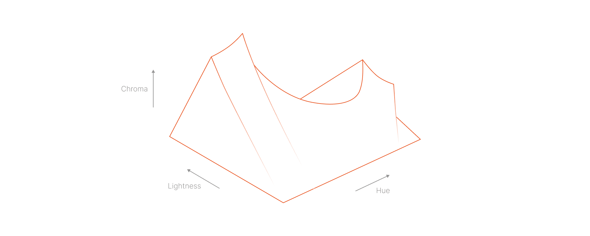
Perceptually uniform color spaces support human perception, not computers. While RGB’s are consistent in how a color displays on a monitor, PUCs are consistent with how we actually see the color. As a result, their 3D shapes are not perfect geometric shapes, such as the one from Oklch (pictured above). Shocker!
This property of perceptually uniform color spaces, which aligns more closely with actual human color perception, holds enormous potential for UI design and the wider design spectrum. For example, it’s much easier to create color palettes in which the brightness of different colors appears more uniform in the same “gradation”. This potential fascinated me, so I took a deeper dive into perceptually uniform color spaces and human perception of colors and contrasts in general.
How humans perceive contrast
One of the things I learned during my research was the shortcomings of the contrast algorithm currently recommended in the WCAG guidelines, a recommendation based on the ISO-9241-3 standard. The author of APCA, myndex, does an excellent job of documenting the shortcomings of WCAG.
Essentially, WCAG produces both false positives and false negatives when it evaluates contrast between two colors. Meaning, WCAG approvals aren’t necessarily accessible because some combinations with high contrast fail and some with low contrast pass. APCA is a contrast algorithm that is more closely aligned with human contrast perception and is therefore much better at evaluating contrast than WCAG.

At that time, I also was going to start creating a new color palette for Canonical’s design system. So I expanded my research to include how different color spaces and contrast algorithms can be used to create color palettes. In this context, I also read another article by Matthew Ström on color generation, titled “How to Generate Color Palettes for Design Systems.” This article was one of the most important sources of inspiration for my further work and this blog post; In particular, Ström’s principle of using contrasts to determine color gradations, which made me wonder whether it could be developed further.
Generating color palettes for design systems…
To support my work creating a new color palette for Canonical’s design system, I also researched how color spaces and contrast algorithms can be used to make color palettes. In his article Ström explores combining contrast algorithms and perceptually uniform color spaces to generate color palettes.
Contrast is one of the most important aspects of working with color in user interfaces (and other media). There must be sufficient contrast between two colors so that people can distinguish between them. Ström believes that contrast should determine the gradation between colors in a palette. Applied to Ström’s palette, this means that every pair of colors with a distance of 500 will have the WCAG mandated contrast ratio of 4.5:1.

In a color palette where the contrast between two shades is consistent, it’s easy to choose accessible color pairs. Choose any two shades in the palette that are a certain distance apart, and you’ve got an accessible color pair. You no longer need to manually check all color combinations in your user interface. In an internal survey of designers at Canonical, we found that selecting accessible color pairs is an important concern for designers. Therefore, a color palette in which it is easy to select accessible color pairs seemed ideal for us.
… inspired by APCA!
Matthew Ström used the WCAG algorithm in his blog post to good effect, but as mentioned earlier, the WCAG contrast algorithm has its drawbacks. I was curious to see if it would be possible to follow the same principle (basing color palette gradation on contrast) but replace the WCAG algorithm with a perceptual contrast algorithm; in fact, even Ström mentioned in his article that it would be an interesting experiment. I found the idea of trying it with perceptual contrast exciting and began to investigate its feasibility.
So began my journey to create a color palette inspired by APCA contrast algorithm principles.
 The APCA formula
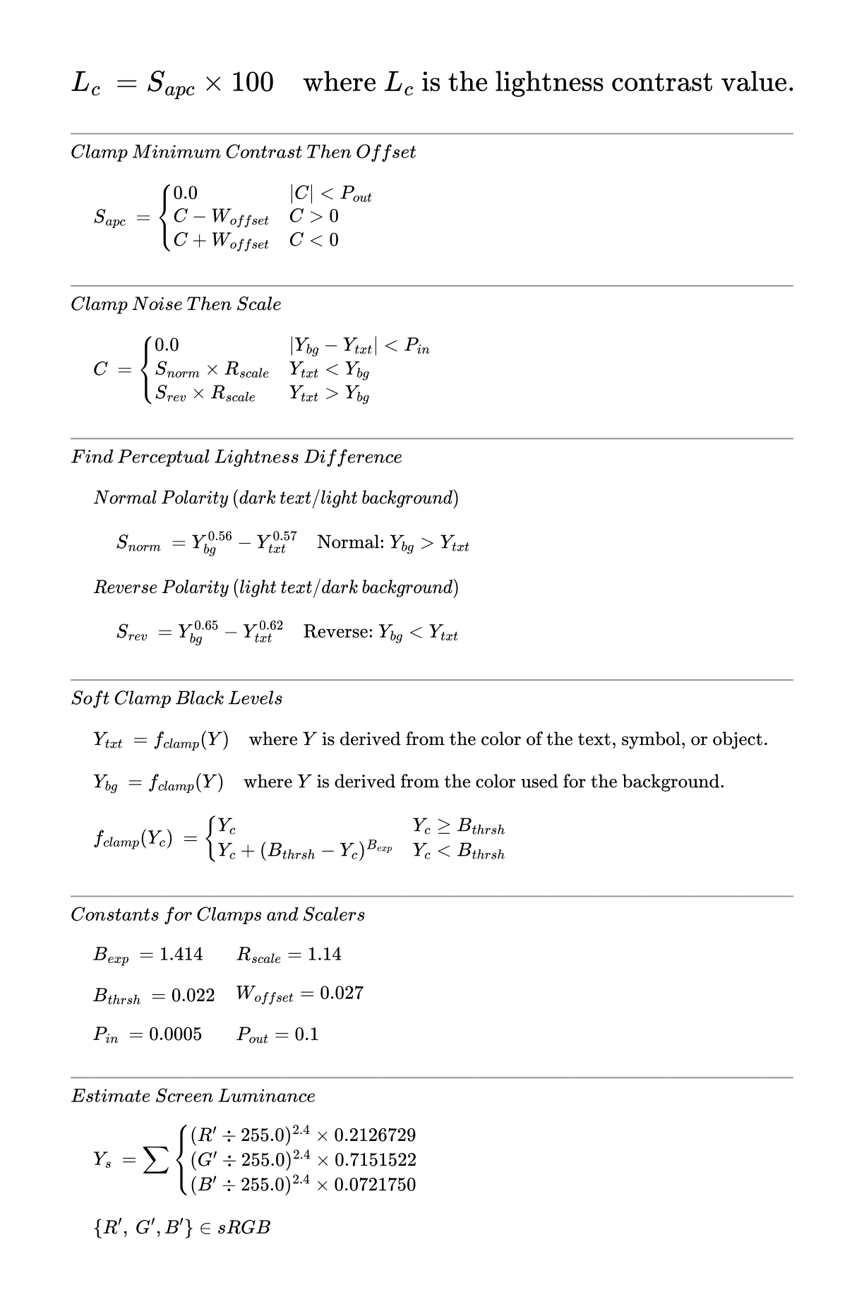
First, I had to create a reverse perceptual contrast algorithm. APCA takes two colors and outputs a number between -108 and 106 (where 0 is low contrast and the extreme values are high contrast) to indicate how contrasting the color pair is. Reversing the algorithm means restructuring it so that we can specify a color and a desired contrast ratio to the algorithm, and it returns a color that meets those criteria. Due to its complexity, reversing a perceptual contrast algorithm was much harder than reversing the WCAG algorithm.
I knew that the apca-w3 package already had a “reverse APCA” function. Originally, I thought I would have to go beyond the capabilities of this function (it can only perform the reversal with grayscale colors). As a side project during a climbing trip with friends, I therefore tried to sketch out the reversal of the APCA algorithm on a napkin myself (with the help of a physicist friend, as I’m not that good at math myself).

Much of the APCA algorithm’s complexity stems from the fact that there are four possible cases and the equation looks different depending on the case. The four cases we need to consider for our inverse algorithm are the polarity (is the text lighter than the background) and which of the two variables we want to solve for (text or background).
So for the inverse algorithm, we need to consider four cases:
- Case 1: Light text on a dark background, solving for text
- Case 2: Dark text on light background, solving for text
- Case 3: Light text on dark background, solving for background
- Case 4: Dark text on light background, solving for background
I will show my process for the first case. The process for the other cases is basically the same, but different substitutions and signs must be used depending on the case.
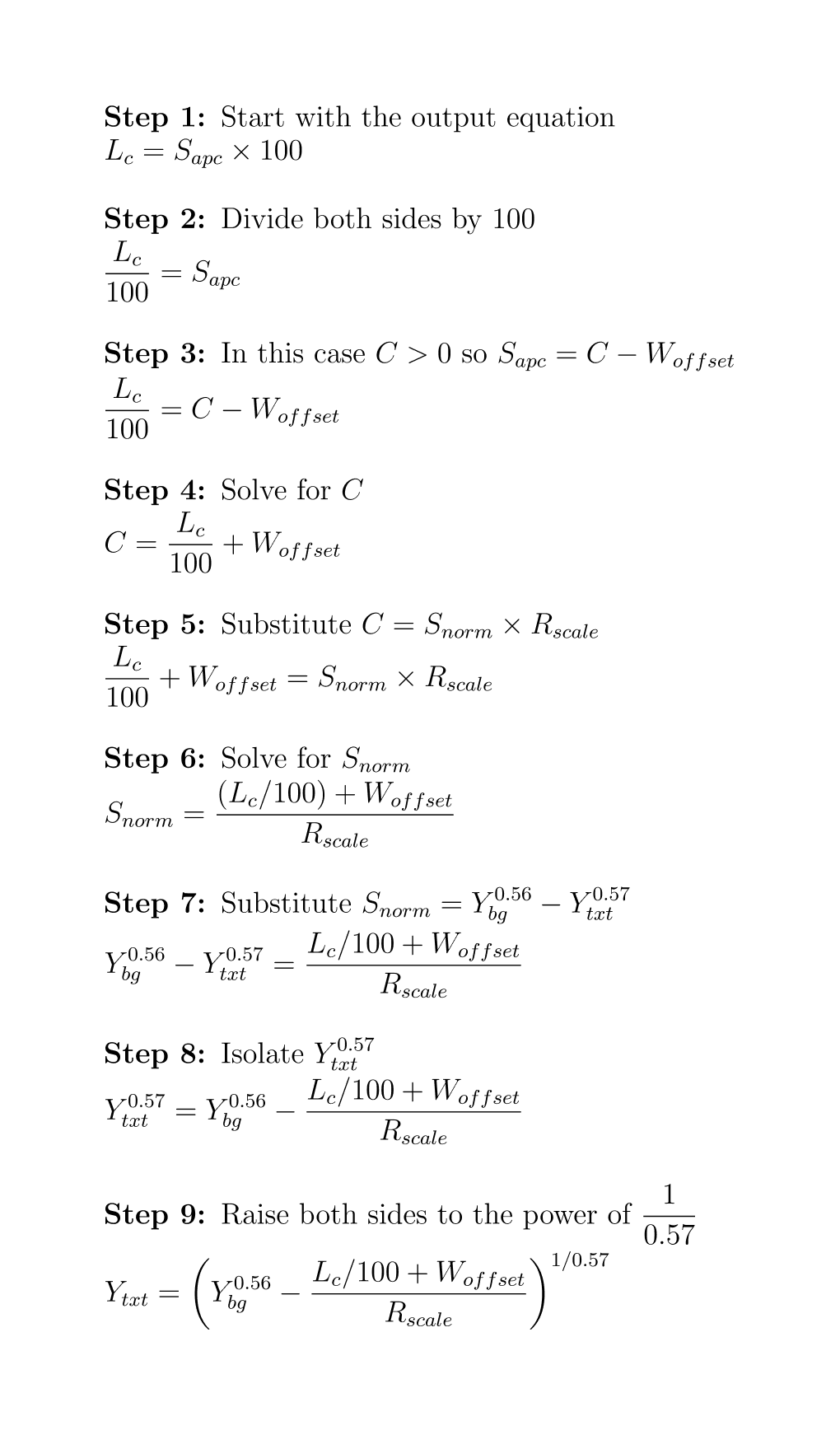
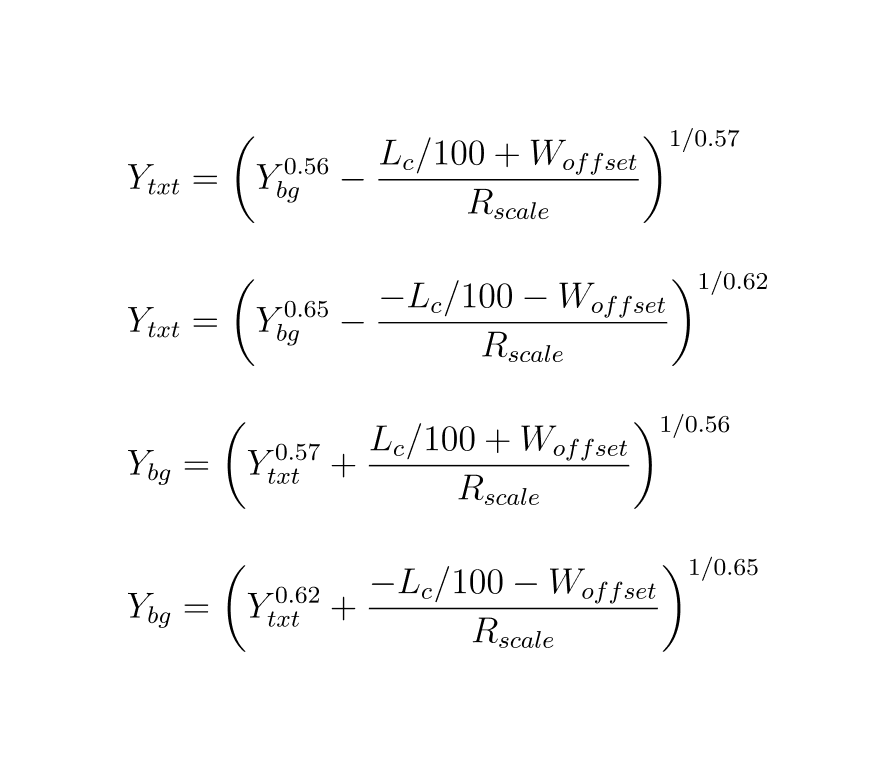
Repeating the same process for the other cases we get the following 4 equations for our 4 cases:
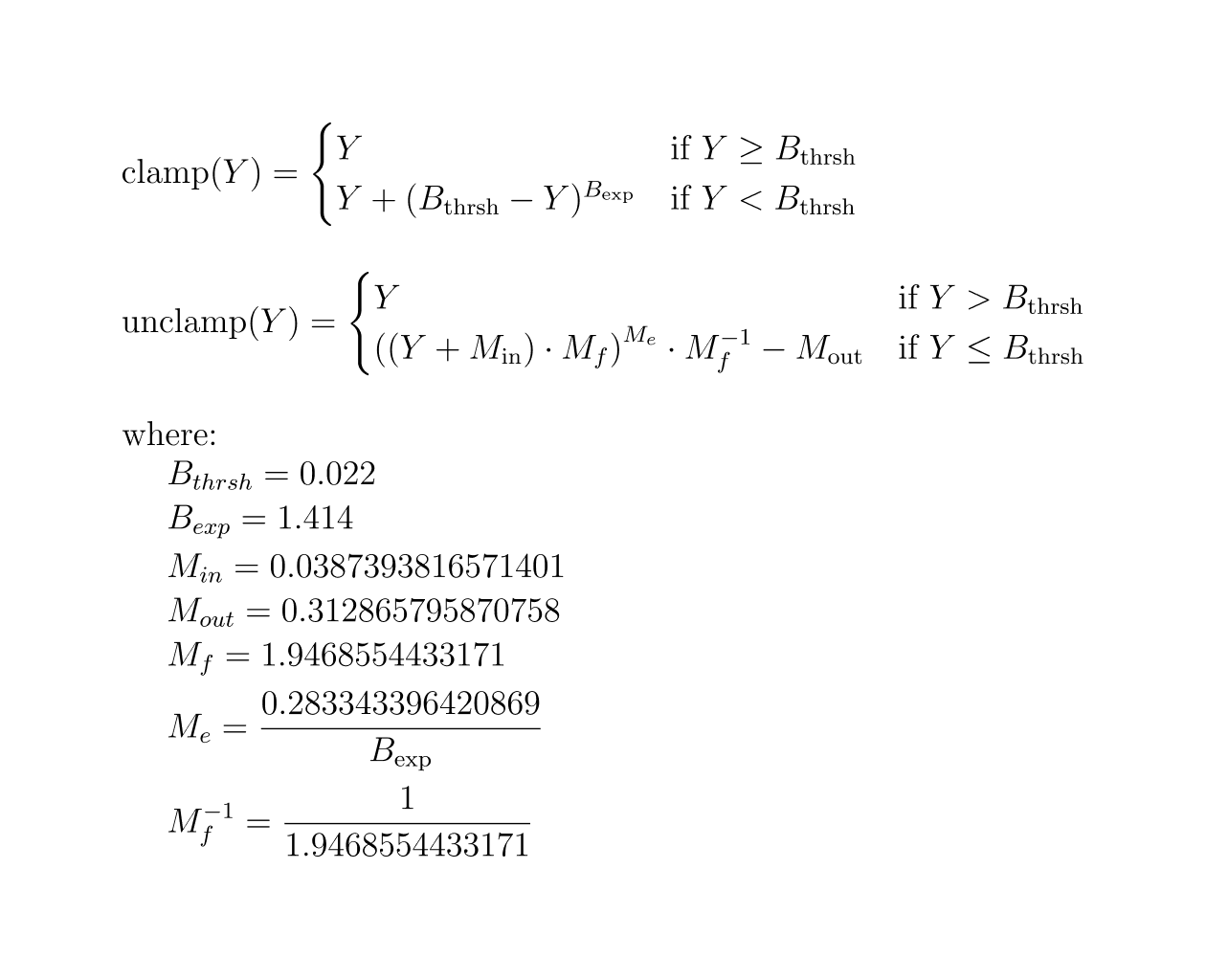
Finally, in APCA, all input Y values must be clamped, and the Y value returned as the output of the inverse function must be unclamped. The two functions for clamping and unclamping Y are as follows:
After completing all the scary calculations, I was ready to translate it all into code. In doing so, I realized that I had only determined the required Y component (in the XYZ color space) of a color with the correct contrast value distance, but not a full color. So, the formula is essentially capable of determining a grayscale color that has the correct contrast distance to the input color – exactly what the existing reverse APCA function can do 😅.
I took another look at Ström’s article and realized that the Y component was actually all I needed to generate the palettes. So I could have just used the function available in the apca-w3 package… So if you are considering a similar project, you can save yourself (and your physicist friends) the napkin calculations and either use the existing reverseAPCA() function in the apca-w3 package or my code below.
I still thought it was a good learning experience to reverse it myself, and since apca-w3 is not completely open source (it doesn’t have a standard open source license), I also thought it would be nice to have an implementation of the reverse algorithm with a truly open source license. I’m not sure if what I did is compatible with the APCA trademark license, so I’ll refrain from claiming that my result is APCA-compliant. The code for my inverse perceptual contrast finder, inspired by APCA algorithm principles, is as follows:
/**
* Constants used in perceptual contrast calculations
* Inspired by the formula found at https://github.com/Myndex/apca-w3/blob/c012257167d822f91bc417120bdb82e1b854b4a4/src/apca-w3.js#L146
*/

const PERCEPTUAL_CONTRAST_CONSTANTS: {
BLACK_THRESHOLD: number
BLACK_CLAMP: number
OFFSET: number
SCALE: number
MAGIC_OFFSET_IN: number
MAGIC_OFFSET_OUT: number
MAGIC_FACTOR: number
MAGIC_EXPONENT: number
MACIG_FACTOR_INVERSE: number
} = {
BLACK_THRESHOLD: 0.022,
BLACK_CLAMP: 1.414,
OFFSET: 0.027,
SCALE: 1.14,
MAGIC_OFFSET_IN: 0.0387393816571401,
MAGIC_OFFSET_OUT: 0.312865795870758,
MAGIC_FACTOR: 1.9468554433171,
MAGIC_EXPONENT: 0.283343396420869 / 1.414,
MACIG_FACTOR_INVERSE: 1 / 1.9468554433171,
}

/**
* Removes clamping from near-black colors to restore original values
* Inspired by the formula found at: https://github.com/Myndex/apca-w3/blob/c012257167d822f91bc417120bdb82e1b854b4a4/src/apca-w3.js#L403
* @param y - The clamped luminance value to be unclamped
* @returns The unclamped luminance value
*/
function unclampY(y: number): number {
return y > PERCEPTUAL_CONTRAST_CONSTANTS.BLACK_THRESHOLD
? y
: Math.pow(
(y + PERCEPTUAL_CONTRAST_CONSTANTS.MAGIC_OFFSET_IN) *
PERCEPTUAL_CONTRAST_CONSTANTS.MAGIC_FACTOR,
PERCEPTUAL_CONTRAST_CONSTANTS.MAGIC_EXPONENT
) *
PERCEPTUAL_CONTRAST_CONSTANTS.MACIG_FACTOR_INVERSE -
PERCEPTUAL_CONTRAST_CONSTANTS.MAGIC_OFFSET_OUT
}

/**
* Applies clamping to near-black colors to prevent contrast calculation issues
* Inspired by the formula found at: https://github.com/Myndex/apca-w3/blob/c012257167d822f91bc417120bdb82e1b854b4a4/src/apca-w3.js#L381
* @param y - The luminance value to be clamped
* @returns The clamped luminance value
*/
function clampY(y: number): number {
return y >= PERCEPTUAL_CONTRAST_CONSTANTS.BLACK_THRESHOLD
? y
: y +
Math.pow(
PERCEPTUAL_CONTRAST_CONSTANTS.BLACK_THRESHOLD - y,
PERCEPTUAL_CONTRAST_CONSTANTS.BLACK_CLAMP
)
}

/**
* Reverses perceptual contrast calculations to find a matching luminance
* Inspired by the formula found at: https://github.com/Myndex/apca-w3/blob/c012257167d822f91bc417120bdb82e1b854b4a4/images/APCAw3_0.1.17_APCA0.0.98G.svg
* @param contrast - Target contrast value (between 5 and 106.04066)
* @param y - Known luminance value (between 0 and 1)
* @param bgIsDarker - Whether the background is darker than the text
* @param lookingFor - What we're solving for: "txt" (text color) or "bg" (background color)
* @returns The calculated luminance value, or false if no valid solution exists
*/
export function reversePerceptualContrast(
contrast: number = 75, // Default contrast of 75
y: number = 1, // Default luminance of 1
bgIsDarker: boolean = false, // Default assumes background is lighter
lookingFor: "txt" | "bg" = "txt" // Default solves for text color
): number | false {
contrast = Math.abs(contrast)
let output: number | undefined

if (!(y > 0 && y <= 1)) {
console.log("y is not a valid value (y > 0 && y <= 1)")
return false
}

if (!(contrast >= 5 && contrast <= 106.04066)) {
console.log(
"contrast is not a valid value (contrast >= 5 && contrast <= 106.04066)"
)
return false
}

// Apply clamping to input luminance
y = clampY(y)

// Calculate output luminance based on what we're looking for and background darkness
// You could do these calculations here more DRY, but I find that it is easier to
// understand the derivation from the original calculation with the if statements.

if (lookingFor === "txt") {
if (bgIsDarker) {
// For light text on dark background
output =
(y ** 0.65 -
(-contrast / 100 - PERCEPTUAL_CONTRAST_CONSTANTS.OFFSET) *
(1 / PERCEPTUAL_CONTRAST_CONSTANTS.SCALE)) **
(1 / 0.62)
} else if (!bgIsDarker) {
// For dark text on light background
output =
(y ** 0.56 -
(contrast / 100 + PERCEPTUAL_CONTRAST_CONSTANTS.OFFSET) *
(1 / PERCEPTUAL_CONTRAST_CONSTANTS.SCALE)) **
(1 / 0.57)
}
} else if (lookingFor === "bg") {
if (bgIsDarker) {
// For dark background with light text
output =
(y ** 0.62 +
(-contrast / 100 - PERCEPTUAL_CONTRAST_CONSTANTS.OFFSET) *
(1 / PERCEPTUAL_CONTRAST_CONSTANTS.SCALE)) **
(1 / 0.65)
} else if (!bgIsDarker) {
// For light background with dark text
output =
(y ** 0.57 +
(contrast / 100 + PERCEPTUAL_CONTRAST_CONSTANTS.OFFSET) *
(1 / PERCEPTUAL_CONTRAST_CONSTANTS.SCALE)) **
(1 / 0.56)
}
}

// Unclamp the output value if valid
if (output !== undefined && !isNaN(output)) {
output = unclampY(output)
}

// Validate final output
if (
output === undefined ||
isNaN(output) ||
!(output > 0 && output <= 1)
) {
console.log("A color with the specifications does not exist")
return false
} else {
return output
}
}
After performing the perceptual contrast inversion, all I had to do was combine my code for reverse perceptual contrast with Ström’s code:
import Color from "colorjs.io"

/**
* Converts OKHSl color to sRGB array
* @param {OkHSL} hsl - Array containing [hue, saturation, lightness]
*   hue: number (0-360) - The hue angle in degrees
*   saturation: number (0-1) - The saturation value
*   lightness: number (0-1) - The lightness value
* @returns {[number, number, number]} sRGB array [r, g, b] in 0-255 range
*/
export function okhslToSrgb(
hsl: [number, number, number],
): [number, number, number] {
// Create new color in OKHSl space
let c = new Color("okhsl", hsl)
// Convert to sRGB color space
c = c.to("srgb")

return [c.srgb[0] * 255, c.srgb[1] * 255, c.srgb[2] * 255]
}

/**
* Converts Y (luminance) value to OKHSL lightness
* Inspired by the formula found at https://github.com/Myndex/apca-w3/blob/c012257167d822f91bc417120bdb82e1b854b4a4/src/apca-w3.js#L418
* @param {number} y - Linear luminance value (0-1)
* @returns {number} OKHSL lightness value (0-1)
*/
export function yToOkhslLightness(y: number): number {
const srgbComponent = y ** (1 / 2.4)
const c = new Color("srgb", [srgbComponent, srgbComponent, srgbComponent])
return c.okhsl[2]
}

/**
* Color scale object with hex color values keyed by scale number
*/
interface ColorScale {
[step: number]: [number, number, number]
}

/**
* Compensates for the Bezold-Brücke effect where colors appear more purplish in shadows
* and more yellowish in highlights by shifting the hue up to 5 degrees
* Derived from https://mattstromawn.com/writing/generating-color-palettes/#putting-it-all-together%3A-all-the-code-you-need
* Copyright (c) 2025 Matthew Ström-Awn
* Licensed under MIT. See LICENSE file.
* @param step - Scale step value (0-1000)
* @param baseHue - Starting hue in degrees (0-360)
* @returns Adjusted hue value
* @throws If parameters are invalid
*/
function computeHue(step: number, baseHue: number): number {
// Normalize step from 0-1000 range to 0-1
const normalizedStep = step / 1000

// Validate normalizedStep is between 0 and 1
if (normalizedStep < 0 || normalizedStep > 1) {
throw new Error("step must produce a normalized value between 0 and 1")
}

// Validate baseHue is between 0 and 360
if (baseHue < 0 || baseHue > 360) {
throw new Error("baseHue must be a number between 0 and 360")
}

if (baseHue === 0) {
return baseHue
}

return baseHue + 5 * (1 - normalizedStep)
}

/**
* Creates a parabolic function for chroma/saturation that peaks at middle values
* This ensures colors are most vibrant in the middle of the scale while being
* more subtle at the extremes
* Derived from https://mattstromawn.com/writing/generating-color-palettes/#putting-it-all-together%3A-all-the-code-you-need
* Copyright (c) 2025 Matthew Ström-Awn
* Licensed under MIT. See LICENSE file.
* @param step - Scale step value (0-1000)
* @param minChroma - Minimum chroma/saturation value (0-1)
* @param maxChroma - Maximum chroma/saturation value (0-1)
* @returns Calculated chroma value
* @throws If parameters are invalid
*/
function computeChroma(
step: number,
minChroma: number,
maxChroma: number,
): number {
const normalizedStep = step / 1000

// Validate normalizedStep is between 0 and 1
if (normalizedStep < 0 || normalizedStep > 1) {
throw new Error("step must produce a normalized value between 0 and 1")
}

// Validate chroma values are between 0 and 1 and properly ordered
if (minChroma < 0 || minChroma > 1 || maxChroma < 0 || maxChroma > 1) {
throw new Error("Chroma values must be numbers between 0 and 1")
}
if (minChroma > maxChroma) {
throw new Error("minChroma must be less than or equal to maxChroma")
}

const chromaDifference = maxChroma - minChroma
return (
-4 * chromaDifference * Math.pow(normalizedStep, 2) +
4 * chromaDifference * normalizedStep +
minChroma
)
}

/**
* Computes OKHSL lightness from a target contrast step using perceptual contrast
* Derived from https://mattstromawn.com/writing/generating-color-palettes/#putting-it-all-together%3A-all-the-code-you-need
* Copyright (c) 2025 Matthew Ström-Awn
* Licensed under MIT. See LICENSE file.
* @param step - Scale step value (0-1000)
* @returns OKHSL lightness value (0-1)
* @throws If target luminance cannot be calculated
*/
function computeLightness(step: number): number {
// Clip values below minimum threshold to full lightness (white)
if (step < 50) {
return 1
}

// Rescale 50-999 to perceptual contrast's 5-106.04066 range
const perceptualContrast = 5 + ((step - 50) * (106.04066 - 5)) / (1000 - 50)

const targetLuminance = reversePerceptualContrast(
perceptualContrast,
1,
false,
"txt",
)

if (targetLuminance === false) {
throw new Error(
`Problem calculating the target luminance for step ${step}`,
)
}

return yToOkhslLightness(targetLuminance)
}

/**
* Options for generating a color scale
*/
export interface GenerateColorScaleOptions {
/** Base hue in degrees (0-360) */
baseHue: number
/** Minimum chroma/saturation (0-1) */
minChroma: number
/** Maximum chroma/saturation (0-1) */
maxChroma: number
/** Array of scale values to generate (integer values between 0-1000) */
steps: number[]
}

/**
* Generates a complete color scale with accessible contrast levels
* @param options - Configuration object for color scale generation
* @returns Scale object with color srgb values keyed by scale number
*/
export function generateColorScale(
options: GenerateColorScaleOptions,
): ColorScale {
const { baseHue, minChroma, maxChroma, steps } = options

if (baseHue < 0 || baseHue > 360) {
throw new Error("baseHue must be a number between 0 and 360")
}

if (minChroma < 0 || minChroma > 1 || maxChroma < 0 || maxChroma > 1) {
throw new Error("Chroma values must be numbers between 0 and 1")
}

if (minChroma > maxChroma) {
throw new Error("minChroma must be less than or equal to maxChroma")
}

if (
steps.some((step) => step < 0 || step > 1000 || !Number.isInteger(step))
) {
throw new Error("All steps must be integers between 0 and 1000")
}

// Generate the color scale using map and reduce
return steps.reduce((scale, step) => {
const h = computeHue(step, baseHue)
const s = computeChroma(step, minChroma, maxChroma)
const l = computeLightness(step)

const srgb = okhslToSrgb([h, s, l])

return { ...scale, [step]: srgb }
}, {})
}
And just like that, we can generate a color palette with predictable perceptual contrast based shades:
| Shade | Gray | Blue | Green | Red | Yellow |
|---|---|---|---|---|---|
| 0 | #fff | #fff | #fff | #fff | #fff |
| 10 | #e9e9e9 | #e4eaf4 | #dfeee1 | #f4e6e4 | #f2e8dc |
| 20 | #d7d7d7 | #c7d9f5 | #a9eab2 | #f5ccc7 | #f3d1a9 |
| 30 | #c4c4c4 | #a5c6fa | #66e37e | #faaea5 | #f7b666 |
| 40 | #b1b1b1 | #81b2fe | #32d25b | #fd8c81 | #f09c1b |
| 50 | #9c9c9c | #5a9cff | #00bd43 | #ff5f58 | #d88900 |
| 60 | #878787 | #3083f8 | #2ba142 | #f32c34 | #bb7608 |
| 70 | #707070 | #2a6ecb | #3b8343 | #c13938 | #9a6317 |
| 80 | #585858 | #2e5892 | #38643a | #8c3a37 | #754f23 |
| 90 | #3c3c3c | #2c3d56 | #2f422f | #543230 | #4b3926 |
| 100 | #000 | #000 | #000 | #000 | #000 |
You can find the entire code in a Github repository. I mentioned that I did all this work in preparation for developing a new color palette for Canonical’s design system. But in the end, we decided (for good reasons) to go with the WCAG-based approach, which I will write about in my next blog post. So stay tuned 🙂