- 18 Oct, 2025 *
Introduction
This blog post outlines a first attempt to forecast hourly solar power generation in Germany for June 2025. This is a highly condensed version of the project described in this git repository, where the whole process is presented in detail in a series of quarto notebooks.
Data Overview
We have two main datasets: one with hourly solar power generation observations and another with atmospheric data from weather forecasts. After merging them, we have a single dataset indexed by time, from the beginning of 2022 to the end of May 2025. The data is clean, with no missing values, variables are aggregated based on solar power plant geolocations weighted by their installed capacity. I did not produce the data. …
- 18 Oct, 2025 *
Introduction
This blog post outlines a first attempt to forecast hourly solar power generation in Germany for June 2025. This is a highly condensed version of the project described in this git repository, where the whole process is presented in detail in a series of quarto notebooks.
Data Overview
We have two main datasets: one with hourly solar power generation observations and another with atmospheric data from weather forecasts. After merging them, we have a single dataset indexed by time, from the beginning of 2022 to the end of May 2025. The data is clean, with no missing values, variables are aggregated based on solar power plant geolocations weighted by their installed capacity. I did not produce the data.
Variables provided include:
DateTime (Hourly timestamp in UTC)
Global horizontal irradiance in (W/m²)
Temperature at 2m height (°C)
Total cloud cover (%)
Total precipitation (mm)
Snow depth (mm)
Wind speed at 10m height (m/s)
Wind speed at 100m height (m/s)
Feels-like temperature (°C)
Relative humidity at 2m height (%)
Solar power generation (MWh)
A quick look at the entire time series of power generation shows a clear seasonal pattern, with more power generated in the summer than in the winter.
import pandas as pd
import matplotlib.pyplot as plt
import seaborn as sns

# Load and merge data
solar_obs = pd.read_csv("../data/germany_solar_observation_q1.csv", parse_dates=['DateTime'])
atm_features = pd.read_csv("../data/germany_atm_features_q1.csv", parse_dates=['DateTime'])
data = pd.merge(solar_obs, atm_features, on="DateTime", how="inner")
data = data.set_index('DateTime').sort_index()

# Plot
fig, ax = plt.subplots(figsize=(15, 6))
data['power'].plot(ax=ax, title='Hourly Solar Power Generation in Germany (2022-2025)')
ax.set_ylabel('Power (MWh)')
ax.set_xlabel('Date')
ax.grid(True, which='both', linestyle='--', linewidth=0.5)
plt.show()
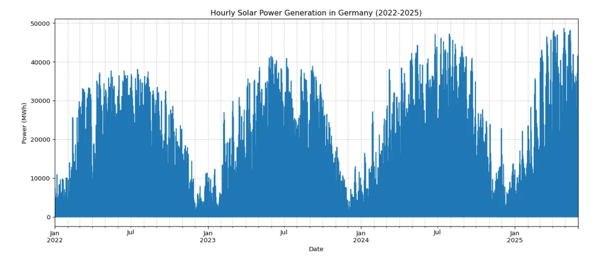
The plot also shows that the peak generation in summer seems to increase each year. This suggests that the total installed solar capacity in Germany is growing. This is an important point to keep in mind.
Key Relationships
The most important factors for solar power generation are related to the sun’s position and the weather.
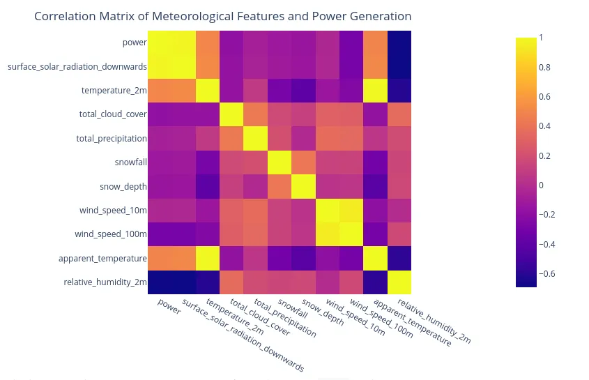
A correlation analysis shows that surface_solar_radiation_downwards has a very strong positive correlation (+0.92) with power generation, while total_cloud_cover has a strong negative correlation (-0.60). This is expected: more sun and fewer clouds mean more power.
A Simple Forecasting Model
Based on the initial data exploration, we can build a forecasting model. This first version will focus on the most direct relationships found in the data.
Feature Engineering
To build the model, we need to create features from the data. These features will be the inputs to our model. We can create several types of features:
- Temporal Features: Hour of the day, day of the year, and month. These are encoded cyclically (using sine and cosine) to represent their circular nature.
- Solar Position: We can calculate the sun’s position in the sky using features like solar elevation and air mass. This is more accurate than just using the time of day.
- Interaction Features: We can combine weather variables with solar position. For example,
clear_sky_indexis created by multiplying solar radiation by(1 - total_cloud_cover).
A key part of our feature engineering is to accurately model the sun’s position. We do this with a function that calculates several astronomical angles. The code snippet below shows how this is done.
import numpy as np

def calculate_solar_position(df: pd.DataFrame, latitude: float = 51.5) -> pd.DataFrame:
df = df.copy()
df['hour'] = df.index.hour
df['day_of_year'] = df.index.dayofyear

# Solar Declination
df['declination'] = 23.45 * np.sin(np.radians(360 * (284 + df['day_of_year']) / 365))

# Hour Angle
df['hour_angle'] = 15 * (df['hour'] - 12)

# Solar Elevation
elevation_rad = np.arcsin(
np.sin(np.radians(df['declination'])) * np.sin(np.radians(latitude)) +
np.cos(np.radians(df['declination'])) * np.cos(np.radians(latitude)) *
np.cos(np.radians(df['hour_angle']))
)
df['solar_elevation'] = np.degrees(elevation_rad)
df['solar_elevation'] = np.maximum(0, df['solar_elevation'])

return df

data = calculate_solar_position(data)
How the Solar Position Calculation Works
The code above might look complex, so let’s break it down.
Solar Declination: df['declination']
- This calculates the sun’s angle relative to the plane of the Earth’s equator, which is the cause of our seasons. It varies from +23.45° in summer to -23.45° in winter. The formula uses a sine wave to model this yearly cycle. The
23.45is the Earth’s axial tilt, and the rest of the expression(360 * (284 + df['day_of_year']) / 365)determines the exact point in the yearly cycle.
Hour Angle: df['hour_angle'] = 15 * (df['hour'] - 12)
- This measures how far the sun is from its highest point in the sky (solar noon). The Earth rotates 15 degrees per hour (
360 / 24). This formula calculates the angle of the sun east or west of the local meridian based on the hour of the day.
Solar Elevation: elevation_rad = np.arcsin(...)
- This is the main formula that calculates how high the sun is above the horizon. It combines the
declination, thelatitudeof the location (51.5° for Germany), and thehour_angle. - The final line,
np.maximum(0, df['solar_elevation']), is important because a negative elevation means the sun is below the horizon. We set these values to 0, as there is no solar power at night.
By calculating these features, we give the model a much more physically accurate understanding of the sun’s potential to generate power than just using the hour of the day.
Modeling with LightGBM
For this task, we use a machine learning model called LightGBM, which is a type of gradient boosting model. It is fast and performs well on tabular data like ours. We use a technique called quantile regression, which allows us to not only predict a single value but also a range of likely values (a prediction interval). This gives us a probabilistic forecast.
The model is trained on the historical data from 2022 to early 2025. We then use it to predict the solar power generation for June 2025. Details of the training and prediction process can be found in this rendered Quarto notebook.
The model produces a forecast for June 2025. We can visualize the forecast to see how it looks. The plot below shows the median forecast along with 50% and 90% prediction interval. The second plot shows a more detailed view of the first week of June with an 80 % prediction interval.
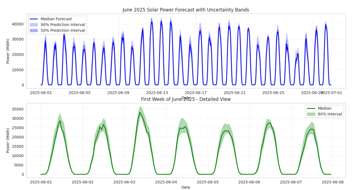
The “prediction intervals” are there to show the uncertainty in the forecast.
Here’s what it means in simple terms:
A Forecast is Never Perfect: A model gives us a best guess (the “median forecast” line), but it can’t be 100% certain. Weather is unpredictable, and other small factors can influence the outcome. 1.
Predicting a Range, Not a Single Number: The prediction interval provides a range of likely values, not just a single number. The shaded blue area on the chart represents this range. 1.
What “90%” Means: It’s a statement of confidence. A 90% prediction interval means: “We expect the actual solar power generation to fall within this shaded blue range 90% of the time.”
This also implies there’s a 10% chance the real value will fall outside the range (5% chance of being below the bottom edge and 5% chance of being above the top edge).
Why is this useful to illustrate?
It visualizes the model’s confidence.
When the interval is narrow: The model is very confident. For example, at night, the interval is very tight around zero because the model is certain there will be no solar power.
When the interval is wide: The model is less confident. This often happens during the middle of the day when weather conditions (like scattered clouds) could cause the actual power output to vary significantly.
For a practical user, like an energy grid operator, this is critical. It helps them understand the potential risk and plan for a range of scenarios, not just a single predicted outcome.
A Critical Shortcoming
While this model captures the daily and seasonal patterns, it has a significant flaw. Remember the upward trend we saw in the data (ie, the upward trend in the first plot)? This model does not explicitly account for the growth in solar capacity. It is trained on data from 2022-2025, so its predictions for June 2025 will be based on the average capacity over that period.
Because new solar panels are being installed all the time, the capacity in June 2025 will be higher than the average of the past years. As a result, this model will likely underestimate the actual power generation. I will address this issue on my next post.