Oct 29, 2007
The Menu bar: Transparently awful
Whoever gave the go-ahead on adding transparencies to everything menu-related needs to get run over by a train. It’s distracting and focuses your attention away from the text of the menu. This is a double whammy, considering you’ve already been distracted from an application’s window the menu. To make this less transparent is just downright cruel. It’s like they took the worst feature from Vista’s UI, gave it some rounded corners, and vomited it straight to your desktop.
Context menus are no better:
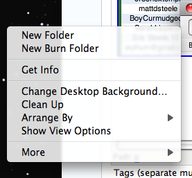
Thanks for splitting my menu in half, jackass.
The New Dock : Let’s get busy
I don’t care so much abo…
Oct 29, 2007
The Menu bar: Transparently awful
Whoever gave the go-ahead on adding transparencies to everything menu-related needs to get run over by a train. It’s distracting and focuses your attention away from the text of the menu. This is a double whammy, considering you’ve already been distracted from an application’s window the menu. To make this less transparent is just downright cruel. It’s like they took the worst feature from Vista’s UI, gave it some rounded corners, and vomited it straight to your desktop.
Context menus are no better:
Thanks for splitting my menu in half, jackass.
The New Dock : Let’s get busy
I don’t care so much about the “Shelf” vs “Dock” sound and fury that’s been circling the web lately, but the screen reflections around the application’s icons are super distracting:

If that horizontal line slicing the dock background in half isn’t enough to grind your gears, then you are less likely than I to fly off the handle over UI changes. Really, how do you sleep at night?
The reflections under the icons are even worse, since they actively prevent you from seeing whether your application is in use. Was the little black triangle too usable, so they had to scale back my satisfaction?
At least Leopard gives me the tools with which to express my frustration: