Table of Contents
I know what you’re thinking: "ANOTHER blog post about redesigning the website?"
Yes. Another blog post about redesigning the website. I enjoy it, what can I say?
I wrote my latest post about redesigning from a monospace-driven, terminal-styled theme to a more natural paper-inspired theme. However, it left a nagging feeling that something was missing. What if I took it further? Was there really any reason that I had any of that CSS at all?
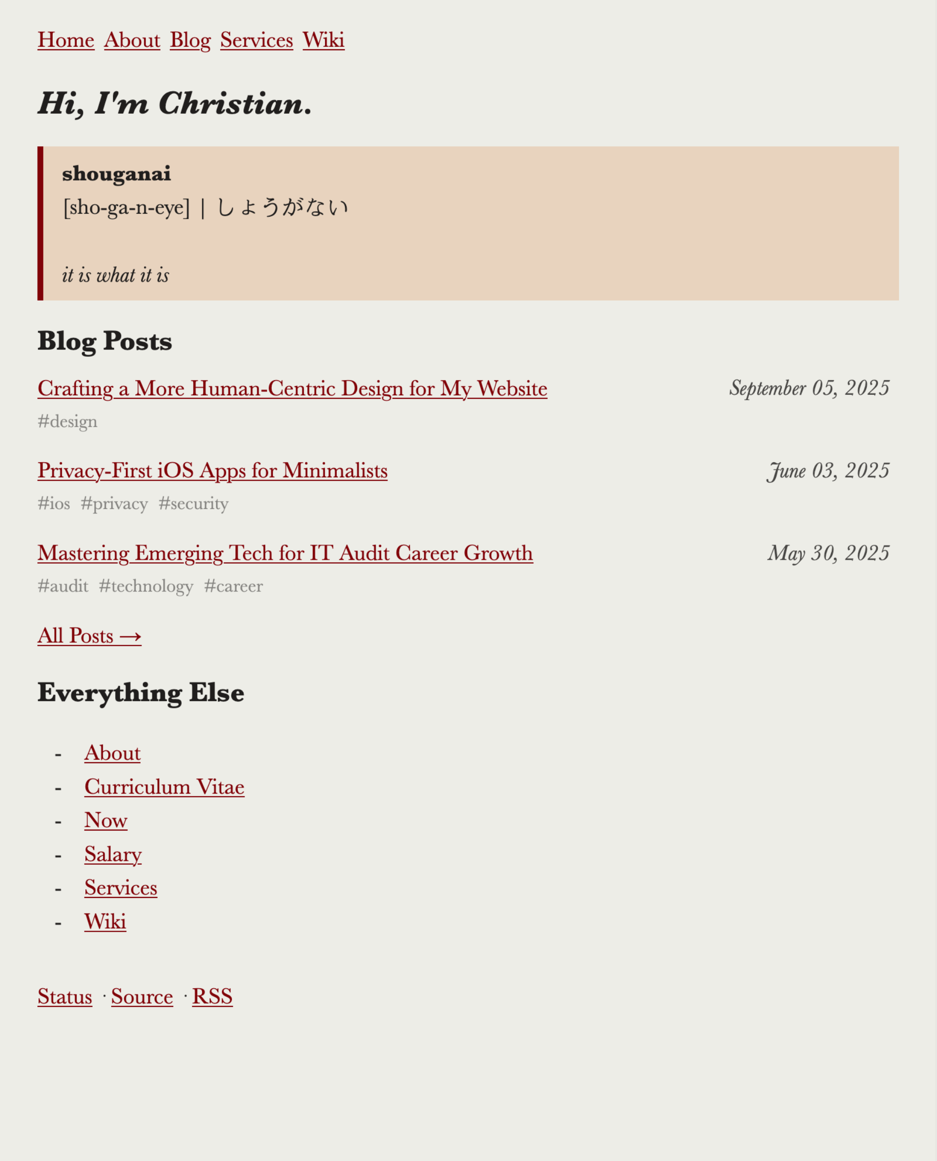
Figure 1: Old Theme
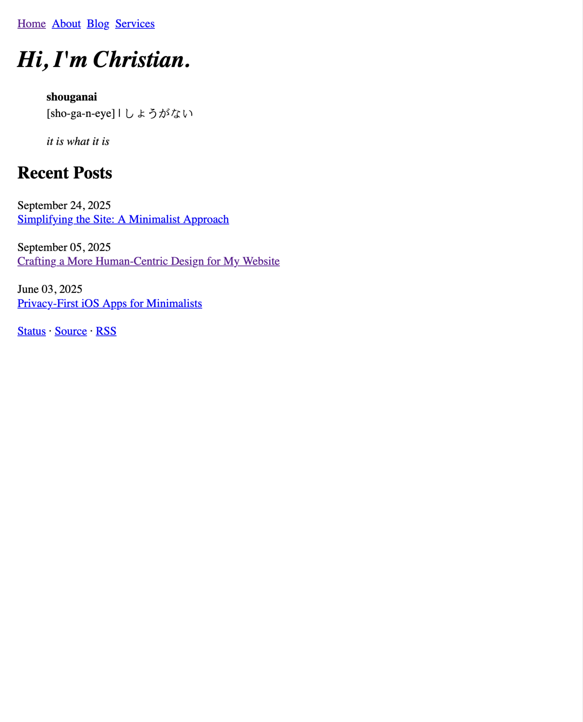
Figure 2: New Theme
1. Inspiration
I briefly touched on my inspiration in the last post (hint: wabi-sabi, sho ga nai, brutalism, minimalism), but I didn’t expand on the why for these concepts.
So, why? The minimalismtic approach to web design has resonated with me for a long time. But why minimalism?
Officially, "the concept of minimalist architecture is to strip everything down to its essential quality and achieve simplicity."
This is a blog. It also has pages dedicated to describing who I am and what I offer. Therefore, the essential quality is the information delivered by the words and the design on your screen. To effectively communicate this information, I tried to understand how online information is best read.
With all of that out of the way, let’s get on with it.
2. Core Changes
Below is a quick audit of the original style sheet and markup, and the elements I’ve removed or added. For more in-depth information, refer to the git diff.
HTML
- HTML is now minified
- File tags
- Links to site pages are moved from the
indexto theaboutpage - Wiki was removed entirely
- Added a few
<br>elements to compensate for some of the CSS removals
CSS
For the CSS, I removed everything, except the following rules.
body {
max-width: 50em;
margin: 1.5rem;
}

nav ul {
list-style-type: none;
display: flex;
padding: 0;
}

nav ul li {
margin-right: 0.5rem;
}

img {
border-style: none;
width: 100%;
}

table {
border: 1px solid #111;
border-collapse: collapse;
width: 100%;
}

pre,
pre>code,
code {
font-size: 0.9rem;
}

pre {
border: 1px solid #111;
margin: 0.5rem 0;
padding: 0.5rem;
overflow-x: auto;
}

time {
display: block;
}

:not(pre)>code {
color: #f00;
}

@media (prefers-color-scheme: dark) {
body {
background-color: #222;
color: #eee;
}

a {
color: #add8e6;
}

pre {
border-color: #eee;
}
}
That’s it. No framework, no vendor prefixes, no unnecessary selectors.