Hello players and fellow developers,
In this devlog, we’d like to share a behind-the-scenes look at the creative process, as well as the art direction and graphic design choices that shaped the development of ROSETTA PRIME. The goal is to give an overview of our team organization, explain our design methodology, and provide additional context for some visual decisions that may not be immediately explicit on screen. We’ll also talk about the tools used for graphic production.
This devlog complements those written by my friend Chroute, which focus on **[audio design](https://anternelab.itch.io/rosetta-prime/devlog/1154480/soundscape…
Hello players and fellow developers,
In this devlog, we’d like to share a behind-the-scenes look at the creative process, as well as the art direction and graphic design choices that shaped the development of ROSETTA PRIME. The goal is to give an overview of our team organization, explain our design methodology, and provide additional context for some visual decisions that may not be immediately explicit on screen. We’ll also talk about the tools used for graphic production.
This devlog complements those written by my friend Chroute, which focus on audio design and the more specific topic of parallax effects.
As a reminder, ROSETTA PRIME was developed over a period of roughly one month, as part of the 20sec JAM (November 2025).
1. Team, Context & Constraints
1.1 The team behind Rosetta Prime
ROSETTA PRIME was developed by Anterne Lab, a small team of 3 people, working in a fully amateur and passion-driven context. None of the team members come from a formal video game background: our paths include political and economic sciences, urban planning, landscape design and architectural visualization, and software development. Our approach to game development is therefore largely self-taught.
In terms of experience, ROSETTA PRIME is our second game jam project together, following Game Off 2024 (More than meets the I game). We approached this project with a measured level of ambition, focused on experimentation, learning, and the joy of making things, rather than on professional-scale production.
For the visual side of the project, I personally rely on tools and a visual culture rooted in architectural visualization, urbanism, and landscape design, which I adapted to the specific constraints of game development and a short game jam format.
1.2 Work organization and design methodology
The project was developed mostly remotely, with only two in-person meetings during the jam. These face-to-face sessions proved extremely valuable: they enabled smoother discussions, deeper debates, and, most importantly, helped us collectively make key design decisions. They complemented a more introspective individual workflow, where each team member generated ideas and material that were later shared and discussed.
Our working method is deliberately horizontal and organic. Overall game design, atmosphere, narrative, and mechanics were conceived in parallel rather than sequentially. All three of us contributed to the core design direction, while each person then took charge—again in parallel—of more technical or production-oriented tasks, depending on skills and availability at a given moment.
1.3 Time management and graphic production rhythm
At the start of the jam, we set up a light planning framework, updated regularly, to keep track of who was available, when, and at what level of involvement. This flexible structure helped us stay realistic without locking the process into something rigid.
For graphic production specifically, I organized my work around two complementary types of work sessions:
Short, regular sessions, about 1 to 2 hours per weekday, usually before going to work.
Longer, intensive sessions, around 3 hours during the first weekend, and then full days (approximately 8 to 12 hours) during the final two weekends.
Short sessions have a major advantage: they’re easier to start, encourage focus, and allow for distance and fresh perspective between sessions. This rhythm is particularly effective during research, visual exploration, and idea maturation phases.
Long sessions, on the other hand, are essential once an idea is clear and validated. They allow for deeper immersion and make it possible to push an image or a set of assets to completion without interruption.
Alternating between these two temporalities proved very effective within the tight constraints of a game jam.
2. Tools & Production Pipeline
2.1 Hand drawing as a thinking tool
First and foremost, my primary tool remains the hand, the pen, and tracing paper. Hand drawing is how I think, sketch ideas quickly, and write early narrative or conceptual notes, with no technical barrier between intention and representation.
Its main strength lies in its absolute simplicity: nothing stands between the idea and its expression. It’s also a very open and inclusive tool for team collaboration, accessible to a wide range of drawing skills and experience levels. In a collaborative context, this greatly facilitates discussion and idea sharing. Everyone on the team picked up a pencil at some point to sketch.
We shouldn’t be ashamed of our ugly drawings, as long as they help us think and communicate
2.2 Miro: a shared design space
To centralize our collective thinking, we used Miro as our main concept board. It allowed us to gather in one shared space:
- reference images,
- links to inspiring works,
- text notes, ideas, and hypotheses,
- diagrams and tables,
- hand-drawn sketches photographed and quickly uploaded.
Miro proved especially well suited for remote collaboration, while remaining just as relevant during in-person working sessions. Its intuitive and visual nature makes it an excellent tool for maintaining an overall vision of the project and tracking its evolution.
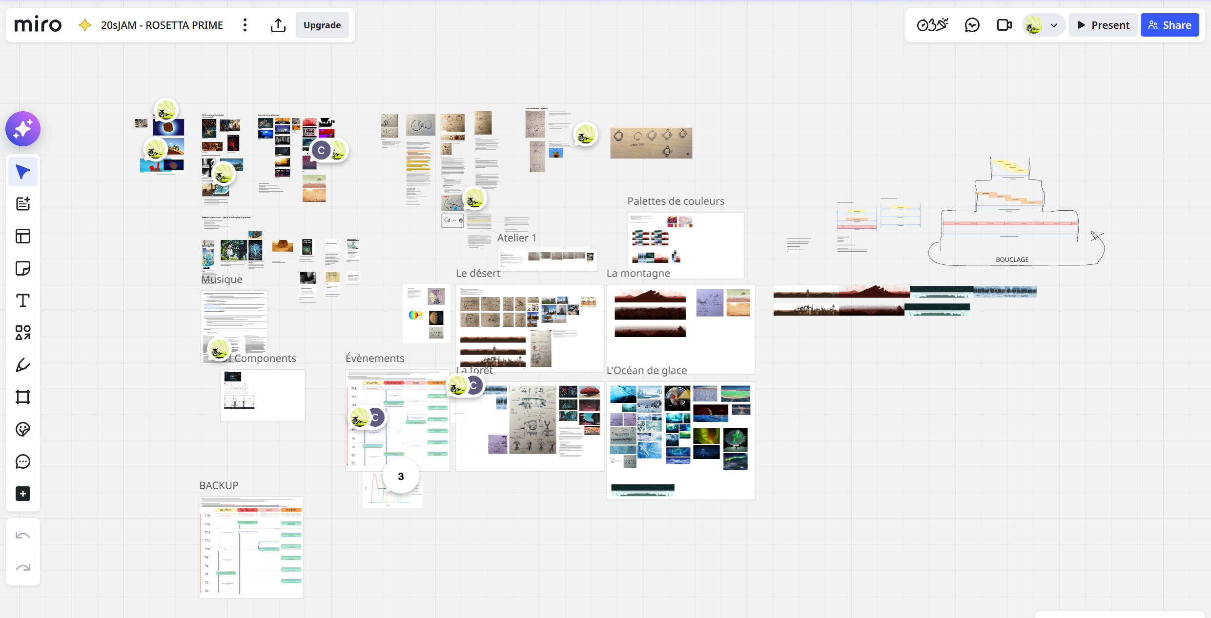
The complete Miro board for the Rosetta Prime game.
2.3 File storage and exchanges
For file exchanges between iPad, computer, and team members, we used a cloud storage solution (Pcloud, though any equivalent service would have worked). This may seem like a minor detail, but good file organization is essential to avoid wasted time and confusion, especially when frequently switching between tools and devices.
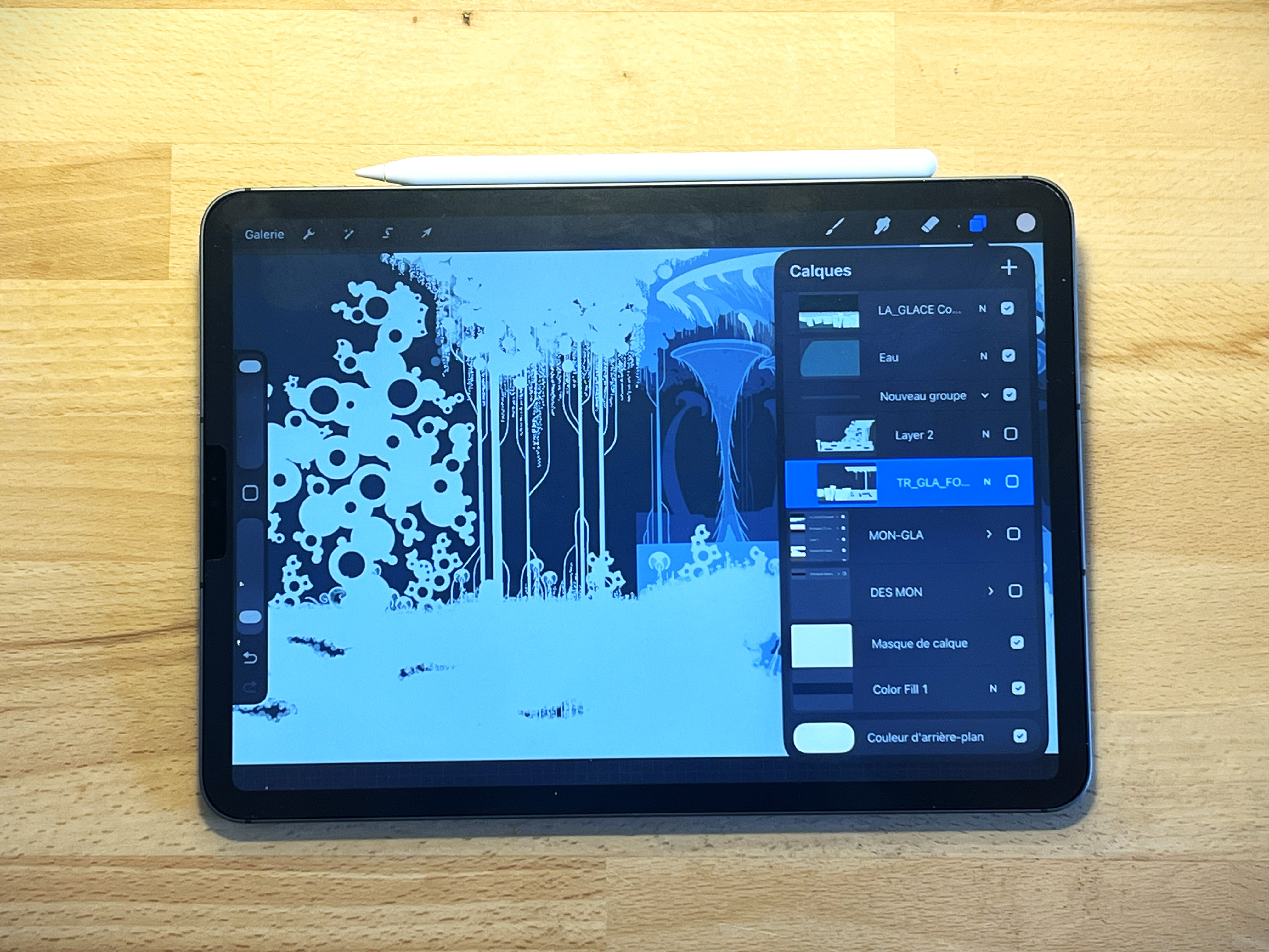
2.4 Graphic production tools: Procreate and Photoshop
Graphic assets were produced mainly using Procreate and Photoshop.
Although I’m very comfortable with Photoshop in an architectural visualization context, I deliberately chose to experiment with Procreate for this project. Its workflow is very close to hand drawing: the iPad and Apple Pencil provide a direct and intuitive feel that’s ideal for fast creation and experimentation. Customizable brushes offer great graphic freedom while maintaining a flexible workflow.
That said, Procreate also has limitations, particularly for tasks requiring high precision or more technical operations. This is where Photoshop comes in as a complement (Illustrator could also have been an option): it’s more efficient for precise geometric elements, strict alignments, complex selections, duplication and accurate placement of elements, clean asset connections, and automated exports.
Moving back and forth between the two tools works fairly well thanks to exports and cloud storage, but it requires rigorous file management. More generally, the fewer tools involved in a pipeline, the better: each additional tool introduces transfers, potential errors, added costs, and extra time when changes are needed.
3. Defining the Universe & Art Direction
3.1 A core principle: between familiarity and strangeness
The main premise guiding the creation of Rosetta Prime’s universe can be summed up simply:
the closer an element is to the real world, the more immediately understandable it is for the player; the further it moves away, the more disorienting—but also intriguing and stimulating—it becomes.
The challenge was therefore to find the right balance between these two poles: enough familiarity for the player to project meaning without heavy explanations, and enough strangeness to spark curiosity and the desire to observe and understand this distant world.
3.2 References and inspirations
We began by exploring a wide range of visual, narrative, and cultural references from video games, cinema, and animation.
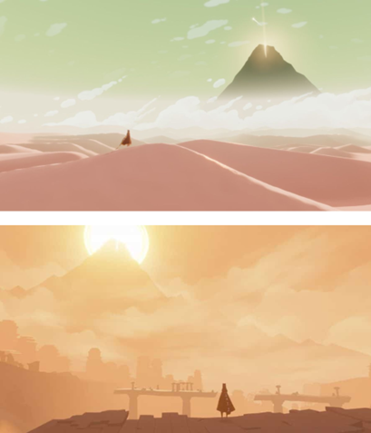
Outer Wilds was naturally a major inspiration, particularly for its approach to exploration, curiosity, and the progressive discovery of an unknown planet, as well as its time-loop mechanic. However, we deliberately chose a different direction in terms of visual universe and atmosphere.
We wanted a world more strongly rooted in science and biology, with a pronounced organic quality. The goal wasn’t to create something “pretty” in a decorative sense, but rather a world that makes sense, where each form, structure, and landscape follows an internal logic—even if that logic is extrapolated or distorted for the needs of the game.
In this spirit, several works consciously influenced our imagination:
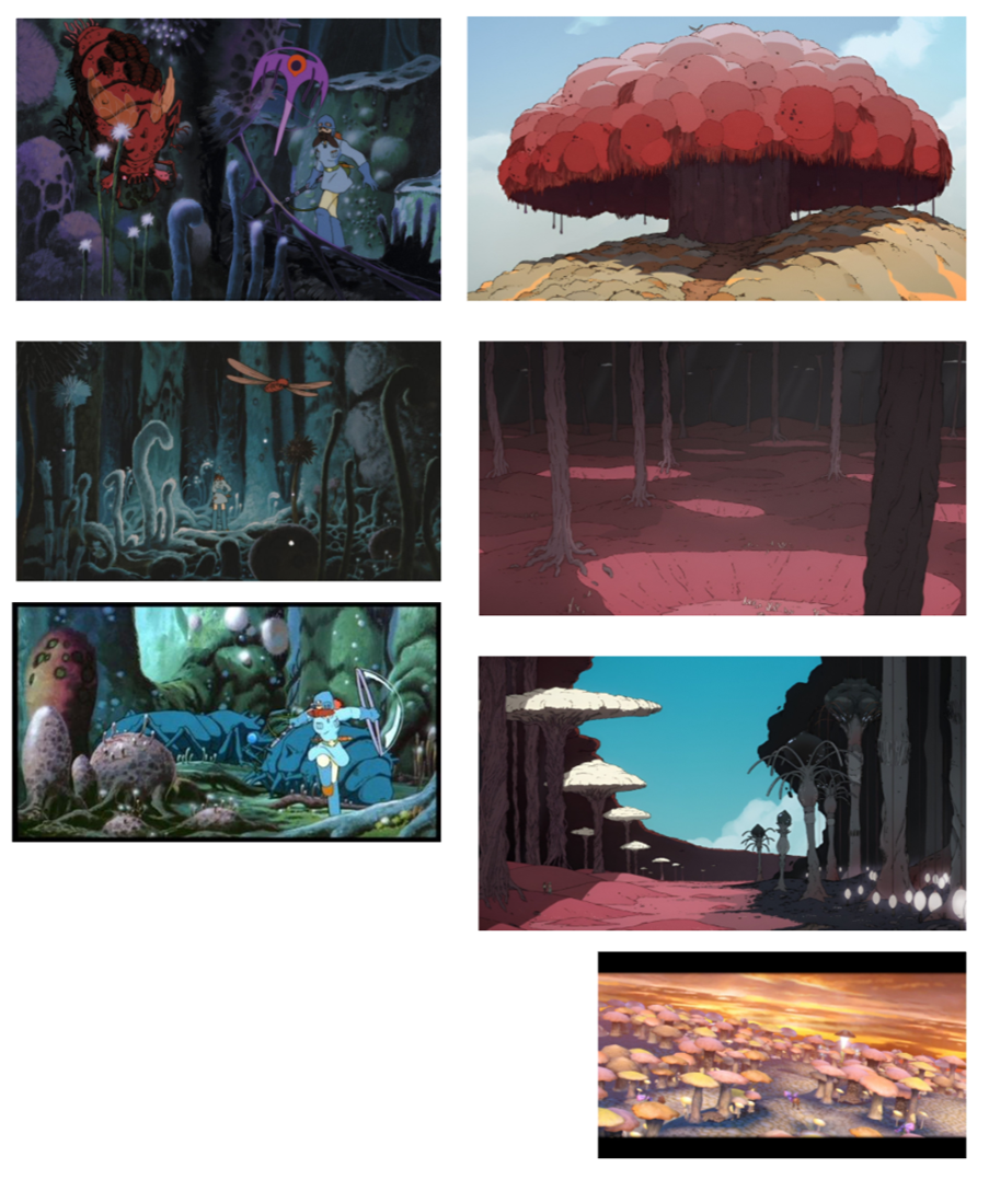
Miyazaki, especially Nausicaä of the Valley of the Wind, for its dense and ambiguous ecosystems, both unsettling and fascinating, rich in detail and invisible relationships.
Fantastic Planet (La Planète Sauvage), for its surreal and disorienting nature, halfway between a familiar world and radical otherness.
Metroid, for its balance between organic and mechanical elements, its scientific, dark, and solitary atmosphere, and its focus on observation and analysis (especially in Metroid Prime).
These references are not directly replicated, but rather serve as a cultural foundation on which we built our own universe.
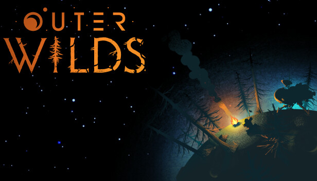 OuterWilds
 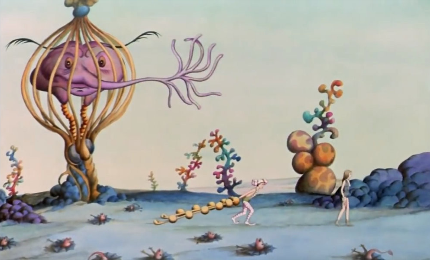 Planète Sauvage - René Laloux - 1973.
 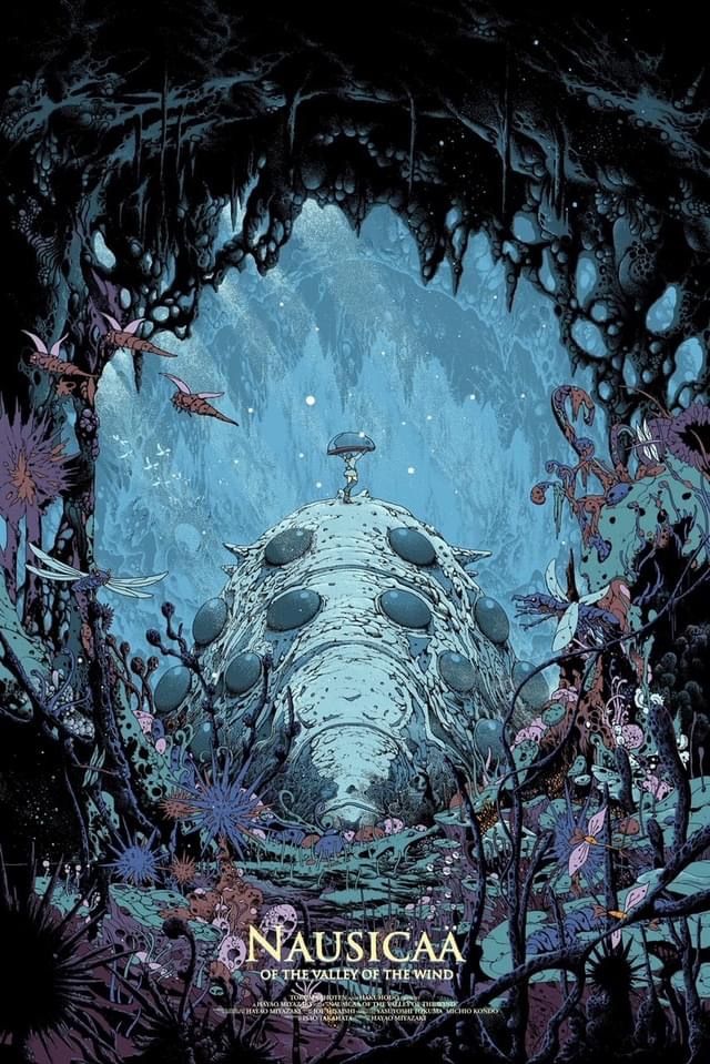 Miyazaki
 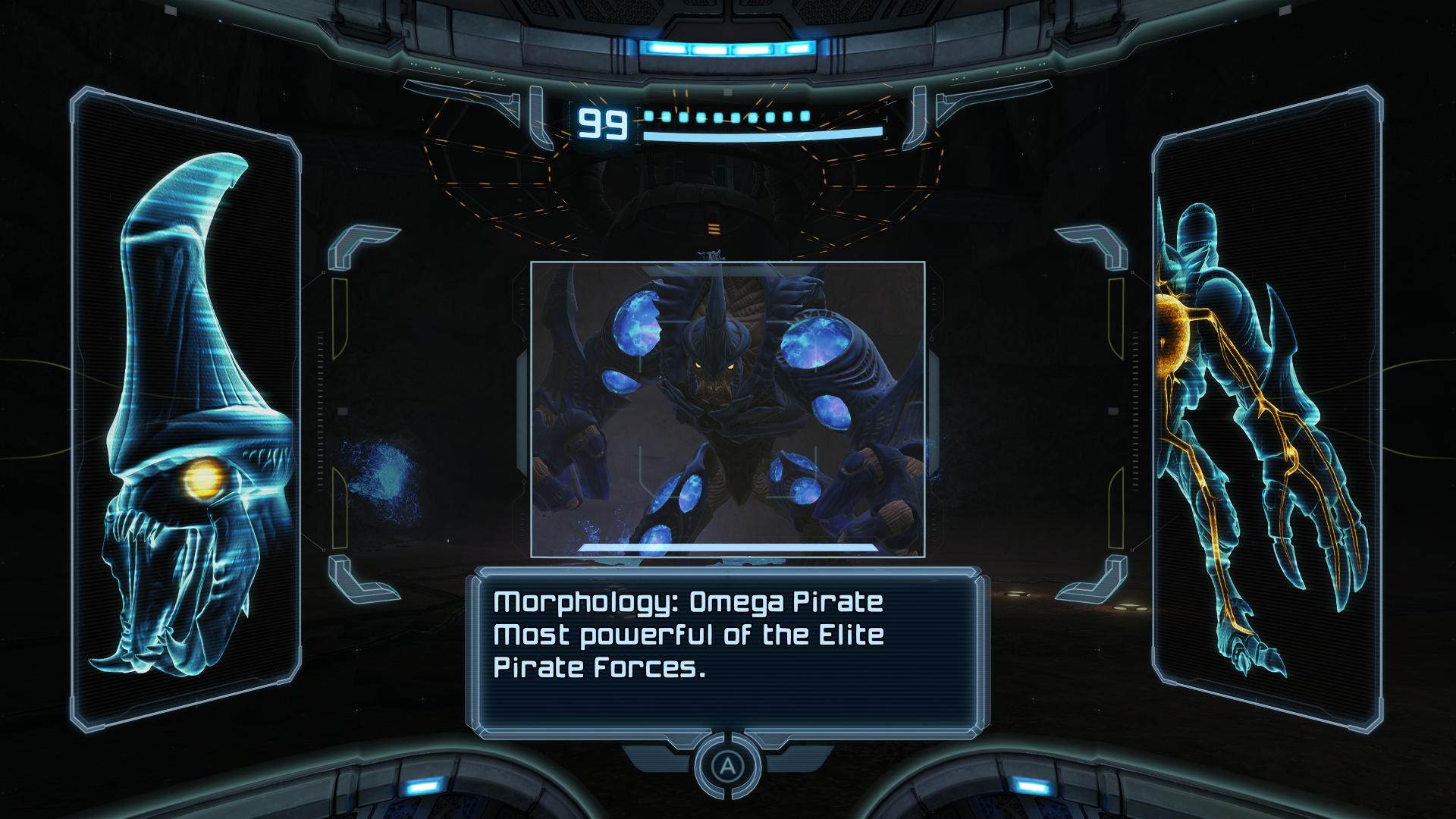 Metroid prime
3.3 Graphic style and production constraints
Given the very limited production time and the small team size, we quickly sought a graphic style that was simple to implement, yet visually strong and narratively coherent.
We oriented the game toward a silhouette / cutout-style aesthetic:
limited color usage,
line-based drawing,
stencil-like, cut shapes,
strong emphasis on silhouettes.
This choice evokes the idea of shadows, or of residual light reaching us from a distant world. We also associated it with the image of a compressed time-lapse, as if we were observing fragments of events stretched over immense periods of time, condensed into a 20-second window.
In this regard, many games influenced us visually: Limbo, Inside, Gris, Patapon, NightSky, Toby, Ovio, and 140.

Shadow puppet 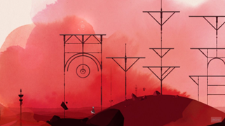 Gris
Gris
Limbo
Patapon
3.4 Visual style and narrative
This aesthetic choice also shaped technical and narrative decisions. The idea of using static appearances, almost like flashes of light, emerged quite naturally. Elements aren’t necessarily smoothly animated: they appear, disappear, and reveal themselves in fragments, like frozen moments.
This approach both:
simplifies production,
and strengthens implicit storytelling, by suggesting that what we see is only a partial and distant glimpse.
One aspect remains imperfect: the rising water in the forest biome is animated smoothly, which goes against this logic of fragmented flashes. This was a time-related compromise we couldn’t address during the jam.
4. Creative Process: From Ideas to Design Decisions
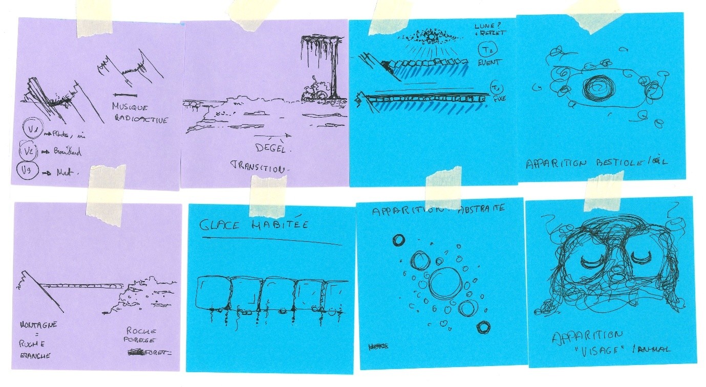
4.1 Text and sketches as a starting point
The creative process began very simply: writing and drawing. We wrote short texts, sometimes resembling scientific abstracts, sometimes closer to film synopses. These texts act as a conceptual thread, a kind of compass that guides the project, even if it needs to be adjusted along the way.
At the same time, numerous hand sketches were produced and shared on Miro. This method, which we also use in architecture and landscape projects, allows us to define intentions quickly without locking forms too early.
4.2 Pillars and pivots
Quite early on, certain ideas emerged as pillars of the project: structural elements we were strongly attached to and wanted to preserve as much as possible. Others were pivots—open decision points that needed to be resolved to steer the design in one direction or another.
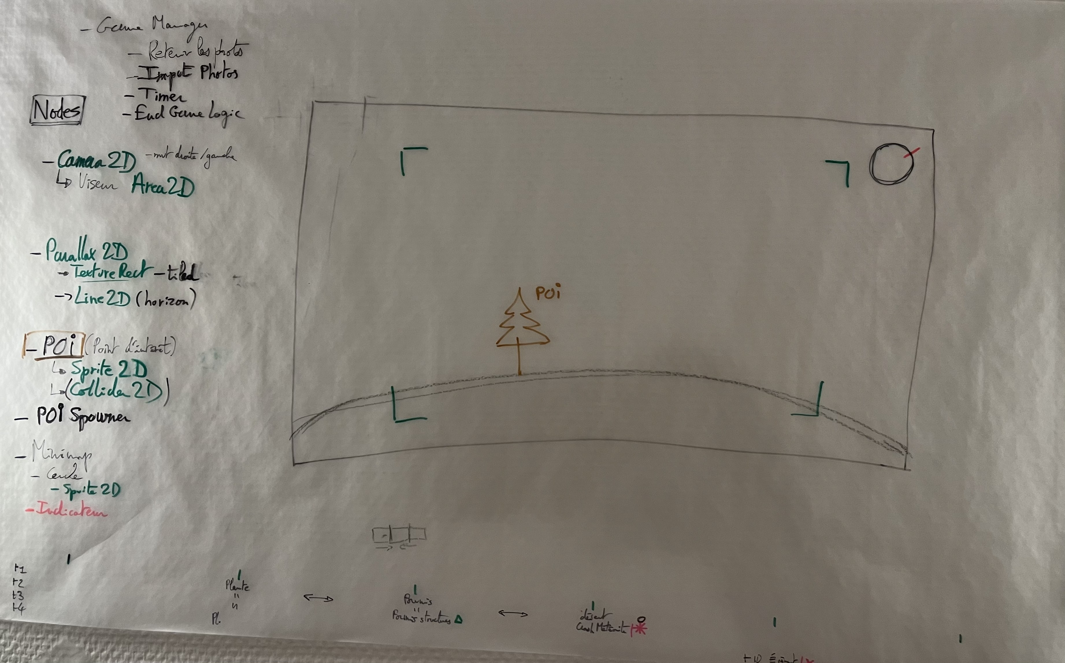
Example of a pillar: the player observes the planet from afar and takes photos. We stuck to this to keep the gameplay simple and readable, suited to a 20-second experience.
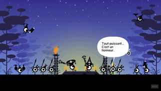
Example of a pivot: the presence of a civilization versus multiple autonomous biomes. We initially imagined a civilization with various events, but removing visible characters and living beings significantly simplified production. The choice of several independent biomes proved more appropriate for the jam format.
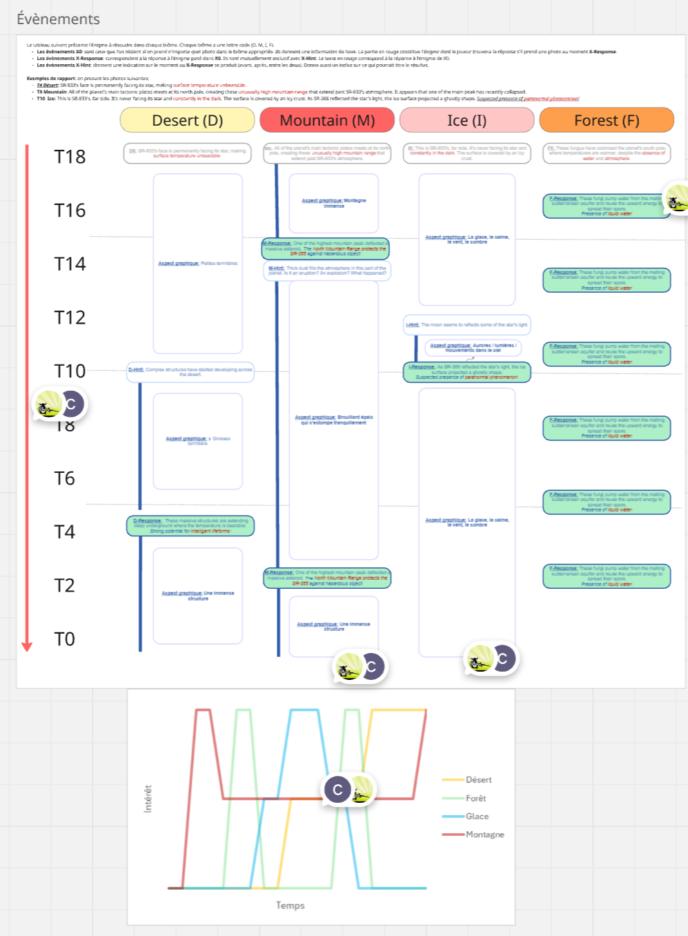
Final table showing the timing of events in the four biomes.
5. Biomes: Building Alien Landscapes
The biomes took shape gradually. After an initial group workshop, we had a vague idea of creating four distinct biomes, without knowing their exact nature. Each one was then refined through discussions, sketches, and research.
For each biome, I worked from:
hand sketches,
research into real-world environments,
observation of species and natural phenomena,
before diverting these references to create a credible alien landscape.
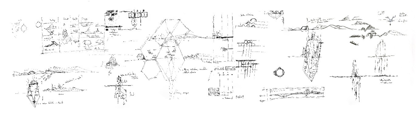
 Research sketches for the narrative and graphic universe
Research sketches for the narrative and graphic universe (2)
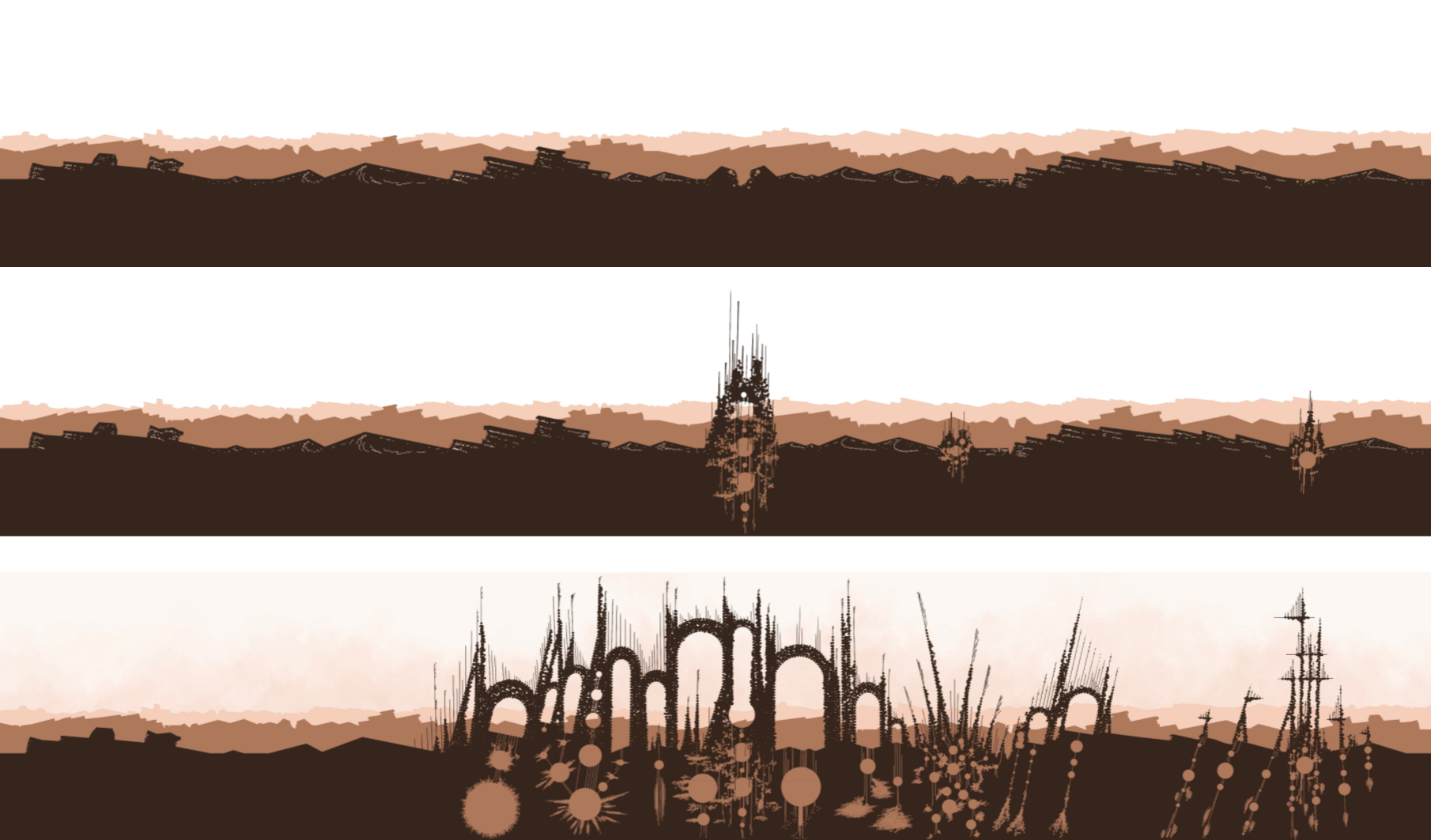
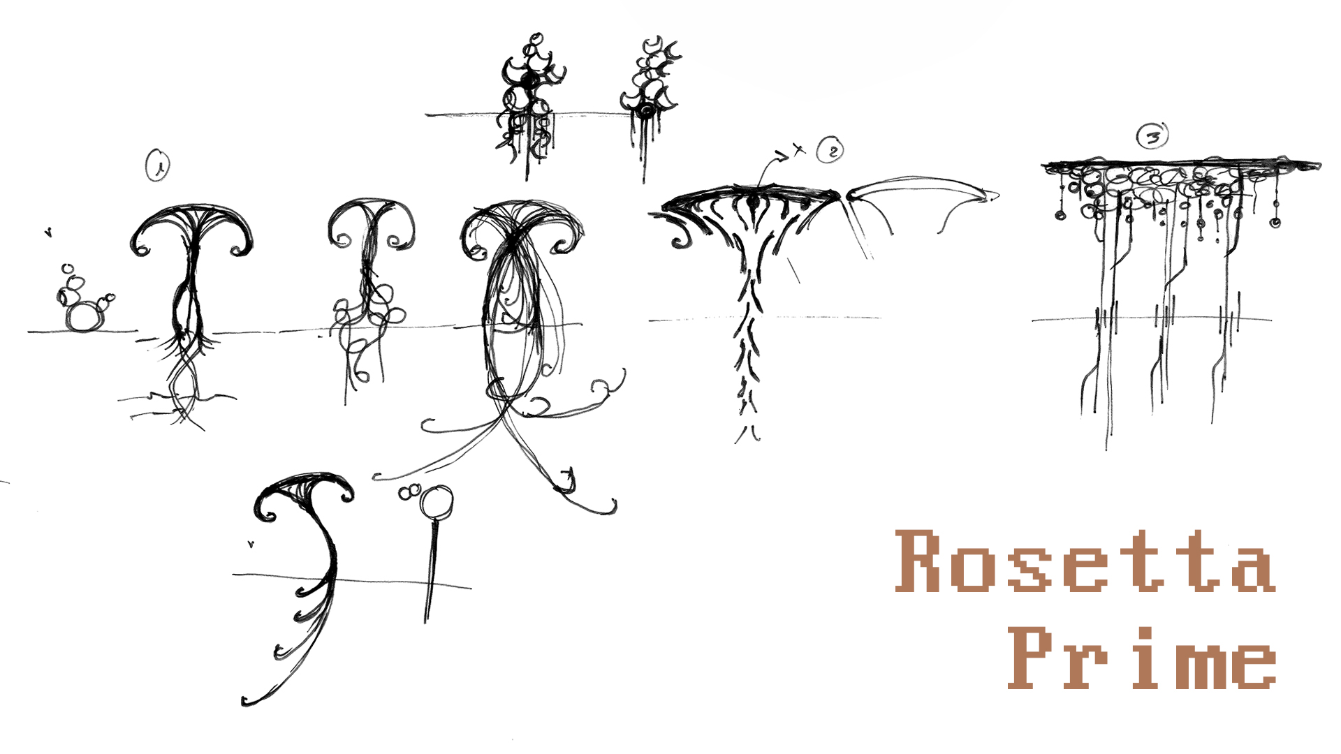
5.1 The Hollow Desert and the termite civilization
The desert was the first biome we developed. The idea of a civilization inspired by termites emerged very early.
This world depicts an arid desert inhabited by a species capable of digging, transforming, and rebuilding its environment to better capture water and energy. Several real-world elements guided the graphic choices:
the idea of a ground that is dug into, consumed, then reassembled into organic structures,
an imperfect, rounded masonry made of accumulated material that gradually refines over time,
fine elements (hairs, nets) oriented toward the sky, evoking atmospheric moisture capture,
an initial settlement in valleys or rock hollows, where water could accumulate sporadically.
 Miro concept board for the Hollow Desert
Research sketches - Hollow Desert
The three temporalities of the desert 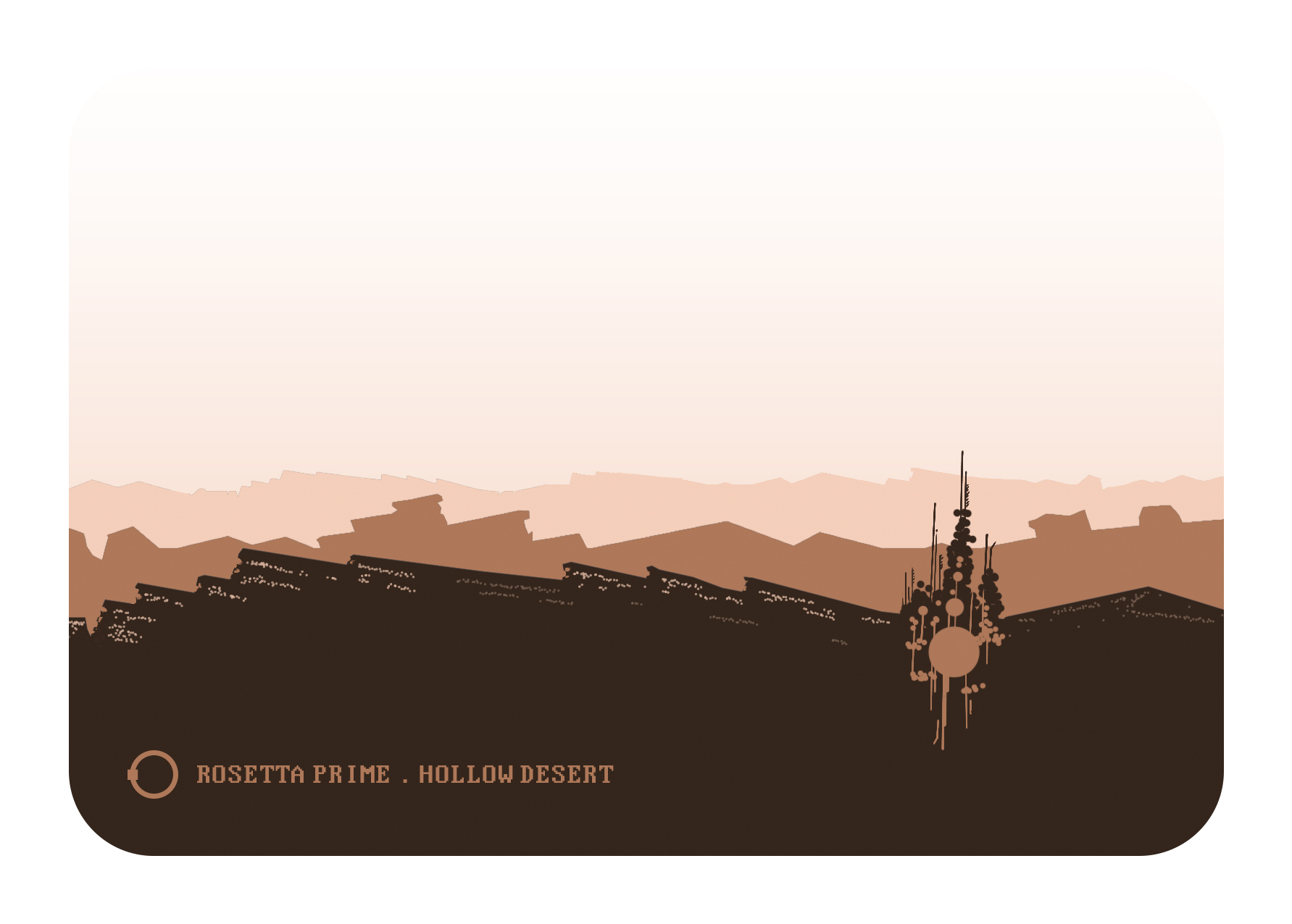
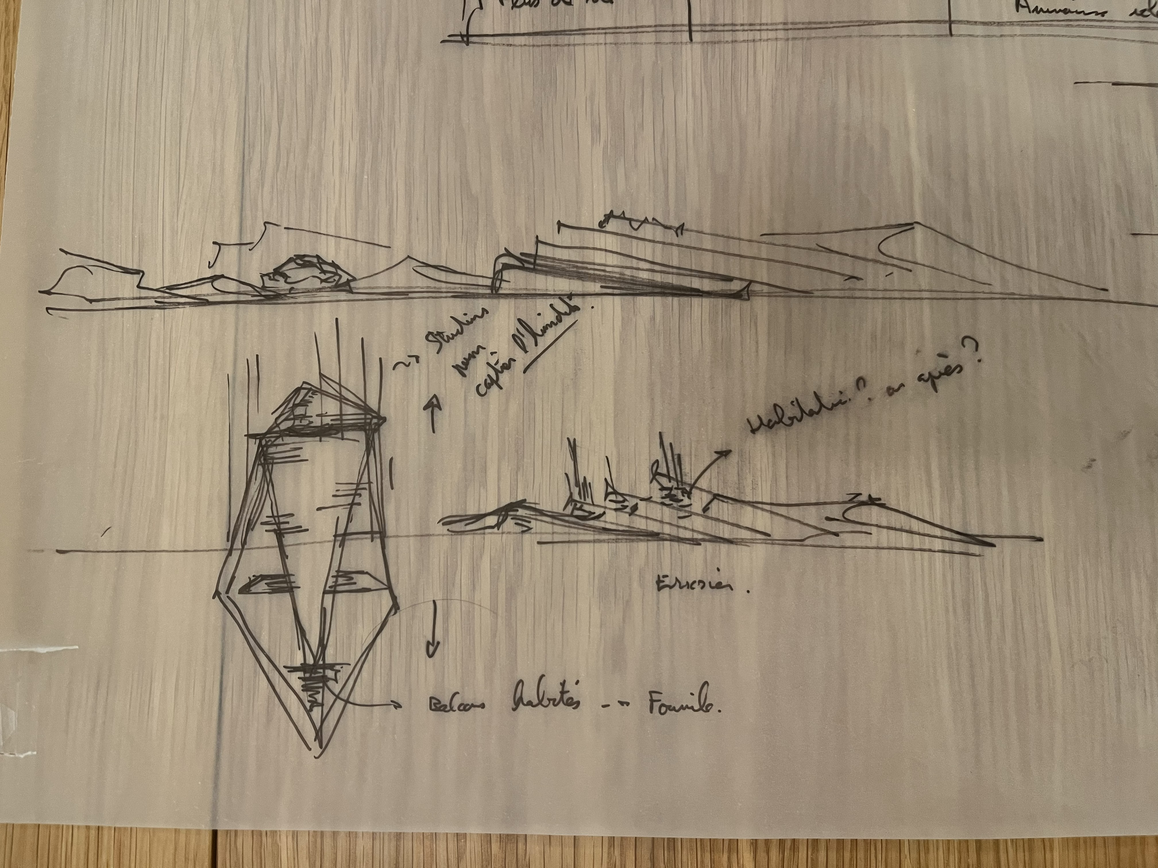
5.2 The Dread Mountains
The second biome is a monumental and solitary mountain, conceived as a strong visual landmark. We wanted a solemn, almost sacred landscape, marked by a major event (a meteor impact), inspired in part by Journey.
This biome is deliberately lifeless. The mountains are made of extremely hard crystalline rock, explaining their immense scale and lack of erosion despite the passage of time. The geological structure features a clear folding direction, giving the drawing a strong orientation: one smooth side aligned with the layers, and one rougher side cutting across them.
Journey
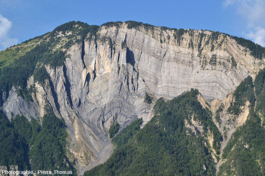
Geological folds of a mountain 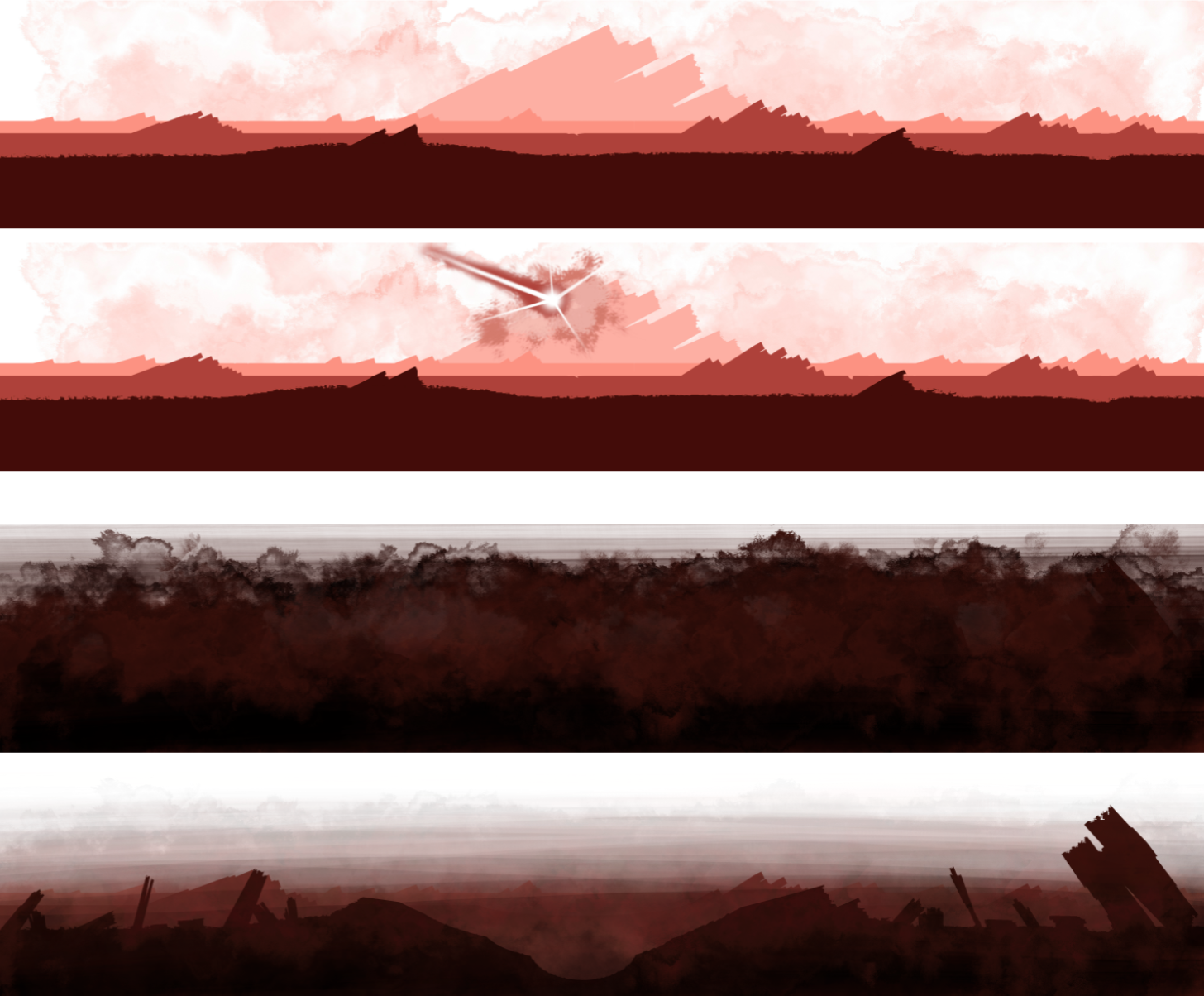
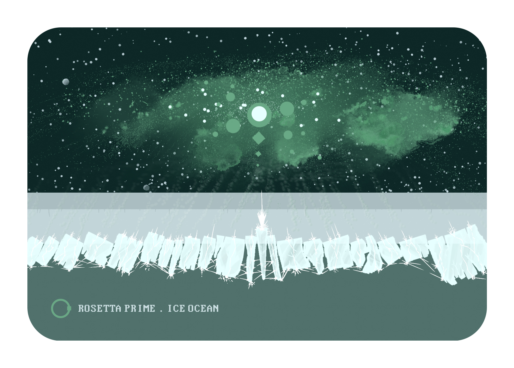
5.3 The Ice Ocean
Beneath the ice sheet, a form of life inspired by sea anemones (Edwardsiella andrillae) has developed. These creatures—reimagined here as “super anemones”—can move the ice and connect with one another to form a super-organism.
During a major event, they cause a shape to emerge in the sky, diffracting light and reacting to the aurora borealis. The exact nature of this event is intentionally left open: a mating dance, a large-scale nutrient exchange, a planetary communication ritual… The player’s imagination fills in what the game does not explicitly state.
Filaments pierce through the ice, spreading underwater and at the surface, contributing to the staging of this exceptional moment.
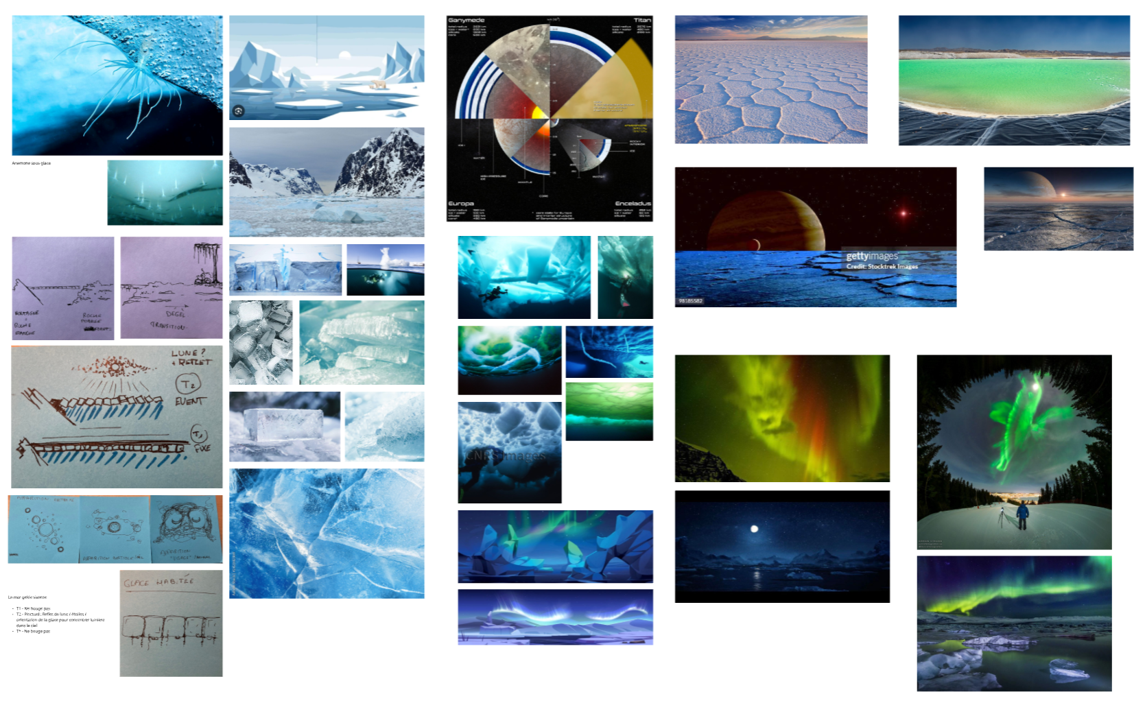
Miro concept board for the Ice Ocean
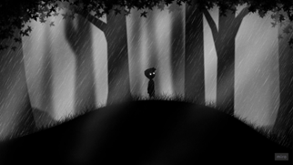
5.4 The Root Forest
The forest was designed as a more welcoming and living biome, in contrast with the previous ones. We aimed for strong organic richness, inspired by the worlds of Miyazaki (Nausicaä) and Metroid Fusion.
The focus here is on the underground world: roots, fungi, cavities, granular or smooth textures, full and empty spaces. Water plays a central role, acting as a structuring event that animates and transforms the landscape.
We designed three main tree types:
linear trees with bubble-like forms,
curved trees,
“skylight” trees.
There are also hollow, crescent-shaped shrub forms. The goal was to give each tree type a clear graphic logic, which could almost be read as a biological system.
Many ideas had to be set aside—we couldn’t implement everything (walking trees, lifted ground, etc.). There’s also a limit to how many events can be meaningfully conveyed in 20 seconds. That said, the universe has strong potential for expansion in a longer-form game.
Sketch of the different types of plants/fungi for the forest biome
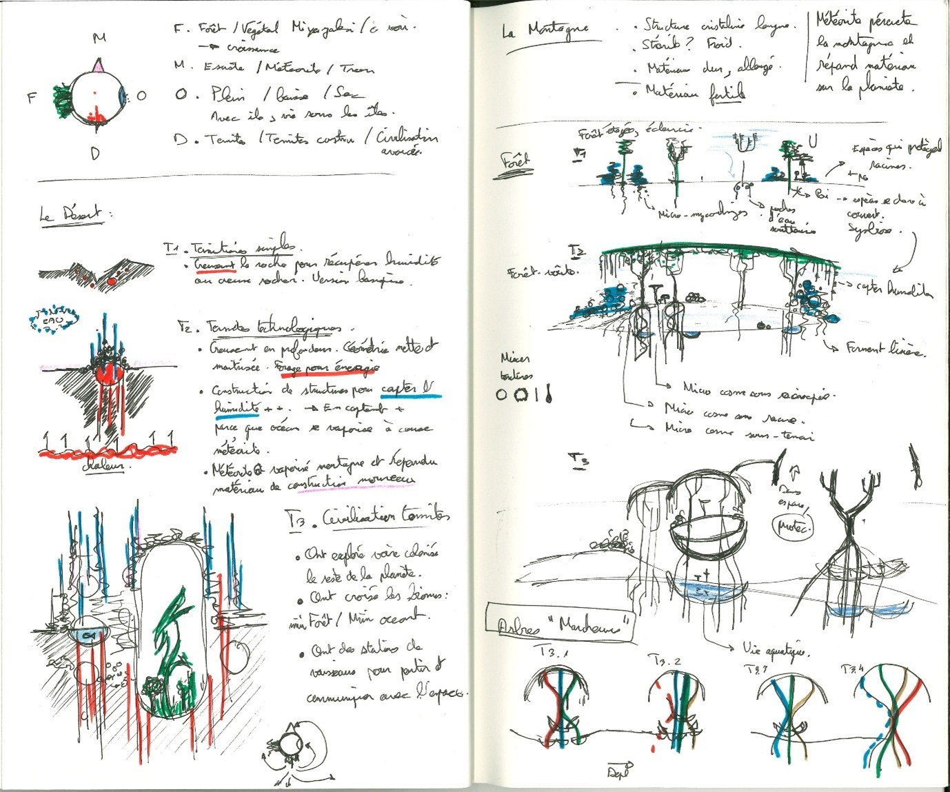
Drawings on the right related to the forest biome. The other drawings explore the interaction between the four biomes, an idea that was ultimately abandoned.
Inspirational references - Nausicaa / Scavengers reign / Final Fantasy Crystal Chronicles
5.5 Color palette
The color palette was defined fairly early. I started with a desert sketch in Procreate, using three depth layers. From there, I chose the colors for the other biomes, aiming for a balanced set:
two warm palettes,
two cool palettes,
clearly distinct colors to reinforce each biome’s identity.
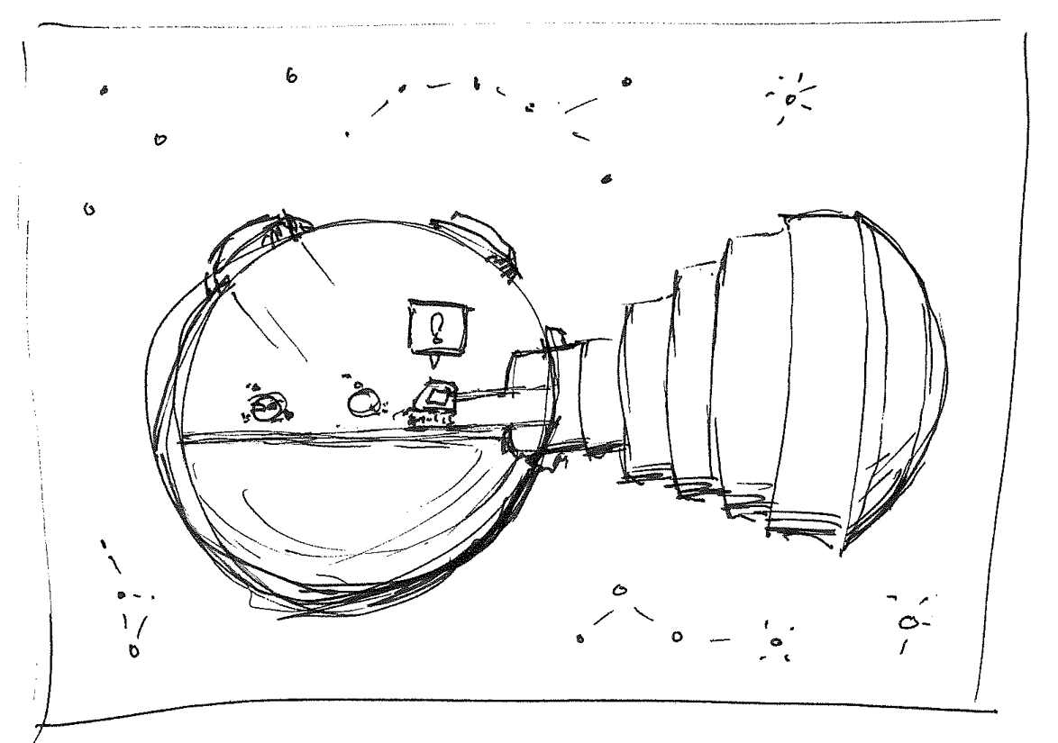
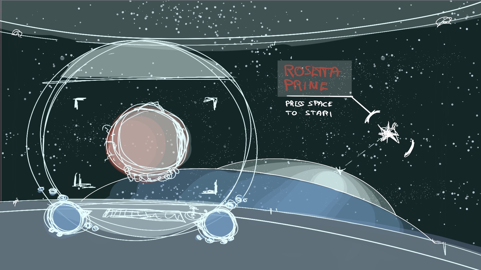
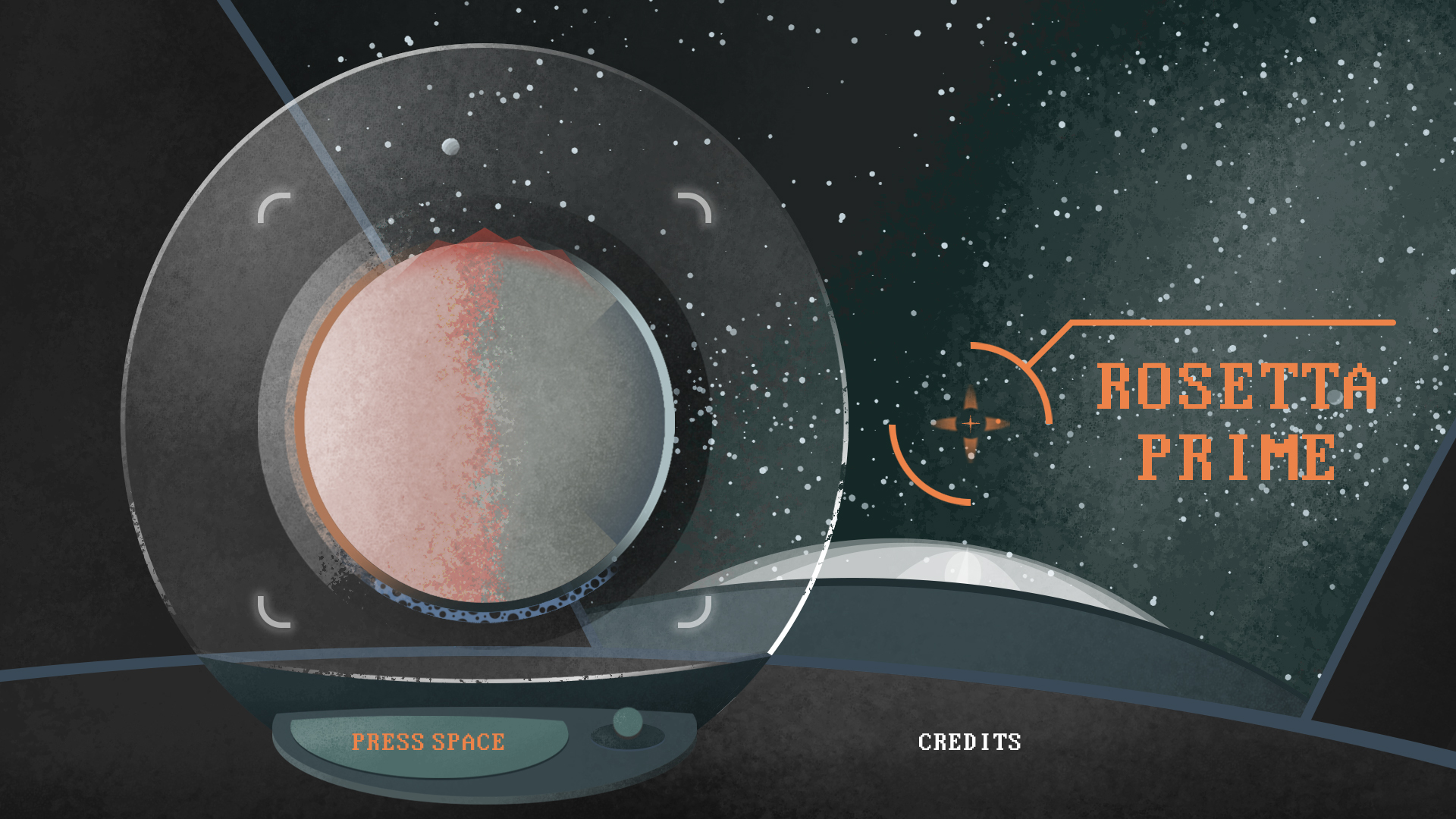
6. Title Screen
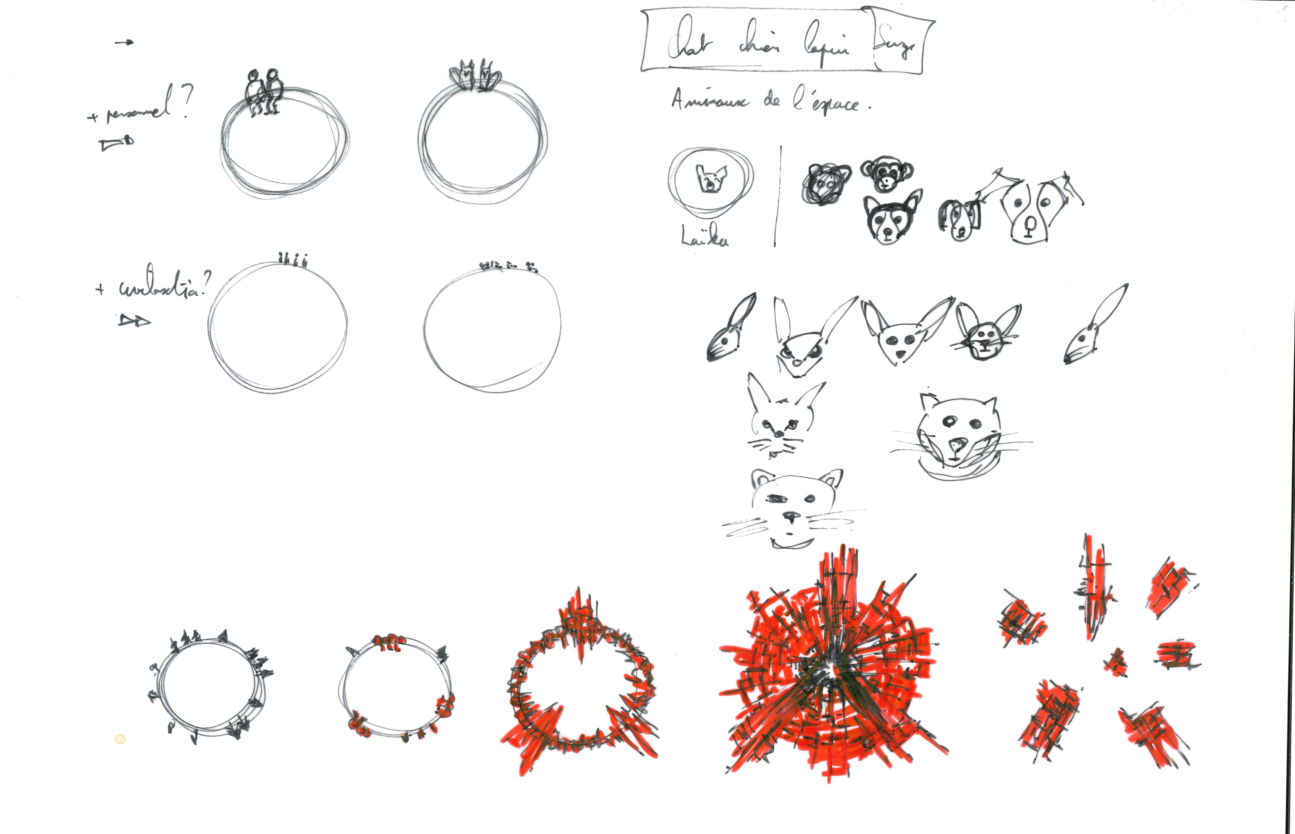
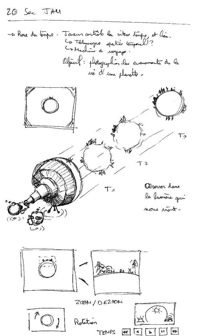
The title screen is directly inspired by the Metroid universe. Initially, we imagined showing scientists observing the planet through a telescope. Ultimately, this idea was dropped: characters were not central to the narrative, and their presence conflicted with the solitary, cold atmosphere we wanted to convey.
The absence of human figures reinforces the feeling of isolation, while also simplifying graphic design and production.
7. Conclusion
Rosetta Prime is a condensed exploration experience, born from strong constraints of time and resources. These constraints guided—and sometimes forced—but often enriched our artistic and narrative choices. This devlog is an attempt to make those decisions visible, along with their origins and the compromises they involved.