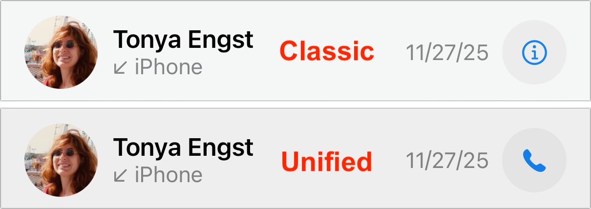
In “Comparing the Classic and Unified Views in iOS 26’s Phone App” (10 November 2025), I wrote about the Classic view’s Recents screen:
Tapping a recent call dials it, whereas tapping the ⓘ button to the right opens the contact card associated with the call.
In contrast, Unified view’s Calls screen displays a different behavior:
Tapping a recent call shows the associated contact; to redial the call, you must tap the blue phone or camera (for FaceTime) button to the right.
The only visual difference is the button to the right, which lets you override what happens when you tap anywhere else on the call. In Classic view, it’s an info ⓘ icon, whereas in Unified view, it’s a phone icon…
In “Comparing the Classic and Unified Views in iOS 26’s Phone App” (10 November 2025), I wrote about the Classic view’s Recents screen:
Tapping a recent call dials it, whereas tapping the ⓘ button to the right opens the contact card associated with the call.
In contrast, Unified view’s Calls screen displays a different behavior:
Tapping a recent call shows the associated contact; to redial the call, you must tap the blue phone or camera (for FaceTime) button to the right.
The only visual difference is the button to the right, which lets you override what happens when you tap anywhere else on the call. In Classic view, it’s an info ⓘ icon, whereas in Unified view, it’s a phone icon.
I have strong opinions about this tap-a-call interface. As I wrote in the previous article:
I have hated this interface with a burning passion for years because it’s far too easy for a stray tap to start an unwanted phone call that I must then frantically cancel and often explain in a message to the accidental recipient so they don’t call me back.
Put simply, an interface shouldn’t make it too easy to perform a destructive action or create more work for you, and inadvertent calls can easily create more work. You may disagree with me about this, but I hope everyone can agree that it’s good to have a choice of whether a tap on a recent call initiates a callback or opens its associated contact.
But isn’t it weird that the way you toggle the tap-a-call behavior is by switching the Phone app’s view? What if you like Unified view but prefer that tapping a recent starts a callback rather than opening a contact?
Playing Hide and Seek with Settings
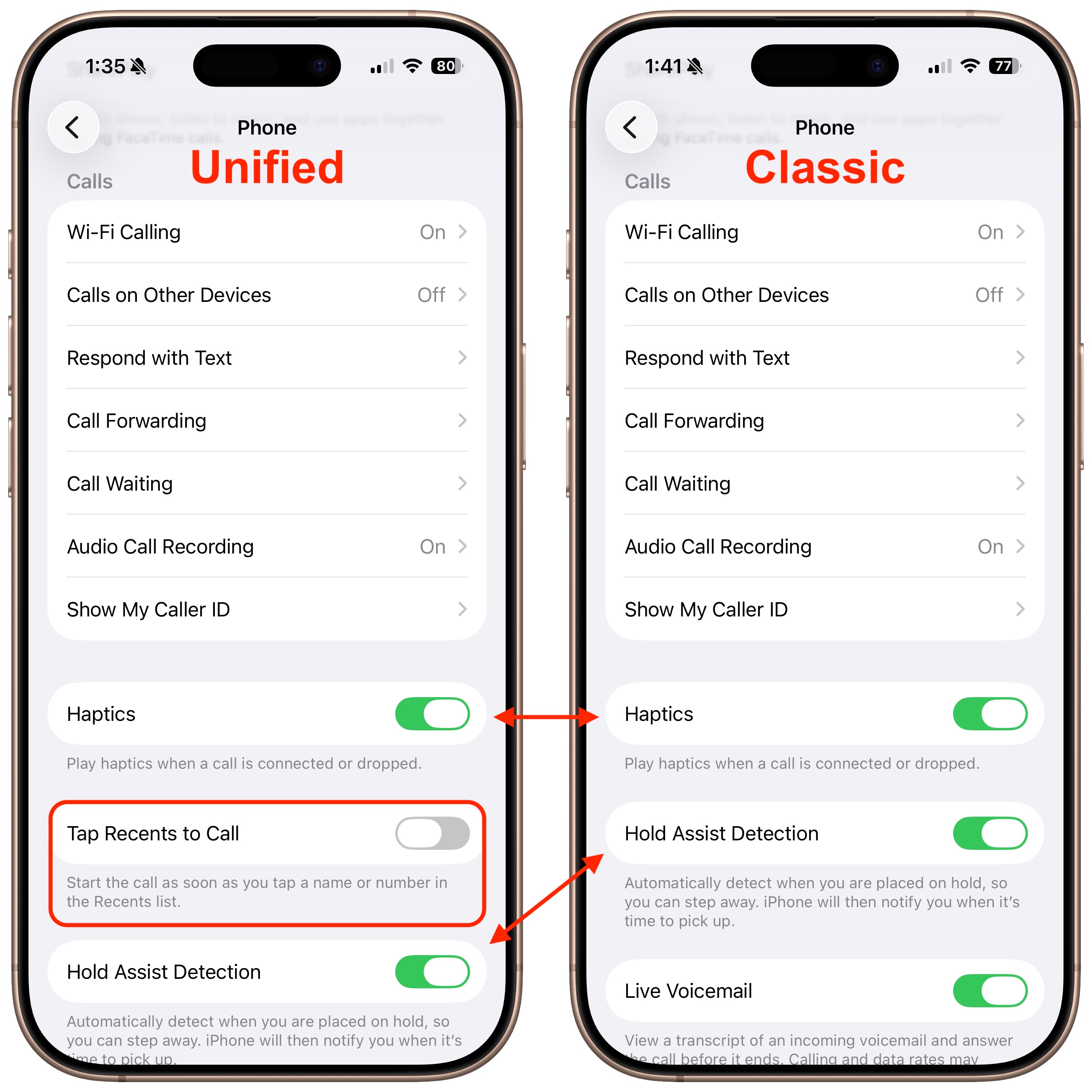
In yet another example of a poorly designed, nearly undiscoverable interface, Apple actually provides a setting for this, but it’s accessible only when the Phone app is set to Unified view—props to Paul Kafasis of Rogue Amoeba for alerting me to this train wreck of an interface.
To find it, make sure the Phone app is in Unified view, open Settings > Apps > Phone, and scroll down past Calls to where you’ll see Tap Recents to Call. Here’s the odd part: if you switch the Phone app to Classic view and then return to Settings, the Tap Recents to Call switch disappears, and Hold Assist Detection slides up. Switch Phone back to Unified and return to Settings again, and you’ll see Tap Recents to Call reappear, pushing Hold Assist Detection down. (If you’re unlucky, Settings will crash instead—I saw several crashes while exploring the feature.)
Interfaces Should Be Predictable
This is deeply wrong. “User interface elements should not come and go based on settings adjusted elsewhere,” said Paul Kafasis, while holding his nose and fanning the air with his hand, in an exaggerated gesture of disgust aimed at Apple. (Hey, tip me off to a hidden interface atrocity, and you too can write your own quote.)
A basic tenet of interface design is predictability: controls must look and work the same way every time, or people lose trust in their ability to use the system. The most egregious example of a changeable interface (outside games, where unpredictability may be the point) came in Microsoft Word 4, where Microsoft had a brief fling with “short menus,” a mode that hid menu items for less common features. Thirty-five years ago, I criticized Word 4’s short menus in “Word 5.0 Wishes” (4 March 1991):
Another major contributor to the interface headaches is the “Short Menus” feature (I’ve heard an instructor in a class once say that Short Menus is a bug, not a feature.). With Short Menus turned on, most of the menu items disappear, resulting in complete and utter confusion when the user wants to perform an action whose menu item no longer exists.
But this is 2025, not 1991, and the unpredictability of the Phone settings is entirely unnecessary. If we agree that the default behavior for tapping a call should be user-configurable, why should that be true only in the Unified view? There’s no reason to prevent those who prefer Classic view from changing the tap-a-call behavior.
I have suggested to Apple that this tap-a-call option apply to Classic view as well, and I’ve reported that the Settings app crashes while toggling the option. We’ll see if anything changes in future versions of iOS.